@charset "UTF-8";
/*! normalize.css v8.0.1 | MIT License | github.com/necolas/normalize.css */
/* Document
========================================================================== */
/**
* 1. Correct the line height in all browsers.
* 2. Prevent adjustments of font size after orientation changes in iOS.
*/
html {
line-height: 1.15; /* 1 */
-webkit-text-size-adjust: 100%; /* 2 */
}
/* Sections
========================================================================== */
/**
* Remove the margin in all browsers.
*/
body {
margin: 0;
}
/**
* Render the `main` element consistently in IE.
*/
main {
display: block;
}
/**
* Correct the font size and margin on `h1` elements within `section` and
* `article` contexts in Chrome, Firefox, and Safari.
*/
h1 {
font-size: 2em;
margin: 0.67em 0;
}
/* Grouping content
========================================================================== */
/**
* 1. Add the correct box sizing in Firefox.
* 2. Show the overflow in Edge and IE.
*/
hr {
box-sizing: content-box; /* 1 */
height: 0; /* 1 */
overflow: visible; /* 2 */
}
/**
* 1. Correct the inheritance and scaling of font size in all browsers.
* 2. Correct the odd `em` font sizing in all browsers.
*/
pre {
font-family: monospace, monospace; /* 1 */
font-size: 1em; /* 2 */
}
/* Text-level semantics
========================================================================== */
/**
* Remove the gray background on active links in IE 10.
*/
a {
background-color: transparent;
}
/**
* 1. Remove the bottom border in Chrome 57-
* 2. Add the correct text decoration in Chrome, Edge, IE, Opera, and Safari.
*/
abbr[title] {
border-bottom: none; /* 1 */
text-decoration: underline; /* 2 */
-webkit-text-decoration: underline dotted;
text-decoration: underline dotted; /* 2 */
}
/**
* Add the correct font weight in Chrome, Edge, and Safari.
*/
b,
strong {
font-weight: bolder;
}
/**
* 1. Correct the inheritance and scaling of font size in all browsers.
* 2. Correct the odd `em` font sizing in all browsers.
*/
code,
kbd,
samp {
font-family: monospace, monospace; /* 1 */
font-size: 1em; /* 2 */
}
/**
* Add the correct font size in all browsers.
*/
small {
font-size: 80%;
}
/**
* Prevent `sub` and `sup` elements from affecting the line height in
* all browsers.
*/
sub,
sup {
font-size: 75%;
line-height: 0;
position: relative;
vertical-align: baseline;
}
sub {
bottom: -0.25em;
}
sup {
top: -0.5em;
}
/* Embedded content
========================================================================== */
/**
* Remove the border on images inside links in IE 10.
*/
img {
border-style: none;
}
/* Forms
========================================================================== */
/**
* 1. Change the font styles in all browsers.
* 2. Remove the margin in Firefox and Safari.
*/
button,
input,
optgroup,
select,
textarea {
font-family: inherit; /* 1 */
font-size: 100%; /* 1 */
line-height: 1.15; /* 1 */
margin: 0; /* 2 */
}
/**
* Show the overflow in IE.
* 1. Show the overflow in Edge.
*/
button,
input { /* 1 */
overflow: visible;
}
/**
* Remove the inheritance of text transform in Edge, Firefox, and IE.
* 1. Remove the inheritance of text transform in Firefox.
*/
button,
select { /* 1 */
text-transform: none;
}
/**
* Correct the inability to style clickable types in iOS and Safari.
*/
button,
[type=button],
[type=reset],
[type=submit] {
-webkit-appearance: button;
}
/**
* Remove the inner border and padding in Firefox.
*/
button::-moz-focus-inner,
[type=button]::-moz-focus-inner,
[type=reset]::-moz-focus-inner,
[type=submit]::-moz-focus-inner {
border-style: none;
padding: 0;
}
/**
* Restore the focus styles unset by the previous rule.
*/
button:-moz-focusring,
[type=button]:-moz-focusring,
[type=reset]:-moz-focusring,
[type=submit]:-moz-focusring {
outline: 1px dotted ButtonText;
}
/**
* Correct the padding in Firefox.
*/
fieldset {
padding: 0.35em 0.75em 0.625em;
}
/**
* 1. Correct the text wrapping in Edge and IE.
* 2. Correct the color inheritance from `fieldset` elements in IE.
* 3. Remove the padding so developers are not caught out when they zero out
* `fieldset` elements in all browsers.
*/
legend {
box-sizing: border-box; /* 1 */
color: inherit; /* 2 */
display: table; /* 1 */
max-width: 100%; /* 1 */
padding: 0; /* 3 */
white-space: normal; /* 1 */
}
/**
* Add the correct vertical alignment in Chrome, Firefox, and Opera.
*/
progress {
vertical-align: baseline;
}
/**
* Remove the default vertical scrollbar in IE 10+.
*/
textarea {
overflow: auto;
}
/**
* 1. Add the correct box sizing in IE 10.
* 2. Remove the padding in IE 10.
*/
[type=checkbox],
[type=radio] {
box-sizing: border-box; /* 1 */
padding: 0; /* 2 */
}
/**
* Correct the cursor style of increment and decrement buttons in Chrome.
*/
[type=number]::-webkit-inner-spin-button,
[type=number]::-webkit-outer-spin-button {
height: auto;
}
/**
* 1. Correct the odd appearance in Chrome and Safari.
* 2. Correct the outline style in Safari.
*/
[type=search] {
-webkit-appearance: textfield; /* 1 */
outline-offset: -2px; /* 2 */
}
/**
* Remove the inner padding in Chrome and Safari on macOS.
*/
[type=search]::-webkit-search-decoration {
-webkit-appearance: none;
}
/**
* 1. Correct the inability to style clickable types in iOS and Safari.
* 2. Change font properties to `inherit` in Safari.
*/
::-webkit-file-upload-button {
-webkit-appearance: button; /* 1 */
font: inherit; /* 2 */
}
/* Interactive
========================================================================== */
/*
* Add the correct display in Edge, IE 10+, and Firefox.
*/
details {
display: block;
}
/*
* Add the correct display in all browsers.
*/
summary {
display: list-item;
}
/* Misc
========================================================================== */
/**
* Add the correct display in IE 10+.
*/
template {
display: none;
}
/**
* Add the correct display in IE 10.
*/
[hidden] {
display: none;
}
*,
::before,
::after {
box-sizing: border-box;
}
html {
height: 100%;
font-family: sans-serif;
line-height: 1.5;
text-align: left;
line-break: normal;
word-wrap: break-word;
text-underline-offset: 0.125em;
}
:root {
--vw-without-scrollbar: calc(100vw - var(--scrollbar-width));
}
:focus:not(:focus-visible) {
outline: 0;
}
body {
height: 100%;
}
h1,
h2,
h3,
h4,
h5,
h6,
p,
hr,
blockquote,
ol,
ul,
dl,
dd,
figure,
pre {
margin: 0;
}
h1,
h2,
h3,
h4,
h5,
h6 {
font-size: inherit;
font-weight: inherit;
}
hr {
border: 0;
}
ol,
ul {
padding: 0;
}
li {
list-style-type: none;
list-style: none;
}
a {
color: currentColor;
text-decoration: none;
}
u,
ins {
text-decoration: none;
}
strong,
b {
font-weight: inherit;
}
i,
cite,
em,
var,
address,
dfn {
font-style: inherit;
}
code,
kbd,
samp {
font-size: inherit;
}
mark {
color: currentColor;
background-color: transparent;
}
small {
font-size: inherit;
}
s,
del {
text-decoration: none;
}
img,
svg,
video,
canvas,
audio,
iframe,
embed,
object {
display: block;
max-width: 100%;
}
img,
svg,
video,
canvas {
height: auto;
}
audio {
width: 100%;
}
svg {
fill: currentColor;
}
table {
border-color: currentColor;
border-spacing: 0;
border-collapse: collapse;
}
td,
th {
padding: 0;
}
th {
font-weight: inherit;
text-align: inherit;
}
input,
textarea,
select,
button {
padding: 0;
font: inherit;
letter-spacing: inherit;
color: currentColor;
background-color: transparent;
border: 0;
}
input[type=search] {
-webkit-appearance: none;
}
button:not(:disabled):not([aria-disabled=true]) {
cursor: pointer;
}
select {
-moz-appearance: none;
-webkit-appearance: none;
border-radius: 0;
}
::-ms-expand {
display: none;
}
textarea {
resize: vertical;
}
fieldset {
min-width: 0;
margin: 0;
padding: 0;
border: 0;
}
[hidden][hidden] {
display: none !important;
}
body {
font-family: source-han-sans-japanese, sans-serif;
color: #2b2f38;
font-weight: 500;
}
.-en {
font-family: canada-type-gibson, sans-serif;
font-weight: 400;
font-style: normal;
}
p {
font-size: 0.75rem;
line-height: 1.8em;
letter-spacing: 0.03em;
font-feature-settings: "palt";
letter-spacing: 0.08em;
}
@media (min-width: 48em) {
p {
font-size: 1.12rem;
line-height: 1.8em;
letter-spacing: 0.03em;
}
}
p.mt {
margin-top: 1.2em;
}
h1,
h2,
h3,
h4,
h5 {
font-feature-settings: "palt";
}
h1,
h2,
h3 {
font-weight: 700;
}
h5 {
font-size: 0.75rem;
line-height: 1.8em;
letter-spacing: 0.03em;
}
@media (min-width: 48em) {
h5 {
font-size: 1.12rem;
line-height: 1.8em;
}
}
dl {
font-size: 1rem;
}
@media (min-width: 48em) {
dl {
font-size: 1.12rem;
}
}
ul {
font-size: 0.87rem;
}
@media (min-width: 48em) {
ul {
font-size: 1rem;
}
}
.caution {
font-size: 0.62rem;
color: #7d8492;
}
@media (min-width: 64em) {
.caution {
font-size: 0.75rem !important;
}
}
.-annotation {
font-size: 0.62rem !important;
color: #7d8492;
}
@media (min-width: 64em) {
.-annotation {
font-size: 0.75rem !important;
}
}
.-annotation .description {
margin-top: 0.62rem;
display: inline-block;
}
.-highlight {
color: #e7153f;
}
.-black .-highlight {
color: #2b2f38;
}
/**
* Usage:
*
*
*
* Justify variants:
*
*
*
*/
.justify-start {
justify-content: flex-start;
}
.justify-end {
justify-content: flex-end;
}
.justify-center {
justify-content: center;
}
.justify-between {
justify-content: space-between;
}
@media (min-width: 20em) {
.justify-start\@xxs {
justify-content: flex-start;
}
.justify-end\@xxs {
justify-content: flex-end;
}
.justify-center\@xxs {
justify-content: center;
}
.justify-between\@xxs {
justify-content: space-between;
}
}
@media (min-width: 23em) {
.justify-start\@xs {
justify-content: flex-start;
}
.justify-end\@xs {
justify-content: flex-end;
}
.justify-center\@xs {
justify-content: center;
}
.justify-between\@xs {
justify-content: space-between;
}
}
@media (min-width: 36em) {
.justify-start\@sm {
justify-content: flex-start;
}
.justify-end\@sm {
justify-content: flex-end;
}
.justify-center\@sm {
justify-content: center;
}
.justify-between\@sm {
justify-content: space-between;
}
}
@media (min-width: 48em) {
.justify-start\@md {
justify-content: flex-start;
}
.justify-end\@md {
justify-content: flex-end;
}
.justify-center\@md {
justify-content: center;
}
.justify-between\@md {
justify-content: space-between;
}
}
@media (min-width: 64em) {
.justify-start\@lg {
justify-content: flex-start;
}
.justify-end\@lg {
justify-content: flex-end;
}
.justify-center\@lg {
justify-content: center;
}
.justify-between\@lg {
justify-content: space-between;
}
}
@media (min-width: 64.0625em) {
.justify-start\@lgup {
justify-content: flex-start;
}
.justify-end\@lgup {
justify-content: flex-end;
}
.justify-center\@lgup {
justify-content: center;
}
.justify-between\@lgup {
justify-content: space-between;
}
}
@media (min-width: 80em) {
.justify-start\@xl {
justify-content: flex-start;
}
.justify-end\@xl {
justify-content: flex-end;
}
.justify-center\@xl {
justify-content: center;
}
.justify-between\@xl {
justify-content: space-between;
}
}
@media (min-width: 80.0625em) {
.justify-start\@xlup {
justify-content: flex-start;
}
.justify-end\@xlup {
justify-content: flex-end;
}
.justify-center\@xlup {
justify-content: center;
}
.justify-between\@xlup {
justify-content: space-between;
}
}
@media (min-width: 90em) {
.justify-start\@xxl {
justify-content: flex-start;
}
.justify-end\@xxl {
justify-content: flex-end;
}
.justify-center\@xxl {
justify-content: center;
}
.justify-between\@xxl {
justify-content: space-between;
}
}
/**
* Usage:
*
*
*
* Items variants:
*
*
*
*/
.items-start {
align-items: flex-start;
}
.items-end {
align-items: flex-end;
}
.items-center {
align-items: center;
}
.items-baseline {
align-items: baseline;
}
.items-stretch {
align-items: stretch;
}
@media (min-width: 20em) {
.items-start\@xxs {
align-items: flex-start;
}
.items-end\@xxs {
align-items: flex-end;
}
.items-center\@xxs {
align-items: center;
}
.items-baseline\@xxs {
align-items: baseline;
}
.items-stretch\@xxs {
align-items: stretch;
}
}
@media (min-width: 23em) {
.items-start\@xs {
align-items: flex-start;
}
.items-end\@xs {
align-items: flex-end;
}
.items-center\@xs {
align-items: center;
}
.items-baseline\@xs {
align-items: baseline;
}
.items-stretch\@xs {
align-items: stretch;
}
}
@media (min-width: 36em) {
.items-start\@sm {
align-items: flex-start;
}
.items-end\@sm {
align-items: flex-end;
}
.items-center\@sm {
align-items: center;
}
.items-baseline\@sm {
align-items: baseline;
}
.items-stretch\@sm {
align-items: stretch;
}
}
@media (min-width: 48em) {
.items-start\@md {
align-items: flex-start;
}
.items-end\@md {
align-items: flex-end;
}
.items-center\@md {
align-items: center;
}
.items-baseline\@md {
align-items: baseline;
}
.items-stretch\@md {
align-items: stretch;
}
}
@media (min-width: 64em) {
.items-start\@lg {
align-items: flex-start;
}
.items-end\@lg {
align-items: flex-end;
}
.items-center\@lg {
align-items: center;
}
.items-baseline\@lg {
align-items: baseline;
}
.items-stretch\@lg {
align-items: stretch;
}
}
@media (min-width: 64.0625em) {
.items-start\@lgup {
align-items: flex-start;
}
.items-end\@lgup {
align-items: flex-end;
}
.items-center\@lgup {
align-items: center;
}
.items-baseline\@lgup {
align-items: baseline;
}
.items-stretch\@lgup {
align-items: stretch;
}
}
@media (min-width: 80em) {
.items-start\@xl {
align-items: flex-start;
}
.items-end\@xl {
align-items: flex-end;
}
.items-center\@xl {
align-items: center;
}
.items-baseline\@xl {
align-items: baseline;
}
.items-stretch\@xl {
align-items: stretch;
}
}
@media (min-width: 80.0625em) {
.items-start\@xlup {
align-items: flex-start;
}
.items-end\@xlup {
align-items: flex-end;
}
.items-center\@xlup {
align-items: center;
}
.items-baseline\@xlup {
align-items: baseline;
}
.items-stretch\@xlup {
align-items: stretch;
}
}
@media (min-width: 90em) {
.items-start\@xxl {
align-items: flex-start;
}
.items-end\@xxl {
align-items: flex-end;
}
.items-center\@xxl {
align-items: center;
}
.items-baseline\@xxl {
align-items: baseline;
}
.items-stretch\@xxl {
align-items: stretch;
}
}
.text-align-left {
text-align: left;
}
.text-align-right {
text-align: right;
}
@media (min-width: 20em) {
.text-align-left\@xxs {
text-align: left;
}
.text-align-right\@xxs {
text-align: right;
}
}
@media (min-width: 23em) {
.text-align-left\@xs {
text-align: left;
}
.text-align-right\@xs {
text-align: right;
}
}
@media (min-width: 36em) {
.text-align-left\@sm {
text-align: left;
}
.text-align-right\@sm {
text-align: right;
}
}
@media (min-width: 48em) {
.text-align-left\@md {
text-align: left;
}
.text-align-right\@md {
text-align: right;
}
}
@media (min-width: 64em) {
.text-align-left\@lg {
text-align: left;
}
.text-align-right\@lg {
text-align: right;
}
}
@media (min-width: 64.0625em) {
.text-align-left\@lgup {
text-align: left;
}
.text-align-right\@lgup {
text-align: right;
}
}
@media (min-width: 80em) {
.text-align-left\@xl {
text-align: left;
}
.text-align-right\@xl {
text-align: right;
}
}
@media (min-width: 80.0625em) {
.text-align-left\@xlup {
text-align: left;
}
.text-align-right\@xlup {
text-align: right;
}
}
@media (min-width: 90em) {
.text-align-left\@xxl {
text-align: left;
}
.text-align-right\@xxl {
text-align: right;
}
}
/**
* Usage:
*
*
*/
.center {
box-sizing: content-box;
display: block;
max-width: 60rem;
margin-right: auto;
margin-left: auto;
}
/**
* Usage:
*
*
*/
.cluster {
display: flex;
flex-wrap: wrap;
}
/**
* Spacing variants:
*
*
*
*
*
*
*
*/
.cluster--s0 {
margin: 0;
}
.cluster--s0 > * {
margin: 0;
}
.cluster--s10 {
margin: -0.3125rem;
}
.cluster--s10 > * {
margin: 0.3125rem;
}
.cluster--s15 {
margin: -0.46875rem;
}
.cluster--s15 > * {
margin: 0.46875rem;
}
.cluster--s20 {
margin: -0.625rem;
}
.cluster--s20 > * {
margin: 0.625rem;
}
.cluster--s40 {
margin: -1.25rem;
}
.cluster--s40 > * {
margin: 1.25rem;
}
.cluster--s60 {
margin: -1.875rem;
}
.cluster--s60 > * {
margin: 1.875rem;
}
.cluster--s80 {
margin: -2.5rem;
}
.cluster--s80 > * {
margin: 2.5rem;
}
.cluster--s100 {
margin: -3.125rem;
}
.cluster--s100 > * {
margin: 3.125rem;
}
.cluster--s120 {
margin: -3.75rem;
}
.cluster--s120 > * {
margin: 3.75rem;
}
.cluster--s140 {
margin: -4.375rem;
}
.cluster--s140 > * {
margin: 4.375rem;
}
.cluster--s160 {
margin: -5rem;
}
.cluster--s160 > * {
margin: 5rem;
}
.cluster--s200 {
margin: -6.25rem;
}
.cluster--s200 > * {
margin: 6.25rem;
}
.cluster--s240 {
margin: -7.5rem;
}
.cluster--s240 > * {
margin: 7.5rem;
}
.cluster--s320 {
margin: -10rem;
}
.cluster--s320 > * {
margin: 10rem;
}
.cluster--sx0 {
margin-right: 0;
margin-left: 0;
}
.cluster--sx0 > * {
margin-right: 0;
margin-left: 0;
}
.cluster--sy0 {
margin-top: 0;
margin-bottom: 0;
}
.cluster--sy0 > * {
margin-top: 0;
margin-bottom: 0;
}
.cluster--sx10 {
margin-right: -0.3125rem;
margin-left: -0.3125rem;
}
.cluster--sx10 > * {
margin-right: 0.3125rem;
margin-left: 0.3125rem;
}
.cluster--sy10 {
margin-top: -0.3125rem;
margin-bottom: -0.3125rem;
}
.cluster--sy10 > * {
margin-top: 0.3125rem;
margin-bottom: 0.3125rem;
}
.cluster--sx15 {
margin-right: -0.46875rem;
margin-left: -0.46875rem;
}
.cluster--sx15 > * {
margin-right: 0.46875rem;
margin-left: 0.46875rem;
}
.cluster--sy15 {
margin-top: -0.46875rem;
margin-bottom: -0.46875rem;
}
.cluster--sy15 > * {
margin-top: 0.46875rem;
margin-bottom: 0.46875rem;
}
.cluster--sx20 {
margin-right: -0.625rem;
margin-left: -0.625rem;
}
.cluster--sx20 > * {
margin-right: 0.625rem;
margin-left: 0.625rem;
}
.cluster--sy20 {
margin-top: -0.625rem;
margin-bottom: -0.625rem;
}
.cluster--sy20 > * {
margin-top: 0.625rem;
margin-bottom: 0.625rem;
}
.cluster--sx40 {
margin-right: -1.25rem;
margin-left: -1.25rem;
}
.cluster--sx40 > * {
margin-right: 1.25rem;
margin-left: 1.25rem;
}
.cluster--sy40 {
margin-top: -1.25rem;
margin-bottom: -1.25rem;
}
.cluster--sy40 > * {
margin-top: 1.25rem;
margin-bottom: 1.25rem;
}
.cluster--sx60 {
margin-right: -1.875rem;
margin-left: -1.875rem;
}
.cluster--sx60 > * {
margin-right: 1.875rem;
margin-left: 1.875rem;
}
.cluster--sy60 {
margin-top: -1.875rem;
margin-bottom: -1.875rem;
}
.cluster--sy60 > * {
margin-top: 1.875rem;
margin-bottom: 1.875rem;
}
.cluster--sx80 {
margin-right: -2.5rem;
margin-left: -2.5rem;
}
.cluster--sx80 > * {
margin-right: 2.5rem;
margin-left: 2.5rem;
}
.cluster--sy80 {
margin-top: -2.5rem;
margin-bottom: -2.5rem;
}
.cluster--sy80 > * {
margin-top: 2.5rem;
margin-bottom: 2.5rem;
}
.cluster--sx100 {
margin-right: -3.125rem;
margin-left: -3.125rem;
}
.cluster--sx100 > * {
margin-right: 3.125rem;
margin-left: 3.125rem;
}
.cluster--sy100 {
margin-top: -3.125rem;
margin-bottom: -3.125rem;
}
.cluster--sy100 > * {
margin-top: 3.125rem;
margin-bottom: 3.125rem;
}
.cluster--sx120 {
margin-right: -3.75rem;
margin-left: -3.75rem;
}
.cluster--sx120 > * {
margin-right: 3.75rem;
margin-left: 3.75rem;
}
.cluster--sy120 {
margin-top: -3.75rem;
margin-bottom: -3.75rem;
}
.cluster--sy120 > * {
margin-top: 3.75rem;
margin-bottom: 3.75rem;
}
.cluster--sx140 {
margin-right: -4.375rem;
margin-left: -4.375rem;
}
.cluster--sx140 > * {
margin-right: 4.375rem;
margin-left: 4.375rem;
}
.cluster--sy140 {
margin-top: -4.375rem;
margin-bottom: -4.375rem;
}
.cluster--sy140 > * {
margin-top: 4.375rem;
margin-bottom: 4.375rem;
}
.cluster--sx160 {
margin-right: -5rem;
margin-left: -5rem;
}
.cluster--sx160 > * {
margin-right: 5rem;
margin-left: 5rem;
}
.cluster--sy160 {
margin-top: -5rem;
margin-bottom: -5rem;
}
.cluster--sy160 > * {
margin-top: 5rem;
margin-bottom: 5rem;
}
.cluster--sx200 {
margin-right: -6.25rem;
margin-left: -6.25rem;
}
.cluster--sx200 > * {
margin-right: 6.25rem;
margin-left: 6.25rem;
}
.cluster--sy200 {
margin-top: -6.25rem;
margin-bottom: -6.25rem;
}
.cluster--sy200 > * {
margin-top: 6.25rem;
margin-bottom: 6.25rem;
}
.cluster--sx240 {
margin-right: -7.5rem;
margin-left: -7.5rem;
}
.cluster--sx240 > * {
margin-right: 7.5rem;
margin-left: 7.5rem;
}
.cluster--sy240 {
margin-top: -7.5rem;
margin-bottom: -7.5rem;
}
.cluster--sy240 > * {
margin-top: 7.5rem;
margin-bottom: 7.5rem;
}
.cluster--sx320 {
margin-right: -10rem;
margin-left: -10rem;
}
.cluster--sx320 > * {
margin-right: 10rem;
margin-left: 10rem;
}
.cluster--sy320 {
margin-top: -10rem;
margin-bottom: -10rem;
}
.cluster--sy320 > * {
margin-top: 10rem;
margin-bottom: 10rem;
}
@media (min-width: 20em) {
.cluster--s0\@xxs {
margin: 0;
}
.cluster--s0\@xxs > * {
margin: 0;
}
.cluster--s10\@xxs {
margin: -0.3125rem;
}
.cluster--s10\@xxs > * {
margin: 0.3125rem;
}
.cluster--s15\@xxs {
margin: -0.46875rem;
}
.cluster--s15\@xxs > * {
margin: 0.46875rem;
}
.cluster--s20\@xxs {
margin: -0.625rem;
}
.cluster--s20\@xxs > * {
margin: 0.625rem;
}
.cluster--s40\@xxs {
margin: -1.25rem;
}
.cluster--s40\@xxs > * {
margin: 1.25rem;
}
.cluster--s60\@xxs {
margin: -1.875rem;
}
.cluster--s60\@xxs > * {
margin: 1.875rem;
}
.cluster--s80\@xxs {
margin: -2.5rem;
}
.cluster--s80\@xxs > * {
margin: 2.5rem;
}
.cluster--s100\@xxs {
margin: -3.125rem;
}
.cluster--s100\@xxs > * {
margin: 3.125rem;
}
.cluster--s120\@xxs {
margin: -3.75rem;
}
.cluster--s120\@xxs > * {
margin: 3.75rem;
}
.cluster--s140\@xxs {
margin: -4.375rem;
}
.cluster--s140\@xxs > * {
margin: 4.375rem;
}
.cluster--s160\@xxs {
margin: -5rem;
}
.cluster--s160\@xxs > * {
margin: 5rem;
}
.cluster--s200\@xxs {
margin: -6.25rem;
}
.cluster--s200\@xxs > * {
margin: 6.25rem;
}
.cluster--s240\@xxs {
margin: -7.5rem;
}
.cluster--s240\@xxs > * {
margin: 7.5rem;
}
.cluster--s320\@xxs {
margin: -10rem;
}
.cluster--s320\@xxs > * {
margin: 10rem;
}
.cluster--sx0\@xxs {
margin-right: 0;
margin-left: 0;
}
.cluster--sx0\@xxs > * {
margin-right: 0;
margin-left: 0;
}
.cluster--sy0\@xxs {
margin-top: 0;
margin-bottom: 0;
}
.cluster--sy0\@xxs > * {
margin-top: 0;
margin-bottom: 0;
}
.cluster--sx10\@xxs {
margin-right: -0.3125rem;
margin-left: -0.3125rem;
}
.cluster--sx10\@xxs > * {
margin-right: 0.3125rem;
margin-left: 0.3125rem;
}
.cluster--sy10\@xxs {
margin-top: -0.3125rem;
margin-bottom: -0.3125rem;
}
.cluster--sy10\@xxs > * {
margin-top: 0.3125rem;
margin-bottom: 0.3125rem;
}
.cluster--sx15\@xxs {
margin-right: -0.46875rem;
margin-left: -0.46875rem;
}
.cluster--sx15\@xxs > * {
margin-right: 0.46875rem;
margin-left: 0.46875rem;
}
.cluster--sy15\@xxs {
margin-top: -0.46875rem;
margin-bottom: -0.46875rem;
}
.cluster--sy15\@xxs > * {
margin-top: 0.46875rem;
margin-bottom: 0.46875rem;
}
.cluster--sx20\@xxs {
margin-right: -0.625rem;
margin-left: -0.625rem;
}
.cluster--sx20\@xxs > * {
margin-right: 0.625rem;
margin-left: 0.625rem;
}
.cluster--sy20\@xxs {
margin-top: -0.625rem;
margin-bottom: -0.625rem;
}
.cluster--sy20\@xxs > * {
margin-top: 0.625rem;
margin-bottom: 0.625rem;
}
.cluster--sx40\@xxs {
margin-right: -1.25rem;
margin-left: -1.25rem;
}
.cluster--sx40\@xxs > * {
margin-right: 1.25rem;
margin-left: 1.25rem;
}
.cluster--sy40\@xxs {
margin-top: -1.25rem;
margin-bottom: -1.25rem;
}
.cluster--sy40\@xxs > * {
margin-top: 1.25rem;
margin-bottom: 1.25rem;
}
.cluster--sx60\@xxs {
margin-right: -1.875rem;
margin-left: -1.875rem;
}
.cluster--sx60\@xxs > * {
margin-right: 1.875rem;
margin-left: 1.875rem;
}
.cluster--sy60\@xxs {
margin-top: -1.875rem;
margin-bottom: -1.875rem;
}
.cluster--sy60\@xxs > * {
margin-top: 1.875rem;
margin-bottom: 1.875rem;
}
.cluster--sx80\@xxs {
margin-right: -2.5rem;
margin-left: -2.5rem;
}
.cluster--sx80\@xxs > * {
margin-right: 2.5rem;
margin-left: 2.5rem;
}
.cluster--sy80\@xxs {
margin-top: -2.5rem;
margin-bottom: -2.5rem;
}
.cluster--sy80\@xxs > * {
margin-top: 2.5rem;
margin-bottom: 2.5rem;
}
.cluster--sx100\@xxs {
margin-right: -3.125rem;
margin-left: -3.125rem;
}
.cluster--sx100\@xxs > * {
margin-right: 3.125rem;
margin-left: 3.125rem;
}
.cluster--sy100\@xxs {
margin-top: -3.125rem;
margin-bottom: -3.125rem;
}
.cluster--sy100\@xxs > * {
margin-top: 3.125rem;
margin-bottom: 3.125rem;
}
.cluster--sx120\@xxs {
margin-right: -3.75rem;
margin-left: -3.75rem;
}
.cluster--sx120\@xxs > * {
margin-right: 3.75rem;
margin-left: 3.75rem;
}
.cluster--sy120\@xxs {
margin-top: -3.75rem;
margin-bottom: -3.75rem;
}
.cluster--sy120\@xxs > * {
margin-top: 3.75rem;
margin-bottom: 3.75rem;
}
.cluster--sx140\@xxs {
margin-right: -4.375rem;
margin-left: -4.375rem;
}
.cluster--sx140\@xxs > * {
margin-right: 4.375rem;
margin-left: 4.375rem;
}
.cluster--sy140\@xxs {
margin-top: -4.375rem;
margin-bottom: -4.375rem;
}
.cluster--sy140\@xxs > * {
margin-top: 4.375rem;
margin-bottom: 4.375rem;
}
.cluster--sx160\@xxs {
margin-right: -5rem;
margin-left: -5rem;
}
.cluster--sx160\@xxs > * {
margin-right: 5rem;
margin-left: 5rem;
}
.cluster--sy160\@xxs {
margin-top: -5rem;
margin-bottom: -5rem;
}
.cluster--sy160\@xxs > * {
margin-top: 5rem;
margin-bottom: 5rem;
}
.cluster--sx200\@xxs {
margin-right: -6.25rem;
margin-left: -6.25rem;
}
.cluster--sx200\@xxs > * {
margin-right: 6.25rem;
margin-left: 6.25rem;
}
.cluster--sy200\@xxs {
margin-top: -6.25rem;
margin-bottom: -6.25rem;
}
.cluster--sy200\@xxs > * {
margin-top: 6.25rem;
margin-bottom: 6.25rem;
}
.cluster--sx240\@xxs {
margin-right: -7.5rem;
margin-left: -7.5rem;
}
.cluster--sx240\@xxs > * {
margin-right: 7.5rem;
margin-left: 7.5rem;
}
.cluster--sy240\@xxs {
margin-top: -7.5rem;
margin-bottom: -7.5rem;
}
.cluster--sy240\@xxs > * {
margin-top: 7.5rem;
margin-bottom: 7.5rem;
}
.cluster--sx320\@xxs {
margin-right: -10rem;
margin-left: -10rem;
}
.cluster--sx320\@xxs > * {
margin-right: 10rem;
margin-left: 10rem;
}
.cluster--sy320\@xxs {
margin-top: -10rem;
margin-bottom: -10rem;
}
.cluster--sy320\@xxs > * {
margin-top: 10rem;
margin-bottom: 10rem;
}
}
@media (min-width: 23em) {
.cluster--s0\@xs {
margin: 0;
}
.cluster--s0\@xs > * {
margin: 0;
}
.cluster--s10\@xs {
margin: -0.3125rem;
}
.cluster--s10\@xs > * {
margin: 0.3125rem;
}
.cluster--s15\@xs {
margin: -0.46875rem;
}
.cluster--s15\@xs > * {
margin: 0.46875rem;
}
.cluster--s20\@xs {
margin: -0.625rem;
}
.cluster--s20\@xs > * {
margin: 0.625rem;
}
.cluster--s40\@xs {
margin: -1.25rem;
}
.cluster--s40\@xs > * {
margin: 1.25rem;
}
.cluster--s60\@xs {
margin: -1.875rem;
}
.cluster--s60\@xs > * {
margin: 1.875rem;
}
.cluster--s80\@xs {
margin: -2.5rem;
}
.cluster--s80\@xs > * {
margin: 2.5rem;
}
.cluster--s100\@xs {
margin: -3.125rem;
}
.cluster--s100\@xs > * {
margin: 3.125rem;
}
.cluster--s120\@xs {
margin: -3.75rem;
}
.cluster--s120\@xs > * {
margin: 3.75rem;
}
.cluster--s140\@xs {
margin: -4.375rem;
}
.cluster--s140\@xs > * {
margin: 4.375rem;
}
.cluster--s160\@xs {
margin: -5rem;
}
.cluster--s160\@xs > * {
margin: 5rem;
}
.cluster--s200\@xs {
margin: -6.25rem;
}
.cluster--s200\@xs > * {
margin: 6.25rem;
}
.cluster--s240\@xs {
margin: -7.5rem;
}
.cluster--s240\@xs > * {
margin: 7.5rem;
}
.cluster--s320\@xs {
margin: -10rem;
}
.cluster--s320\@xs > * {
margin: 10rem;
}
.cluster--sx0\@xs {
margin-right: 0;
margin-left: 0;
}
.cluster--sx0\@xs > * {
margin-right: 0;
margin-left: 0;
}
.cluster--sy0\@xs {
margin-top: 0;
margin-bottom: 0;
}
.cluster--sy0\@xs > * {
margin-top: 0;
margin-bottom: 0;
}
.cluster--sx10\@xs {
margin-right: -0.3125rem;
margin-left: -0.3125rem;
}
.cluster--sx10\@xs > * {
margin-right: 0.3125rem;
margin-left: 0.3125rem;
}
.cluster--sy10\@xs {
margin-top: -0.3125rem;
margin-bottom: -0.3125rem;
}
.cluster--sy10\@xs > * {
margin-top: 0.3125rem;
margin-bottom: 0.3125rem;
}
.cluster--sx15\@xs {
margin-right: -0.46875rem;
margin-left: -0.46875rem;
}
.cluster--sx15\@xs > * {
margin-right: 0.46875rem;
margin-left: 0.46875rem;
}
.cluster--sy15\@xs {
margin-top: -0.46875rem;
margin-bottom: -0.46875rem;
}
.cluster--sy15\@xs > * {
margin-top: 0.46875rem;
margin-bottom: 0.46875rem;
}
.cluster--sx20\@xs {
margin-right: -0.625rem;
margin-left: -0.625rem;
}
.cluster--sx20\@xs > * {
margin-right: 0.625rem;
margin-left: 0.625rem;
}
.cluster--sy20\@xs {
margin-top: -0.625rem;
margin-bottom: -0.625rem;
}
.cluster--sy20\@xs > * {
margin-top: 0.625rem;
margin-bottom: 0.625rem;
}
.cluster--sx40\@xs {
margin-right: -1.25rem;
margin-left: -1.25rem;
}
.cluster--sx40\@xs > * {
margin-right: 1.25rem;
margin-left: 1.25rem;
}
.cluster--sy40\@xs {
margin-top: -1.25rem;
margin-bottom: -1.25rem;
}
.cluster--sy40\@xs > * {
margin-top: 1.25rem;
margin-bottom: 1.25rem;
}
.cluster--sx60\@xs {
margin-right: -1.875rem;
margin-left: -1.875rem;
}
.cluster--sx60\@xs > * {
margin-right: 1.875rem;
margin-left: 1.875rem;
}
.cluster--sy60\@xs {
margin-top: -1.875rem;
margin-bottom: -1.875rem;
}
.cluster--sy60\@xs > * {
margin-top: 1.875rem;
margin-bottom: 1.875rem;
}
.cluster--sx80\@xs {
margin-right: -2.5rem;
margin-left: -2.5rem;
}
.cluster--sx80\@xs > * {
margin-right: 2.5rem;
margin-left: 2.5rem;
}
.cluster--sy80\@xs {
margin-top: -2.5rem;
margin-bottom: -2.5rem;
}
.cluster--sy80\@xs > * {
margin-top: 2.5rem;
margin-bottom: 2.5rem;
}
.cluster--sx100\@xs {
margin-right: -3.125rem;
margin-left: -3.125rem;
}
.cluster--sx100\@xs > * {
margin-right: 3.125rem;
margin-left: 3.125rem;
}
.cluster--sy100\@xs {
margin-top: -3.125rem;
margin-bottom: -3.125rem;
}
.cluster--sy100\@xs > * {
margin-top: 3.125rem;
margin-bottom: 3.125rem;
}
.cluster--sx120\@xs {
margin-right: -3.75rem;
margin-left: -3.75rem;
}
.cluster--sx120\@xs > * {
margin-right: 3.75rem;
margin-left: 3.75rem;
}
.cluster--sy120\@xs {
margin-top: -3.75rem;
margin-bottom: -3.75rem;
}
.cluster--sy120\@xs > * {
margin-top: 3.75rem;
margin-bottom: 3.75rem;
}
.cluster--sx140\@xs {
margin-right: -4.375rem;
margin-left: -4.375rem;
}
.cluster--sx140\@xs > * {
margin-right: 4.375rem;
margin-left: 4.375rem;
}
.cluster--sy140\@xs {
margin-top: -4.375rem;
margin-bottom: -4.375rem;
}
.cluster--sy140\@xs > * {
margin-top: 4.375rem;
margin-bottom: 4.375rem;
}
.cluster--sx160\@xs {
margin-right: -5rem;
margin-left: -5rem;
}
.cluster--sx160\@xs > * {
margin-right: 5rem;
margin-left: 5rem;
}
.cluster--sy160\@xs {
margin-top: -5rem;
margin-bottom: -5rem;
}
.cluster--sy160\@xs > * {
margin-top: 5rem;
margin-bottom: 5rem;
}
.cluster--sx200\@xs {
margin-right: -6.25rem;
margin-left: -6.25rem;
}
.cluster--sx200\@xs > * {
margin-right: 6.25rem;
margin-left: 6.25rem;
}
.cluster--sy200\@xs {
margin-top: -6.25rem;
margin-bottom: -6.25rem;
}
.cluster--sy200\@xs > * {
margin-top: 6.25rem;
margin-bottom: 6.25rem;
}
.cluster--sx240\@xs {
margin-right: -7.5rem;
margin-left: -7.5rem;
}
.cluster--sx240\@xs > * {
margin-right: 7.5rem;
margin-left: 7.5rem;
}
.cluster--sy240\@xs {
margin-top: -7.5rem;
margin-bottom: -7.5rem;
}
.cluster--sy240\@xs > * {
margin-top: 7.5rem;
margin-bottom: 7.5rem;
}
.cluster--sx320\@xs {
margin-right: -10rem;
margin-left: -10rem;
}
.cluster--sx320\@xs > * {
margin-right: 10rem;
margin-left: 10rem;
}
.cluster--sy320\@xs {
margin-top: -10rem;
margin-bottom: -10rem;
}
.cluster--sy320\@xs > * {
margin-top: 10rem;
margin-bottom: 10rem;
}
}
@media (min-width: 36em) {
.cluster--s0\@sm {
margin: 0;
}
.cluster--s0\@sm > * {
margin: 0;
}
.cluster--s10\@sm {
margin: -0.3125rem;
}
.cluster--s10\@sm > * {
margin: 0.3125rem;
}
.cluster--s15\@sm {
margin: -0.46875rem;
}
.cluster--s15\@sm > * {
margin: 0.46875rem;
}
.cluster--s20\@sm {
margin: -0.625rem;
}
.cluster--s20\@sm > * {
margin: 0.625rem;
}
.cluster--s40\@sm {
margin: -1.25rem;
}
.cluster--s40\@sm > * {
margin: 1.25rem;
}
.cluster--s60\@sm {
margin: -1.875rem;
}
.cluster--s60\@sm > * {
margin: 1.875rem;
}
.cluster--s80\@sm {
margin: -2.5rem;
}
.cluster--s80\@sm > * {
margin: 2.5rem;
}
.cluster--s100\@sm {
margin: -3.125rem;
}
.cluster--s100\@sm > * {
margin: 3.125rem;
}
.cluster--s120\@sm {
margin: -3.75rem;
}
.cluster--s120\@sm > * {
margin: 3.75rem;
}
.cluster--s140\@sm {
margin: -4.375rem;
}
.cluster--s140\@sm > * {
margin: 4.375rem;
}
.cluster--s160\@sm {
margin: -5rem;
}
.cluster--s160\@sm > * {
margin: 5rem;
}
.cluster--s200\@sm {
margin: -6.25rem;
}
.cluster--s200\@sm > * {
margin: 6.25rem;
}
.cluster--s240\@sm {
margin: -7.5rem;
}
.cluster--s240\@sm > * {
margin: 7.5rem;
}
.cluster--s320\@sm {
margin: -10rem;
}
.cluster--s320\@sm > * {
margin: 10rem;
}
.cluster--sx0\@sm {
margin-right: 0;
margin-left: 0;
}
.cluster--sx0\@sm > * {
margin-right: 0;
margin-left: 0;
}
.cluster--sy0\@sm {
margin-top: 0;
margin-bottom: 0;
}
.cluster--sy0\@sm > * {
margin-top: 0;
margin-bottom: 0;
}
.cluster--sx10\@sm {
margin-right: -0.3125rem;
margin-left: -0.3125rem;
}
.cluster--sx10\@sm > * {
margin-right: 0.3125rem;
margin-left: 0.3125rem;
}
.cluster--sy10\@sm {
margin-top: -0.3125rem;
margin-bottom: -0.3125rem;
}
.cluster--sy10\@sm > * {
margin-top: 0.3125rem;
margin-bottom: 0.3125rem;
}
.cluster--sx15\@sm {
margin-right: -0.46875rem;
margin-left: -0.46875rem;
}
.cluster--sx15\@sm > * {
margin-right: 0.46875rem;
margin-left: 0.46875rem;
}
.cluster--sy15\@sm {
margin-top: -0.46875rem;
margin-bottom: -0.46875rem;
}
.cluster--sy15\@sm > * {
margin-top: 0.46875rem;
margin-bottom: 0.46875rem;
}
.cluster--sx20\@sm {
margin-right: -0.625rem;
margin-left: -0.625rem;
}
.cluster--sx20\@sm > * {
margin-right: 0.625rem;
margin-left: 0.625rem;
}
.cluster--sy20\@sm {
margin-top: -0.625rem;
margin-bottom: -0.625rem;
}
.cluster--sy20\@sm > * {
margin-top: 0.625rem;
margin-bottom: 0.625rem;
}
.cluster--sx40\@sm {
margin-right: -1.25rem;
margin-left: -1.25rem;
}
.cluster--sx40\@sm > * {
margin-right: 1.25rem;
margin-left: 1.25rem;
}
.cluster--sy40\@sm {
margin-top: -1.25rem;
margin-bottom: -1.25rem;
}
.cluster--sy40\@sm > * {
margin-top: 1.25rem;
margin-bottom: 1.25rem;
}
.cluster--sx60\@sm {
margin-right: -1.875rem;
margin-left: -1.875rem;
}
.cluster--sx60\@sm > * {
margin-right: 1.875rem;
margin-left: 1.875rem;
}
.cluster--sy60\@sm {
margin-top: -1.875rem;
margin-bottom: -1.875rem;
}
.cluster--sy60\@sm > * {
margin-top: 1.875rem;
margin-bottom: 1.875rem;
}
.cluster--sx80\@sm {
margin-right: -2.5rem;
margin-left: -2.5rem;
}
.cluster--sx80\@sm > * {
margin-right: 2.5rem;
margin-left: 2.5rem;
}
.cluster--sy80\@sm {
margin-top: -2.5rem;
margin-bottom: -2.5rem;
}
.cluster--sy80\@sm > * {
margin-top: 2.5rem;
margin-bottom: 2.5rem;
}
.cluster--sx100\@sm {
margin-right: -3.125rem;
margin-left: -3.125rem;
}
.cluster--sx100\@sm > * {
margin-right: 3.125rem;
margin-left: 3.125rem;
}
.cluster--sy100\@sm {
margin-top: -3.125rem;
margin-bottom: -3.125rem;
}
.cluster--sy100\@sm > * {
margin-top: 3.125rem;
margin-bottom: 3.125rem;
}
.cluster--sx120\@sm {
margin-right: -3.75rem;
margin-left: -3.75rem;
}
.cluster--sx120\@sm > * {
margin-right: 3.75rem;
margin-left: 3.75rem;
}
.cluster--sy120\@sm {
margin-top: -3.75rem;
margin-bottom: -3.75rem;
}
.cluster--sy120\@sm > * {
margin-top: 3.75rem;
margin-bottom: 3.75rem;
}
.cluster--sx140\@sm {
margin-right: -4.375rem;
margin-left: -4.375rem;
}
.cluster--sx140\@sm > * {
margin-right: 4.375rem;
margin-left: 4.375rem;
}
.cluster--sy140\@sm {
margin-top: -4.375rem;
margin-bottom: -4.375rem;
}
.cluster--sy140\@sm > * {
margin-top: 4.375rem;
margin-bottom: 4.375rem;
}
.cluster--sx160\@sm {
margin-right: -5rem;
margin-left: -5rem;
}
.cluster--sx160\@sm > * {
margin-right: 5rem;
margin-left: 5rem;
}
.cluster--sy160\@sm {
margin-top: -5rem;
margin-bottom: -5rem;
}
.cluster--sy160\@sm > * {
margin-top: 5rem;
margin-bottom: 5rem;
}
.cluster--sx200\@sm {
margin-right: -6.25rem;
margin-left: -6.25rem;
}
.cluster--sx200\@sm > * {
margin-right: 6.25rem;
margin-left: 6.25rem;
}
.cluster--sy200\@sm {
margin-top: -6.25rem;
margin-bottom: -6.25rem;
}
.cluster--sy200\@sm > * {
margin-top: 6.25rem;
margin-bottom: 6.25rem;
}
.cluster--sx240\@sm {
margin-right: -7.5rem;
margin-left: -7.5rem;
}
.cluster--sx240\@sm > * {
margin-right: 7.5rem;
margin-left: 7.5rem;
}
.cluster--sy240\@sm {
margin-top: -7.5rem;
margin-bottom: -7.5rem;
}
.cluster--sy240\@sm > * {
margin-top: 7.5rem;
margin-bottom: 7.5rem;
}
.cluster--sx320\@sm {
margin-right: -10rem;
margin-left: -10rem;
}
.cluster--sx320\@sm > * {
margin-right: 10rem;
margin-left: 10rem;
}
.cluster--sy320\@sm {
margin-top: -10rem;
margin-bottom: -10rem;
}
.cluster--sy320\@sm > * {
margin-top: 10rem;
margin-bottom: 10rem;
}
}
@media (min-width: 48em) {
.cluster--s0\@md {
margin: 0;
}
.cluster--s0\@md > * {
margin: 0;
}
.cluster--s10\@md {
margin: -0.3125rem;
}
.cluster--s10\@md > * {
margin: 0.3125rem;
}
.cluster--s15\@md {
margin: -0.46875rem;
}
.cluster--s15\@md > * {
margin: 0.46875rem;
}
.cluster--s20\@md {
margin: -0.625rem;
}
.cluster--s20\@md > * {
margin: 0.625rem;
}
.cluster--s40\@md {
margin: -1.25rem;
}
.cluster--s40\@md > * {
margin: 1.25rem;
}
.cluster--s60\@md {
margin: -1.875rem;
}
.cluster--s60\@md > * {
margin: 1.875rem;
}
.cluster--s80\@md {
margin: -2.5rem;
}
.cluster--s80\@md > * {
margin: 2.5rem;
}
.cluster--s100\@md {
margin: -3.125rem;
}
.cluster--s100\@md > * {
margin: 3.125rem;
}
.cluster--s120\@md {
margin: -3.75rem;
}
.cluster--s120\@md > * {
margin: 3.75rem;
}
.cluster--s140\@md {
margin: -4.375rem;
}
.cluster--s140\@md > * {
margin: 4.375rem;
}
.cluster--s160\@md {
margin: -5rem;
}
.cluster--s160\@md > * {
margin: 5rem;
}
.cluster--s200\@md {
margin: -6.25rem;
}
.cluster--s200\@md > * {
margin: 6.25rem;
}
.cluster--s240\@md {
margin: -7.5rem;
}
.cluster--s240\@md > * {
margin: 7.5rem;
}
.cluster--s320\@md {
margin: -10rem;
}
.cluster--s320\@md > * {
margin: 10rem;
}
.cluster--sx0\@md {
margin-right: 0;
margin-left: 0;
}
.cluster--sx0\@md > * {
margin-right: 0;
margin-left: 0;
}
.cluster--sy0\@md {
margin-top: 0;
margin-bottom: 0;
}
.cluster--sy0\@md > * {
margin-top: 0;
margin-bottom: 0;
}
.cluster--sx10\@md {
margin-right: -0.3125rem;
margin-left: -0.3125rem;
}
.cluster--sx10\@md > * {
margin-right: 0.3125rem;
margin-left: 0.3125rem;
}
.cluster--sy10\@md {
margin-top: -0.3125rem;
margin-bottom: -0.3125rem;
}
.cluster--sy10\@md > * {
margin-top: 0.3125rem;
margin-bottom: 0.3125rem;
}
.cluster--sx15\@md {
margin-right: -0.46875rem;
margin-left: -0.46875rem;
}
.cluster--sx15\@md > * {
margin-right: 0.46875rem;
margin-left: 0.46875rem;
}
.cluster--sy15\@md {
margin-top: -0.46875rem;
margin-bottom: -0.46875rem;
}
.cluster--sy15\@md > * {
margin-top: 0.46875rem;
margin-bottom: 0.46875rem;
}
.cluster--sx20\@md {
margin-right: -0.625rem;
margin-left: -0.625rem;
}
.cluster--sx20\@md > * {
margin-right: 0.625rem;
margin-left: 0.625rem;
}
.cluster--sy20\@md {
margin-top: -0.625rem;
margin-bottom: -0.625rem;
}
.cluster--sy20\@md > * {
margin-top: 0.625rem;
margin-bottom: 0.625rem;
}
.cluster--sx40\@md {
margin-right: -1.25rem;
margin-left: -1.25rem;
}
.cluster--sx40\@md > * {
margin-right: 1.25rem;
margin-left: 1.25rem;
}
.cluster--sy40\@md {
margin-top: -1.25rem;
margin-bottom: -1.25rem;
}
.cluster--sy40\@md > * {
margin-top: 1.25rem;
margin-bottom: 1.25rem;
}
.cluster--sx60\@md {
margin-right: -1.875rem;
margin-left: -1.875rem;
}
.cluster--sx60\@md > * {
margin-right: 1.875rem;
margin-left: 1.875rem;
}
.cluster--sy60\@md {
margin-top: -1.875rem;
margin-bottom: -1.875rem;
}
.cluster--sy60\@md > * {
margin-top: 1.875rem;
margin-bottom: 1.875rem;
}
.cluster--sx80\@md {
margin-right: -2.5rem;
margin-left: -2.5rem;
}
.cluster--sx80\@md > * {
margin-right: 2.5rem;
margin-left: 2.5rem;
}
.cluster--sy80\@md {
margin-top: -2.5rem;
margin-bottom: -2.5rem;
}
.cluster--sy80\@md > * {
margin-top: 2.5rem;
margin-bottom: 2.5rem;
}
.cluster--sx100\@md {
margin-right: -3.125rem;
margin-left: -3.125rem;
}
.cluster--sx100\@md > * {
margin-right: 3.125rem;
margin-left: 3.125rem;
}
.cluster--sy100\@md {
margin-top: -3.125rem;
margin-bottom: -3.125rem;
}
.cluster--sy100\@md > * {
margin-top: 3.125rem;
margin-bottom: 3.125rem;
}
.cluster--sx120\@md {
margin-right: -3.75rem;
margin-left: -3.75rem;
}
.cluster--sx120\@md > * {
margin-right: 3.75rem;
margin-left: 3.75rem;
}
.cluster--sy120\@md {
margin-top: -3.75rem;
margin-bottom: -3.75rem;
}
.cluster--sy120\@md > * {
margin-top: 3.75rem;
margin-bottom: 3.75rem;
}
.cluster--sx140\@md {
margin-right: -4.375rem;
margin-left: -4.375rem;
}
.cluster--sx140\@md > * {
margin-right: 4.375rem;
margin-left: 4.375rem;
}
.cluster--sy140\@md {
margin-top: -4.375rem;
margin-bottom: -4.375rem;
}
.cluster--sy140\@md > * {
margin-top: 4.375rem;
margin-bottom: 4.375rem;
}
.cluster--sx160\@md {
margin-right: -5rem;
margin-left: -5rem;
}
.cluster--sx160\@md > * {
margin-right: 5rem;
margin-left: 5rem;
}
.cluster--sy160\@md {
margin-top: -5rem;
margin-bottom: -5rem;
}
.cluster--sy160\@md > * {
margin-top: 5rem;
margin-bottom: 5rem;
}
.cluster--sx200\@md {
margin-right: -6.25rem;
margin-left: -6.25rem;
}
.cluster--sx200\@md > * {
margin-right: 6.25rem;
margin-left: 6.25rem;
}
.cluster--sy200\@md {
margin-top: -6.25rem;
margin-bottom: -6.25rem;
}
.cluster--sy200\@md > * {
margin-top: 6.25rem;
margin-bottom: 6.25rem;
}
.cluster--sx240\@md {
margin-right: -7.5rem;
margin-left: -7.5rem;
}
.cluster--sx240\@md > * {
margin-right: 7.5rem;
margin-left: 7.5rem;
}
.cluster--sy240\@md {
margin-top: -7.5rem;
margin-bottom: -7.5rem;
}
.cluster--sy240\@md > * {
margin-top: 7.5rem;
margin-bottom: 7.5rem;
}
.cluster--sx320\@md {
margin-right: -10rem;
margin-left: -10rem;
}
.cluster--sx320\@md > * {
margin-right: 10rem;
margin-left: 10rem;
}
.cluster--sy320\@md {
margin-top: -10rem;
margin-bottom: -10rem;
}
.cluster--sy320\@md > * {
margin-top: 10rem;
margin-bottom: 10rem;
}
}
@media (min-width: 64em) {
.cluster--s0\@lg {
margin: 0;
}
.cluster--s0\@lg > * {
margin: 0;
}
.cluster--s10\@lg {
margin: -0.3125rem;
}
.cluster--s10\@lg > * {
margin: 0.3125rem;
}
.cluster--s15\@lg {
margin: -0.46875rem;
}
.cluster--s15\@lg > * {
margin: 0.46875rem;
}
.cluster--s20\@lg {
margin: -0.625rem;
}
.cluster--s20\@lg > * {
margin: 0.625rem;
}
.cluster--s40\@lg {
margin: -1.25rem;
}
.cluster--s40\@lg > * {
margin: 1.25rem;
}
.cluster--s60\@lg {
margin: -1.875rem;
}
.cluster--s60\@lg > * {
margin: 1.875rem;
}
.cluster--s80\@lg {
margin: -2.5rem;
}
.cluster--s80\@lg > * {
margin: 2.5rem;
}
.cluster--s100\@lg {
margin: -3.125rem;
}
.cluster--s100\@lg > * {
margin: 3.125rem;
}
.cluster--s120\@lg {
margin: -3.75rem;
}
.cluster--s120\@lg > * {
margin: 3.75rem;
}
.cluster--s140\@lg {
margin: -4.375rem;
}
.cluster--s140\@lg > * {
margin: 4.375rem;
}
.cluster--s160\@lg {
margin: -5rem;
}
.cluster--s160\@lg > * {
margin: 5rem;
}
.cluster--s200\@lg {
margin: -6.25rem;
}
.cluster--s200\@lg > * {
margin: 6.25rem;
}
.cluster--s240\@lg {
margin: -7.5rem;
}
.cluster--s240\@lg > * {
margin: 7.5rem;
}
.cluster--s320\@lg {
margin: -10rem;
}
.cluster--s320\@lg > * {
margin: 10rem;
}
.cluster--sx0\@lg {
margin-right: 0;
margin-left: 0;
}
.cluster--sx0\@lg > * {
margin-right: 0;
margin-left: 0;
}
.cluster--sy0\@lg {
margin-top: 0;
margin-bottom: 0;
}
.cluster--sy0\@lg > * {
margin-top: 0;
margin-bottom: 0;
}
.cluster--sx10\@lg {
margin-right: -0.3125rem;
margin-left: -0.3125rem;
}
.cluster--sx10\@lg > * {
margin-right: 0.3125rem;
margin-left: 0.3125rem;
}
.cluster--sy10\@lg {
margin-top: -0.3125rem;
margin-bottom: -0.3125rem;
}
.cluster--sy10\@lg > * {
margin-top: 0.3125rem;
margin-bottom: 0.3125rem;
}
.cluster--sx15\@lg {
margin-right: -0.46875rem;
margin-left: -0.46875rem;
}
.cluster--sx15\@lg > * {
margin-right: 0.46875rem;
margin-left: 0.46875rem;
}
.cluster--sy15\@lg {
margin-top: -0.46875rem;
margin-bottom: -0.46875rem;
}
.cluster--sy15\@lg > * {
margin-top: 0.46875rem;
margin-bottom: 0.46875rem;
}
.cluster--sx20\@lg {
margin-right: -0.625rem;
margin-left: -0.625rem;
}
.cluster--sx20\@lg > * {
margin-right: 0.625rem;
margin-left: 0.625rem;
}
.cluster--sy20\@lg {
margin-top: -0.625rem;
margin-bottom: -0.625rem;
}
.cluster--sy20\@lg > * {
margin-top: 0.625rem;
margin-bottom: 0.625rem;
}
.cluster--sx40\@lg {
margin-right: -1.25rem;
margin-left: -1.25rem;
}
.cluster--sx40\@lg > * {
margin-right: 1.25rem;
margin-left: 1.25rem;
}
.cluster--sy40\@lg {
margin-top: -1.25rem;
margin-bottom: -1.25rem;
}
.cluster--sy40\@lg > * {
margin-top: 1.25rem;
margin-bottom: 1.25rem;
}
.cluster--sx60\@lg {
margin-right: -1.875rem;
margin-left: -1.875rem;
}
.cluster--sx60\@lg > * {
margin-right: 1.875rem;
margin-left: 1.875rem;
}
.cluster--sy60\@lg {
margin-top: -1.875rem;
margin-bottom: -1.875rem;
}
.cluster--sy60\@lg > * {
margin-top: 1.875rem;
margin-bottom: 1.875rem;
}
.cluster--sx80\@lg {
margin-right: -2.5rem;
margin-left: -2.5rem;
}
.cluster--sx80\@lg > * {
margin-right: 2.5rem;
margin-left: 2.5rem;
}
.cluster--sy80\@lg {
margin-top: -2.5rem;
margin-bottom: -2.5rem;
}
.cluster--sy80\@lg > * {
margin-top: 2.5rem;
margin-bottom: 2.5rem;
}
.cluster--sx100\@lg {
margin-right: -3.125rem;
margin-left: -3.125rem;
}
.cluster--sx100\@lg > * {
margin-right: 3.125rem;
margin-left: 3.125rem;
}
.cluster--sy100\@lg {
margin-top: -3.125rem;
margin-bottom: -3.125rem;
}
.cluster--sy100\@lg > * {
margin-top: 3.125rem;
margin-bottom: 3.125rem;
}
.cluster--sx120\@lg {
margin-right: -3.75rem;
margin-left: -3.75rem;
}
.cluster--sx120\@lg > * {
margin-right: 3.75rem;
margin-left: 3.75rem;
}
.cluster--sy120\@lg {
margin-top: -3.75rem;
margin-bottom: -3.75rem;
}
.cluster--sy120\@lg > * {
margin-top: 3.75rem;
margin-bottom: 3.75rem;
}
.cluster--sx140\@lg {
margin-right: -4.375rem;
margin-left: -4.375rem;
}
.cluster--sx140\@lg > * {
margin-right: 4.375rem;
margin-left: 4.375rem;
}
.cluster--sy140\@lg {
margin-top: -4.375rem;
margin-bottom: -4.375rem;
}
.cluster--sy140\@lg > * {
margin-top: 4.375rem;
margin-bottom: 4.375rem;
}
.cluster--sx160\@lg {
margin-right: -5rem;
margin-left: -5rem;
}
.cluster--sx160\@lg > * {
margin-right: 5rem;
margin-left: 5rem;
}
.cluster--sy160\@lg {
margin-top: -5rem;
margin-bottom: -5rem;
}
.cluster--sy160\@lg > * {
margin-top: 5rem;
margin-bottom: 5rem;
}
.cluster--sx200\@lg {
margin-right: -6.25rem;
margin-left: -6.25rem;
}
.cluster--sx200\@lg > * {
margin-right: 6.25rem;
margin-left: 6.25rem;
}
.cluster--sy200\@lg {
margin-top: -6.25rem;
margin-bottom: -6.25rem;
}
.cluster--sy200\@lg > * {
margin-top: 6.25rem;
margin-bottom: 6.25rem;
}
.cluster--sx240\@lg {
margin-right: -7.5rem;
margin-left: -7.5rem;
}
.cluster--sx240\@lg > * {
margin-right: 7.5rem;
margin-left: 7.5rem;
}
.cluster--sy240\@lg {
margin-top: -7.5rem;
margin-bottom: -7.5rem;
}
.cluster--sy240\@lg > * {
margin-top: 7.5rem;
margin-bottom: 7.5rem;
}
.cluster--sx320\@lg {
margin-right: -10rem;
margin-left: -10rem;
}
.cluster--sx320\@lg > * {
margin-right: 10rem;
margin-left: 10rem;
}
.cluster--sy320\@lg {
margin-top: -10rem;
margin-bottom: -10rem;
}
.cluster--sy320\@lg > * {
margin-top: 10rem;
margin-bottom: 10rem;
}
}
@media (min-width: 64.0625em) {
.cluster--s0\@lgup {
margin: 0;
}
.cluster--s0\@lgup > * {
margin: 0;
}
.cluster--s10\@lgup {
margin: -0.3125rem;
}
.cluster--s10\@lgup > * {
margin: 0.3125rem;
}
.cluster--s15\@lgup {
margin: -0.46875rem;
}
.cluster--s15\@lgup > * {
margin: 0.46875rem;
}
.cluster--s20\@lgup {
margin: -0.625rem;
}
.cluster--s20\@lgup > * {
margin: 0.625rem;
}
.cluster--s40\@lgup {
margin: -1.25rem;
}
.cluster--s40\@lgup > * {
margin: 1.25rem;
}
.cluster--s60\@lgup {
margin: -1.875rem;
}
.cluster--s60\@lgup > * {
margin: 1.875rem;
}
.cluster--s80\@lgup {
margin: -2.5rem;
}
.cluster--s80\@lgup > * {
margin: 2.5rem;
}
.cluster--s100\@lgup {
margin: -3.125rem;
}
.cluster--s100\@lgup > * {
margin: 3.125rem;
}
.cluster--s120\@lgup {
margin: -3.75rem;
}
.cluster--s120\@lgup > * {
margin: 3.75rem;
}
.cluster--s140\@lgup {
margin: -4.375rem;
}
.cluster--s140\@lgup > * {
margin: 4.375rem;
}
.cluster--s160\@lgup {
margin: -5rem;
}
.cluster--s160\@lgup > * {
margin: 5rem;
}
.cluster--s200\@lgup {
margin: -6.25rem;
}
.cluster--s200\@lgup > * {
margin: 6.25rem;
}
.cluster--s240\@lgup {
margin: -7.5rem;
}
.cluster--s240\@lgup > * {
margin: 7.5rem;
}
.cluster--s320\@lgup {
margin: -10rem;
}
.cluster--s320\@lgup > * {
margin: 10rem;
}
.cluster--sx0\@lgup {
margin-right: 0;
margin-left: 0;
}
.cluster--sx0\@lgup > * {
margin-right: 0;
margin-left: 0;
}
.cluster--sy0\@lgup {
margin-top: 0;
margin-bottom: 0;
}
.cluster--sy0\@lgup > * {
margin-top: 0;
margin-bottom: 0;
}
.cluster--sx10\@lgup {
margin-right: -0.3125rem;
margin-left: -0.3125rem;
}
.cluster--sx10\@lgup > * {
margin-right: 0.3125rem;
margin-left: 0.3125rem;
}
.cluster--sy10\@lgup {
margin-top: -0.3125rem;
margin-bottom: -0.3125rem;
}
.cluster--sy10\@lgup > * {
margin-top: 0.3125rem;
margin-bottom: 0.3125rem;
}
.cluster--sx15\@lgup {
margin-right: -0.46875rem;
margin-left: -0.46875rem;
}
.cluster--sx15\@lgup > * {
margin-right: 0.46875rem;
margin-left: 0.46875rem;
}
.cluster--sy15\@lgup {
margin-top: -0.46875rem;
margin-bottom: -0.46875rem;
}
.cluster--sy15\@lgup > * {
margin-top: 0.46875rem;
margin-bottom: 0.46875rem;
}
.cluster--sx20\@lgup {
margin-right: -0.625rem;
margin-left: -0.625rem;
}
.cluster--sx20\@lgup > * {
margin-right: 0.625rem;
margin-left: 0.625rem;
}
.cluster--sy20\@lgup {
margin-top: -0.625rem;
margin-bottom: -0.625rem;
}
.cluster--sy20\@lgup > * {
margin-top: 0.625rem;
margin-bottom: 0.625rem;
}
.cluster--sx40\@lgup {
margin-right: -1.25rem;
margin-left: -1.25rem;
}
.cluster--sx40\@lgup > * {
margin-right: 1.25rem;
margin-left: 1.25rem;
}
.cluster--sy40\@lgup {
margin-top: -1.25rem;
margin-bottom: -1.25rem;
}
.cluster--sy40\@lgup > * {
margin-top: 1.25rem;
margin-bottom: 1.25rem;
}
.cluster--sx60\@lgup {
margin-right: -1.875rem;
margin-left: -1.875rem;
}
.cluster--sx60\@lgup > * {
margin-right: 1.875rem;
margin-left: 1.875rem;
}
.cluster--sy60\@lgup {
margin-top: -1.875rem;
margin-bottom: -1.875rem;
}
.cluster--sy60\@lgup > * {
margin-top: 1.875rem;
margin-bottom: 1.875rem;
}
.cluster--sx80\@lgup {
margin-right: -2.5rem;
margin-left: -2.5rem;
}
.cluster--sx80\@lgup > * {
margin-right: 2.5rem;
margin-left: 2.5rem;
}
.cluster--sy80\@lgup {
margin-top: -2.5rem;
margin-bottom: -2.5rem;
}
.cluster--sy80\@lgup > * {
margin-top: 2.5rem;
margin-bottom: 2.5rem;
}
.cluster--sx100\@lgup {
margin-right: -3.125rem;
margin-left: -3.125rem;
}
.cluster--sx100\@lgup > * {
margin-right: 3.125rem;
margin-left: 3.125rem;
}
.cluster--sy100\@lgup {
margin-top: -3.125rem;
margin-bottom: -3.125rem;
}
.cluster--sy100\@lgup > * {
margin-top: 3.125rem;
margin-bottom: 3.125rem;
}
.cluster--sx120\@lgup {
margin-right: -3.75rem;
margin-left: -3.75rem;
}
.cluster--sx120\@lgup > * {
margin-right: 3.75rem;
margin-left: 3.75rem;
}
.cluster--sy120\@lgup {
margin-top: -3.75rem;
margin-bottom: -3.75rem;
}
.cluster--sy120\@lgup > * {
margin-top: 3.75rem;
margin-bottom: 3.75rem;
}
.cluster--sx140\@lgup {
margin-right: -4.375rem;
margin-left: -4.375rem;
}
.cluster--sx140\@lgup > * {
margin-right: 4.375rem;
margin-left: 4.375rem;
}
.cluster--sy140\@lgup {
margin-top: -4.375rem;
margin-bottom: -4.375rem;
}
.cluster--sy140\@lgup > * {
margin-top: 4.375rem;
margin-bottom: 4.375rem;
}
.cluster--sx160\@lgup {
margin-right: -5rem;
margin-left: -5rem;
}
.cluster--sx160\@lgup > * {
margin-right: 5rem;
margin-left: 5rem;
}
.cluster--sy160\@lgup {
margin-top: -5rem;
margin-bottom: -5rem;
}
.cluster--sy160\@lgup > * {
margin-top: 5rem;
margin-bottom: 5rem;
}
.cluster--sx200\@lgup {
margin-right: -6.25rem;
margin-left: -6.25rem;
}
.cluster--sx200\@lgup > * {
margin-right: 6.25rem;
margin-left: 6.25rem;
}
.cluster--sy200\@lgup {
margin-top: -6.25rem;
margin-bottom: -6.25rem;
}
.cluster--sy200\@lgup > * {
margin-top: 6.25rem;
margin-bottom: 6.25rem;
}
.cluster--sx240\@lgup {
margin-right: -7.5rem;
margin-left: -7.5rem;
}
.cluster--sx240\@lgup > * {
margin-right: 7.5rem;
margin-left: 7.5rem;
}
.cluster--sy240\@lgup {
margin-top: -7.5rem;
margin-bottom: -7.5rem;
}
.cluster--sy240\@lgup > * {
margin-top: 7.5rem;
margin-bottom: 7.5rem;
}
.cluster--sx320\@lgup {
margin-right: -10rem;
margin-left: -10rem;
}
.cluster--sx320\@lgup > * {
margin-right: 10rem;
margin-left: 10rem;
}
.cluster--sy320\@lgup {
margin-top: -10rem;
margin-bottom: -10rem;
}
.cluster--sy320\@lgup > * {
margin-top: 10rem;
margin-bottom: 10rem;
}
}
@media (min-width: 80em) {
.cluster--s0\@xl {
margin: 0;
}
.cluster--s0\@xl > * {
margin: 0;
}
.cluster--s10\@xl {
margin: -0.3125rem;
}
.cluster--s10\@xl > * {
margin: 0.3125rem;
}
.cluster--s15\@xl {
margin: -0.46875rem;
}
.cluster--s15\@xl > * {
margin: 0.46875rem;
}
.cluster--s20\@xl {
margin: -0.625rem;
}
.cluster--s20\@xl > * {
margin: 0.625rem;
}
.cluster--s40\@xl {
margin: -1.25rem;
}
.cluster--s40\@xl > * {
margin: 1.25rem;
}
.cluster--s60\@xl {
margin: -1.875rem;
}
.cluster--s60\@xl > * {
margin: 1.875rem;
}
.cluster--s80\@xl {
margin: -2.5rem;
}
.cluster--s80\@xl > * {
margin: 2.5rem;
}
.cluster--s100\@xl {
margin: -3.125rem;
}
.cluster--s100\@xl > * {
margin: 3.125rem;
}
.cluster--s120\@xl {
margin: -3.75rem;
}
.cluster--s120\@xl > * {
margin: 3.75rem;
}
.cluster--s140\@xl {
margin: -4.375rem;
}
.cluster--s140\@xl > * {
margin: 4.375rem;
}
.cluster--s160\@xl {
margin: -5rem;
}
.cluster--s160\@xl > * {
margin: 5rem;
}
.cluster--s200\@xl {
margin: -6.25rem;
}
.cluster--s200\@xl > * {
margin: 6.25rem;
}
.cluster--s240\@xl {
margin: -7.5rem;
}
.cluster--s240\@xl > * {
margin: 7.5rem;
}
.cluster--s320\@xl {
margin: -10rem;
}
.cluster--s320\@xl > * {
margin: 10rem;
}
.cluster--sx0\@xl {
margin-right: 0;
margin-left: 0;
}
.cluster--sx0\@xl > * {
margin-right: 0;
margin-left: 0;
}
.cluster--sy0\@xl {
margin-top: 0;
margin-bottom: 0;
}
.cluster--sy0\@xl > * {
margin-top: 0;
margin-bottom: 0;
}
.cluster--sx10\@xl {
margin-right: -0.3125rem;
margin-left: -0.3125rem;
}
.cluster--sx10\@xl > * {
margin-right: 0.3125rem;
margin-left: 0.3125rem;
}
.cluster--sy10\@xl {
margin-top: -0.3125rem;
margin-bottom: -0.3125rem;
}
.cluster--sy10\@xl > * {
margin-top: 0.3125rem;
margin-bottom: 0.3125rem;
}
.cluster--sx15\@xl {
margin-right: -0.46875rem;
margin-left: -0.46875rem;
}
.cluster--sx15\@xl > * {
margin-right: 0.46875rem;
margin-left: 0.46875rem;
}
.cluster--sy15\@xl {
margin-top: -0.46875rem;
margin-bottom: -0.46875rem;
}
.cluster--sy15\@xl > * {
margin-top: 0.46875rem;
margin-bottom: 0.46875rem;
}
.cluster--sx20\@xl {
margin-right: -0.625rem;
margin-left: -0.625rem;
}
.cluster--sx20\@xl > * {
margin-right: 0.625rem;
margin-left: 0.625rem;
}
.cluster--sy20\@xl {
margin-top: -0.625rem;
margin-bottom: -0.625rem;
}
.cluster--sy20\@xl > * {
margin-top: 0.625rem;
margin-bottom: 0.625rem;
}
.cluster--sx40\@xl {
margin-right: -1.25rem;
margin-left: -1.25rem;
}
.cluster--sx40\@xl > * {
margin-right: 1.25rem;
margin-left: 1.25rem;
}
.cluster--sy40\@xl {
margin-top: -1.25rem;
margin-bottom: -1.25rem;
}
.cluster--sy40\@xl > * {
margin-top: 1.25rem;
margin-bottom: 1.25rem;
}
.cluster--sx60\@xl {
margin-right: -1.875rem;
margin-left: -1.875rem;
}
.cluster--sx60\@xl > * {
margin-right: 1.875rem;
margin-left: 1.875rem;
}
.cluster--sy60\@xl {
margin-top: -1.875rem;
margin-bottom: -1.875rem;
}
.cluster--sy60\@xl > * {
margin-top: 1.875rem;
margin-bottom: 1.875rem;
}
.cluster--sx80\@xl {
margin-right: -2.5rem;
margin-left: -2.5rem;
}
.cluster--sx80\@xl > * {
margin-right: 2.5rem;
margin-left: 2.5rem;
}
.cluster--sy80\@xl {
margin-top: -2.5rem;
margin-bottom: -2.5rem;
}
.cluster--sy80\@xl > * {
margin-top: 2.5rem;
margin-bottom: 2.5rem;
}
.cluster--sx100\@xl {
margin-right: -3.125rem;
margin-left: -3.125rem;
}
.cluster--sx100\@xl > * {
margin-right: 3.125rem;
margin-left: 3.125rem;
}
.cluster--sy100\@xl {
margin-top: -3.125rem;
margin-bottom: -3.125rem;
}
.cluster--sy100\@xl > * {
margin-top: 3.125rem;
margin-bottom: 3.125rem;
}
.cluster--sx120\@xl {
margin-right: -3.75rem;
margin-left: -3.75rem;
}
.cluster--sx120\@xl > * {
margin-right: 3.75rem;
margin-left: 3.75rem;
}
.cluster--sy120\@xl {
margin-top: -3.75rem;
margin-bottom: -3.75rem;
}
.cluster--sy120\@xl > * {
margin-top: 3.75rem;
margin-bottom: 3.75rem;
}
.cluster--sx140\@xl {
margin-right: -4.375rem;
margin-left: -4.375rem;
}
.cluster--sx140\@xl > * {
margin-right: 4.375rem;
margin-left: 4.375rem;
}
.cluster--sy140\@xl {
margin-top: -4.375rem;
margin-bottom: -4.375rem;
}
.cluster--sy140\@xl > * {
margin-top: 4.375rem;
margin-bottom: 4.375rem;
}
.cluster--sx160\@xl {
margin-right: -5rem;
margin-left: -5rem;
}
.cluster--sx160\@xl > * {
margin-right: 5rem;
margin-left: 5rem;
}
.cluster--sy160\@xl {
margin-top: -5rem;
margin-bottom: -5rem;
}
.cluster--sy160\@xl > * {
margin-top: 5rem;
margin-bottom: 5rem;
}
.cluster--sx200\@xl {
margin-right: -6.25rem;
margin-left: -6.25rem;
}
.cluster--sx200\@xl > * {
margin-right: 6.25rem;
margin-left: 6.25rem;
}
.cluster--sy200\@xl {
margin-top: -6.25rem;
margin-bottom: -6.25rem;
}
.cluster--sy200\@xl > * {
margin-top: 6.25rem;
margin-bottom: 6.25rem;
}
.cluster--sx240\@xl {
margin-right: -7.5rem;
margin-left: -7.5rem;
}
.cluster--sx240\@xl > * {
margin-right: 7.5rem;
margin-left: 7.5rem;
}
.cluster--sy240\@xl {
margin-top: -7.5rem;
margin-bottom: -7.5rem;
}
.cluster--sy240\@xl > * {
margin-top: 7.5rem;
margin-bottom: 7.5rem;
}
.cluster--sx320\@xl {
margin-right: -10rem;
margin-left: -10rem;
}
.cluster--sx320\@xl > * {
margin-right: 10rem;
margin-left: 10rem;
}
.cluster--sy320\@xl {
margin-top: -10rem;
margin-bottom: -10rem;
}
.cluster--sy320\@xl > * {
margin-top: 10rem;
margin-bottom: 10rem;
}
}
@media (min-width: 80.0625em) {
.cluster--s0\@xlup {
margin: 0;
}
.cluster--s0\@xlup > * {
margin: 0;
}
.cluster--s10\@xlup {
margin: -0.3125rem;
}
.cluster--s10\@xlup > * {
margin: 0.3125rem;
}
.cluster--s15\@xlup {
margin: -0.46875rem;
}
.cluster--s15\@xlup > * {
margin: 0.46875rem;
}
.cluster--s20\@xlup {
margin: -0.625rem;
}
.cluster--s20\@xlup > * {
margin: 0.625rem;
}
.cluster--s40\@xlup {
margin: -1.25rem;
}
.cluster--s40\@xlup > * {
margin: 1.25rem;
}
.cluster--s60\@xlup {
margin: -1.875rem;
}
.cluster--s60\@xlup > * {
margin: 1.875rem;
}
.cluster--s80\@xlup {
margin: -2.5rem;
}
.cluster--s80\@xlup > * {
margin: 2.5rem;
}
.cluster--s100\@xlup {
margin: -3.125rem;
}
.cluster--s100\@xlup > * {
margin: 3.125rem;
}
.cluster--s120\@xlup {
margin: -3.75rem;
}
.cluster--s120\@xlup > * {
margin: 3.75rem;
}
.cluster--s140\@xlup {
margin: -4.375rem;
}
.cluster--s140\@xlup > * {
margin: 4.375rem;
}
.cluster--s160\@xlup {
margin: -5rem;
}
.cluster--s160\@xlup > * {
margin: 5rem;
}
.cluster--s200\@xlup {
margin: -6.25rem;
}
.cluster--s200\@xlup > * {
margin: 6.25rem;
}
.cluster--s240\@xlup {
margin: -7.5rem;
}
.cluster--s240\@xlup > * {
margin: 7.5rem;
}
.cluster--s320\@xlup {
margin: -10rem;
}
.cluster--s320\@xlup > * {
margin: 10rem;
}
.cluster--sx0\@xlup {
margin-right: 0;
margin-left: 0;
}
.cluster--sx0\@xlup > * {
margin-right: 0;
margin-left: 0;
}
.cluster--sy0\@xlup {
margin-top: 0;
margin-bottom: 0;
}
.cluster--sy0\@xlup > * {
margin-top: 0;
margin-bottom: 0;
}
.cluster--sx10\@xlup {
margin-right: -0.3125rem;
margin-left: -0.3125rem;
}
.cluster--sx10\@xlup > * {
margin-right: 0.3125rem;
margin-left: 0.3125rem;
}
.cluster--sy10\@xlup {
margin-top: -0.3125rem;
margin-bottom: -0.3125rem;
}
.cluster--sy10\@xlup > * {
margin-top: 0.3125rem;
margin-bottom: 0.3125rem;
}
.cluster--sx15\@xlup {
margin-right: -0.46875rem;
margin-left: -0.46875rem;
}
.cluster--sx15\@xlup > * {
margin-right: 0.46875rem;
margin-left: 0.46875rem;
}
.cluster--sy15\@xlup {
margin-top: -0.46875rem;
margin-bottom: -0.46875rem;
}
.cluster--sy15\@xlup > * {
margin-top: 0.46875rem;
margin-bottom: 0.46875rem;
}
.cluster--sx20\@xlup {
margin-right: -0.625rem;
margin-left: -0.625rem;
}
.cluster--sx20\@xlup > * {
margin-right: 0.625rem;
margin-left: 0.625rem;
}
.cluster--sy20\@xlup {
margin-top: -0.625rem;
margin-bottom: -0.625rem;
}
.cluster--sy20\@xlup > * {
margin-top: 0.625rem;
margin-bottom: 0.625rem;
}
.cluster--sx40\@xlup {
margin-right: -1.25rem;
margin-left: -1.25rem;
}
.cluster--sx40\@xlup > * {
margin-right: 1.25rem;
margin-left: 1.25rem;
}
.cluster--sy40\@xlup {
margin-top: -1.25rem;
margin-bottom: -1.25rem;
}
.cluster--sy40\@xlup > * {
margin-top: 1.25rem;
margin-bottom: 1.25rem;
}
.cluster--sx60\@xlup {
margin-right: -1.875rem;
margin-left: -1.875rem;
}
.cluster--sx60\@xlup > * {
margin-right: 1.875rem;
margin-left: 1.875rem;
}
.cluster--sy60\@xlup {
margin-top: -1.875rem;
margin-bottom: -1.875rem;
}
.cluster--sy60\@xlup > * {
margin-top: 1.875rem;
margin-bottom: 1.875rem;
}
.cluster--sx80\@xlup {
margin-right: -2.5rem;
margin-left: -2.5rem;
}
.cluster--sx80\@xlup > * {
margin-right: 2.5rem;
margin-left: 2.5rem;
}
.cluster--sy80\@xlup {
margin-top: -2.5rem;
margin-bottom: -2.5rem;
}
.cluster--sy80\@xlup > * {
margin-top: 2.5rem;
margin-bottom: 2.5rem;
}
.cluster--sx100\@xlup {
margin-right: -3.125rem;
margin-left: -3.125rem;
}
.cluster--sx100\@xlup > * {
margin-right: 3.125rem;
margin-left: 3.125rem;
}
.cluster--sy100\@xlup {
margin-top: -3.125rem;
margin-bottom: -3.125rem;
}
.cluster--sy100\@xlup > * {
margin-top: 3.125rem;
margin-bottom: 3.125rem;
}
.cluster--sx120\@xlup {
margin-right: -3.75rem;
margin-left: -3.75rem;
}
.cluster--sx120\@xlup > * {
margin-right: 3.75rem;
margin-left: 3.75rem;
}
.cluster--sy120\@xlup {
margin-top: -3.75rem;
margin-bottom: -3.75rem;
}
.cluster--sy120\@xlup > * {
margin-top: 3.75rem;
margin-bottom: 3.75rem;
}
.cluster--sx140\@xlup {
margin-right: -4.375rem;
margin-left: -4.375rem;
}
.cluster--sx140\@xlup > * {
margin-right: 4.375rem;
margin-left: 4.375rem;
}
.cluster--sy140\@xlup {
margin-top: -4.375rem;
margin-bottom: -4.375rem;
}
.cluster--sy140\@xlup > * {
margin-top: 4.375rem;
margin-bottom: 4.375rem;
}
.cluster--sx160\@xlup {
margin-right: -5rem;
margin-left: -5rem;
}
.cluster--sx160\@xlup > * {
margin-right: 5rem;
margin-left: 5rem;
}
.cluster--sy160\@xlup {
margin-top: -5rem;
margin-bottom: -5rem;
}
.cluster--sy160\@xlup > * {
margin-top: 5rem;
margin-bottom: 5rem;
}
.cluster--sx200\@xlup {
margin-right: -6.25rem;
margin-left: -6.25rem;
}
.cluster--sx200\@xlup > * {
margin-right: 6.25rem;
margin-left: 6.25rem;
}
.cluster--sy200\@xlup {
margin-top: -6.25rem;
margin-bottom: -6.25rem;
}
.cluster--sy200\@xlup > * {
margin-top: 6.25rem;
margin-bottom: 6.25rem;
}
.cluster--sx240\@xlup {
margin-right: -7.5rem;
margin-left: -7.5rem;
}
.cluster--sx240\@xlup > * {
margin-right: 7.5rem;
margin-left: 7.5rem;
}
.cluster--sy240\@xlup {
margin-top: -7.5rem;
margin-bottom: -7.5rem;
}
.cluster--sy240\@xlup > * {
margin-top: 7.5rem;
margin-bottom: 7.5rem;
}
.cluster--sx320\@xlup {
margin-right: -10rem;
margin-left: -10rem;
}
.cluster--sx320\@xlup > * {
margin-right: 10rem;
margin-left: 10rem;
}
.cluster--sy320\@xlup {
margin-top: -10rem;
margin-bottom: -10rem;
}
.cluster--sy320\@xlup > * {
margin-top: 10rem;
margin-bottom: 10rem;
}
}
@media (min-width: 90em) {
.cluster--s0\@xxl {
margin: 0;
}
.cluster--s0\@xxl > * {
margin: 0;
}
.cluster--s10\@xxl {
margin: -0.3125rem;
}
.cluster--s10\@xxl > * {
margin: 0.3125rem;
}
.cluster--s15\@xxl {
margin: -0.46875rem;
}
.cluster--s15\@xxl > * {
margin: 0.46875rem;
}
.cluster--s20\@xxl {
margin: -0.625rem;
}
.cluster--s20\@xxl > * {
margin: 0.625rem;
}
.cluster--s40\@xxl {
margin: -1.25rem;
}
.cluster--s40\@xxl > * {
margin: 1.25rem;
}
.cluster--s60\@xxl {
margin: -1.875rem;
}
.cluster--s60\@xxl > * {
margin: 1.875rem;
}
.cluster--s80\@xxl {
margin: -2.5rem;
}
.cluster--s80\@xxl > * {
margin: 2.5rem;
}
.cluster--s100\@xxl {
margin: -3.125rem;
}
.cluster--s100\@xxl > * {
margin: 3.125rem;
}
.cluster--s120\@xxl {
margin: -3.75rem;
}
.cluster--s120\@xxl > * {
margin: 3.75rem;
}
.cluster--s140\@xxl {
margin: -4.375rem;
}
.cluster--s140\@xxl > * {
margin: 4.375rem;
}
.cluster--s160\@xxl {
margin: -5rem;
}
.cluster--s160\@xxl > * {
margin: 5rem;
}
.cluster--s200\@xxl {
margin: -6.25rem;
}
.cluster--s200\@xxl > * {
margin: 6.25rem;
}
.cluster--s240\@xxl {
margin: -7.5rem;
}
.cluster--s240\@xxl > * {
margin: 7.5rem;
}
.cluster--s320\@xxl {
margin: -10rem;
}
.cluster--s320\@xxl > * {
margin: 10rem;
}
.cluster--sx0\@xxl {
margin-right: 0;
margin-left: 0;
}
.cluster--sx0\@xxl > * {
margin-right: 0;
margin-left: 0;
}
.cluster--sy0\@xxl {
margin-top: 0;
margin-bottom: 0;
}
.cluster--sy0\@xxl > * {
margin-top: 0;
margin-bottom: 0;
}
.cluster--sx10\@xxl {
margin-right: -0.3125rem;
margin-left: -0.3125rem;
}
.cluster--sx10\@xxl > * {
margin-right: 0.3125rem;
margin-left: 0.3125rem;
}
.cluster--sy10\@xxl {
margin-top: -0.3125rem;
margin-bottom: -0.3125rem;
}
.cluster--sy10\@xxl > * {
margin-top: 0.3125rem;
margin-bottom: 0.3125rem;
}
.cluster--sx15\@xxl {
margin-right: -0.46875rem;
margin-left: -0.46875rem;
}
.cluster--sx15\@xxl > * {
margin-right: 0.46875rem;
margin-left: 0.46875rem;
}
.cluster--sy15\@xxl {
margin-top: -0.46875rem;
margin-bottom: -0.46875rem;
}
.cluster--sy15\@xxl > * {
margin-top: 0.46875rem;
margin-bottom: 0.46875rem;
}
.cluster--sx20\@xxl {
margin-right: -0.625rem;
margin-left: -0.625rem;
}
.cluster--sx20\@xxl > * {
margin-right: 0.625rem;
margin-left: 0.625rem;
}
.cluster--sy20\@xxl {
margin-top: -0.625rem;
margin-bottom: -0.625rem;
}
.cluster--sy20\@xxl > * {
margin-top: 0.625rem;
margin-bottom: 0.625rem;
}
.cluster--sx40\@xxl {
margin-right: -1.25rem;
margin-left: -1.25rem;
}
.cluster--sx40\@xxl > * {
margin-right: 1.25rem;
margin-left: 1.25rem;
}
.cluster--sy40\@xxl {
margin-top: -1.25rem;
margin-bottom: -1.25rem;
}
.cluster--sy40\@xxl > * {
margin-top: 1.25rem;
margin-bottom: 1.25rem;
}
.cluster--sx60\@xxl {
margin-right: -1.875rem;
margin-left: -1.875rem;
}
.cluster--sx60\@xxl > * {
margin-right: 1.875rem;
margin-left: 1.875rem;
}
.cluster--sy60\@xxl {
margin-top: -1.875rem;
margin-bottom: -1.875rem;
}
.cluster--sy60\@xxl > * {
margin-top: 1.875rem;
margin-bottom: 1.875rem;
}
.cluster--sx80\@xxl {
margin-right: -2.5rem;
margin-left: -2.5rem;
}
.cluster--sx80\@xxl > * {
margin-right: 2.5rem;
margin-left: 2.5rem;
}
.cluster--sy80\@xxl {
margin-top: -2.5rem;
margin-bottom: -2.5rem;
}
.cluster--sy80\@xxl > * {
margin-top: 2.5rem;
margin-bottom: 2.5rem;
}
.cluster--sx100\@xxl {
margin-right: -3.125rem;
margin-left: -3.125rem;
}
.cluster--sx100\@xxl > * {
margin-right: 3.125rem;
margin-left: 3.125rem;
}
.cluster--sy100\@xxl {
margin-top: -3.125rem;
margin-bottom: -3.125rem;
}
.cluster--sy100\@xxl > * {
margin-top: 3.125rem;
margin-bottom: 3.125rem;
}
.cluster--sx120\@xxl {
margin-right: -3.75rem;
margin-left: -3.75rem;
}
.cluster--sx120\@xxl > * {
margin-right: 3.75rem;
margin-left: 3.75rem;
}
.cluster--sy120\@xxl {
margin-top: -3.75rem;
margin-bottom: -3.75rem;
}
.cluster--sy120\@xxl > * {
margin-top: 3.75rem;
margin-bottom: 3.75rem;
}
.cluster--sx140\@xxl {
margin-right: -4.375rem;
margin-left: -4.375rem;
}
.cluster--sx140\@xxl > * {
margin-right: 4.375rem;
margin-left: 4.375rem;
}
.cluster--sy140\@xxl {
margin-top: -4.375rem;
margin-bottom: -4.375rem;
}
.cluster--sy140\@xxl > * {
margin-top: 4.375rem;
margin-bottom: 4.375rem;
}
.cluster--sx160\@xxl {
margin-right: -5rem;
margin-left: -5rem;
}
.cluster--sx160\@xxl > * {
margin-right: 5rem;
margin-left: 5rem;
}
.cluster--sy160\@xxl {
margin-top: -5rem;
margin-bottom: -5rem;
}
.cluster--sy160\@xxl > * {
margin-top: 5rem;
margin-bottom: 5rem;
}
.cluster--sx200\@xxl {
margin-right: -6.25rem;
margin-left: -6.25rem;
}
.cluster--sx200\@xxl > * {
margin-right: 6.25rem;
margin-left: 6.25rem;
}
.cluster--sy200\@xxl {
margin-top: -6.25rem;
margin-bottom: -6.25rem;
}
.cluster--sy200\@xxl > * {
margin-top: 6.25rem;
margin-bottom: 6.25rem;
}
.cluster--sx240\@xxl {
margin-right: -7.5rem;
margin-left: -7.5rem;
}
.cluster--sx240\@xxl > * {
margin-right: 7.5rem;
margin-left: 7.5rem;
}
.cluster--sy240\@xxl {
margin-top: -7.5rem;
margin-bottom: -7.5rem;
}
.cluster--sy240\@xxl > * {
margin-top: 7.5rem;
margin-bottom: 7.5rem;
}
.cluster--sx320\@xxl {
margin-right: -10rem;
margin-left: -10rem;
}
.cluster--sx320\@xxl > * {
margin-right: 10rem;
margin-left: 10rem;
}
.cluster--sy320\@xxl {
margin-top: -10rem;
margin-bottom: -10rem;
}
.cluster--sy320\@xxl > * {
margin-top: 10rem;
margin-bottom: 10rem;
}
}
/**
* Usage:
*
* Hello
*
* Display variants:
*
*
*
*/
.block {
display: block;
}
.inline {
display: inline;
}
.hidden {
display: none;
}
.inline-block {
display: inline-block;
}
.flex {
display: flex;
}
@media (min-width: 20em) {
.block\@xxs {
display: block;
}
.inline\@xxs {
display: inline;
}
.hidden\@xxs {
display: none;
}
.inline-block\@xxs {
display: inline-block;
}
.flex\@xxs {
display: flex;
}
}
@media (min-width: 23em) {
.block\@xs {
display: block;
}
.inline\@xs {
display: inline;
}
.hidden\@xs {
display: none;
}
.inline-block\@xs {
display: inline-block;
}
.flex\@xs {
display: flex;
}
}
@media (min-width: 36em) {
.block\@sm {
display: block;
}
.inline\@sm {
display: inline;
}
.hidden\@sm {
display: none;
}
.inline-block\@sm {
display: inline-block;
}
.flex\@sm {
display: flex;
}
}
@media (min-width: 48em) {
.block\@md {
display: block;
}
.inline\@md {
display: inline;
}
.hidden\@md {
display: none;
}
.inline-block\@md {
display: inline-block;
}
.flex\@md {
display: flex;
}
}
@media (min-width: 64em) {
.block\@lg {
display: block;
}
.inline\@lg {
display: inline;
}
.hidden\@lg {
display: none;
}
.inline-block\@lg {
display: inline-block;
}
.flex\@lg {
display: flex;
}
}
@media (min-width: 64.0625em) {
.block\@lgup {
display: block;
}
.inline\@lgup {
display: inline;
}
.hidden\@lgup {
display: none;
}
.inline-block\@lgup {
display: inline-block;
}
.flex\@lgup {
display: flex;
}
}
@media (min-width: 80em) {
.block\@xl {
display: block;
}
.inline\@xl {
display: inline;
}
.hidden\@xl {
display: none;
}
.inline-block\@xl {
display: inline-block;
}
.flex\@xl {
display: flex;
}
}
@media (min-width: 80.0625em) {
.block\@xlup {
display: block;
}
.inline\@xlup {
display: inline;
}
.hidden\@xlup {
display: none;
}
.inline-block\@xlup {
display: inline-block;
}
.flex\@xlup {
display: flex;
}
}
@media (min-width: 90em) {
.block\@xxl {
display: block;
}
.inline\@xxl {
display: inline;
}
.hidden\@xxl {
display: none;
}
.inline-block\@xxl {
display: inline-block;
}
.flex\@xxl {
display: flex;
}
}
/**
* Usage:
*
*
*
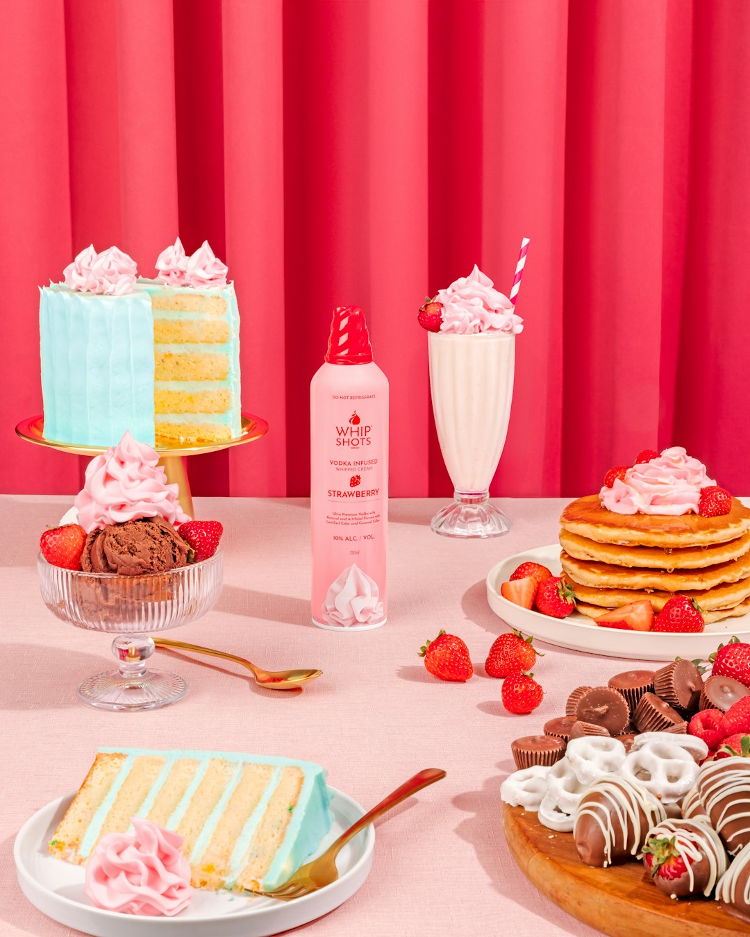
*
bar
*
*
* Spacing variants:
*
*
*
*/
.mt-0 {
margin-top: 0;
}
.mt-0.margin-box, .mt-0.column-box {
margin-top: 0;
}
.mt-0.content-block {
margin-top: 0;
}
.mt-10 {
margin-top: 0.5625rem;
}
.mt-10.margin-box, .mt-10.column-box {
margin-top: 0.625rem;
}
.mt-10.content-block {
margin-top: 0.4375rem;
}
.mt-15 {
margin-top: 0.84375rem;
}
.mt-15.margin-box, .mt-15.column-box {
margin-top: 0.9375rem;
}
.mt-15.content-block {
margin-top: 0.65625rem;
}
.mt-20 {
margin-top: 1.125rem;
}
.mt-20.margin-box, .mt-20.column-box {
margin-top: 1.25rem;
}
.mt-20.content-block {
margin-top: 0.875rem;
}
.mt-40 {
margin-top: 2.25rem;
}
.mt-40.margin-box, .mt-40.column-box {
margin-top: 2.5rem;
}
.mt-40.content-block {
margin-top: 1.75rem;
}
.mt-60 {
margin-top: 3.375rem;
}
.mt-60.margin-box, .mt-60.column-box {
margin-top: 3.75rem;
}
.mt-60.content-block {
margin-top: 2.625rem;
}
.mt-80 {
margin-top: 4.5rem;
}
.mt-80.margin-box, .mt-80.column-box {
margin-top: 5rem;
}
.mt-80.content-block {
margin-top: 3.5rem;
}
.mt-100 {
margin-top: 5.625rem;
}
.mt-100.margin-box, .mt-100.column-box {
margin-top: 6.25rem;
}
.mt-100.content-block {
margin-top: 4.375rem;
}
.mt-120 {
margin-top: 6.75rem;
}
.mt-120.margin-box, .mt-120.column-box {
margin-top: 7.5rem;
}
.mt-120.content-block {
margin-top: 5.25rem;
}
.mt-140 {
margin-top: 7.875rem;
}
.mt-140.margin-box, .mt-140.column-box {
margin-top: 8.75rem;
}
.mt-140.content-block {
margin-top: 6.125rem;
}
.mt-160 {
margin-top: 9rem;
}
.mt-160.margin-box, .mt-160.column-box {
margin-top: 10rem;
}
.mt-160.content-block {
margin-top: 7rem;
}
.mt-200 {
margin-top: 11.25rem;
}
.mt-200.margin-box, .mt-200.column-box {
margin-top: 12.5rem;
}
.mt-200.content-block {
margin-top: 8.75rem;
}
.mt-240 {
margin-top: 13.5rem;
}
.mt-240.margin-box, .mt-240.column-box {
margin-top: 15rem;
}
.mt-240.content-block {
margin-top: 10.5rem;
}
.mt-320 {
margin-top: 18rem;
}
.mt-320.margin-box, .mt-320.column-box {
margin-top: 20rem;
}
.mt-320.content-block {
margin-top: 14rem;
}
@media (min-width: 20em) {
.mt-0\@xxs {
margin-top: 0;
}
.mt-0\@xxs.margin-box, .mt-0\@xxs.column-box {
margin-top: 0;
}
.mt-0\@xxs.content-block {
margin-top: 0;
}
.mt-10\@xxs {
margin-top: 0.5625rem;
}
.mt-10\@xxs.margin-box, .mt-10\@xxs.column-box {
margin-top: 0.625rem;
}
.mt-10\@xxs.content-block {
margin-top: 0.4375rem;
}
.mt-15\@xxs {
margin-top: 0.84375rem;
}
.mt-15\@xxs.margin-box, .mt-15\@xxs.column-box {
margin-top: 0.9375rem;
}
.mt-15\@xxs.content-block {
margin-top: 0.65625rem;
}
.mt-20\@xxs {
margin-top: 1.125rem;
}
.mt-20\@xxs.margin-box, .mt-20\@xxs.column-box {
margin-top: 1.25rem;
}
.mt-20\@xxs.content-block {
margin-top: 0.875rem;
}
.mt-40\@xxs {
margin-top: 2.25rem;
}
.mt-40\@xxs.margin-box, .mt-40\@xxs.column-box {
margin-top: 2.5rem;
}
.mt-40\@xxs.content-block {
margin-top: 1.75rem;
}
.mt-60\@xxs {
margin-top: 3.375rem;
}
.mt-60\@xxs.margin-box, .mt-60\@xxs.column-box {
margin-top: 3.75rem;
}
.mt-60\@xxs.content-block {
margin-top: 2.625rem;
}
.mt-80\@xxs {
margin-top: 4.5rem;
}
.mt-80\@xxs.margin-box, .mt-80\@xxs.column-box {
margin-top: 5rem;
}
.mt-80\@xxs.content-block {
margin-top: 3.5rem;
}
.mt-100\@xxs {
margin-top: 5.625rem;
}
.mt-100\@xxs.margin-box, .mt-100\@xxs.column-box {
margin-top: 6.25rem;
}
.mt-100\@xxs.content-block {
margin-top: 4.375rem;
}
.mt-120\@xxs {
margin-top: 6.75rem;
}
.mt-120\@xxs.margin-box, .mt-120\@xxs.column-box {
margin-top: 7.5rem;
}
.mt-120\@xxs.content-block {
margin-top: 5.25rem;
}
.mt-140\@xxs {
margin-top: 7.875rem;
}
.mt-140\@xxs.margin-box, .mt-140\@xxs.column-box {
margin-top: 8.75rem;
}
.mt-140\@xxs.content-block {
margin-top: 6.125rem;
}
.mt-160\@xxs {
margin-top: 9rem;
}
.mt-160\@xxs.margin-box, .mt-160\@xxs.column-box {
margin-top: 10rem;
}
.mt-160\@xxs.content-block {
margin-top: 7rem;
}
.mt-200\@xxs {
margin-top: 11.25rem;
}
.mt-200\@xxs.margin-box, .mt-200\@xxs.column-box {
margin-top: 12.5rem;
}
.mt-200\@xxs.content-block {
margin-top: 8.75rem;
}
.mt-240\@xxs {
margin-top: 13.5rem;
}
.mt-240\@xxs.margin-box, .mt-240\@xxs.column-box {
margin-top: 15rem;
}
.mt-240\@xxs.content-block {
margin-top: 10.5rem;
}
.mt-320\@xxs {
margin-top: 18rem;
}
.mt-320\@xxs.margin-box, .mt-320\@xxs.column-box {
margin-top: 20rem;
}
.mt-320\@xxs.content-block {
margin-top: 14rem;
}
}
@media (min-width: 23em) {
.mt-0\@xs {
margin-top: 0;
}
.mt-0\@xs.margin-box, .mt-0\@xs.column-box {
margin-top: 0;
}
.mt-0\@xs.content-block {
margin-top: 0;
}
.mt-10\@xs {
margin-top: 0.5625rem;
}
.mt-10\@xs.margin-box, .mt-10\@xs.column-box {
margin-top: 0.625rem;
}
.mt-10\@xs.content-block {
margin-top: 0.4375rem;
}
.mt-15\@xs {
margin-top: 0.84375rem;
}
.mt-15\@xs.margin-box, .mt-15\@xs.column-box {
margin-top: 0.9375rem;
}
.mt-15\@xs.content-block {
margin-top: 0.65625rem;
}
.mt-20\@xs {
margin-top: 1.125rem;
}
.mt-20\@xs.margin-box, .mt-20\@xs.column-box {
margin-top: 1.25rem;
}
.mt-20\@xs.content-block {
margin-top: 0.875rem;
}
.mt-40\@xs {
margin-top: 2.25rem;
}
.mt-40\@xs.margin-box, .mt-40\@xs.column-box {
margin-top: 2.5rem;
}
.mt-40\@xs.content-block {
margin-top: 1.75rem;
}
.mt-60\@xs {
margin-top: 3.375rem;
}
.mt-60\@xs.margin-box, .mt-60\@xs.column-box {
margin-top: 3.75rem;
}
.mt-60\@xs.content-block {
margin-top: 2.625rem;
}
.mt-80\@xs {
margin-top: 4.5rem;
}
.mt-80\@xs.margin-box, .mt-80\@xs.column-box {
margin-top: 5rem;
}
.mt-80\@xs.content-block {
margin-top: 3.5rem;
}
.mt-100\@xs {
margin-top: 5.625rem;
}
.mt-100\@xs.margin-box, .mt-100\@xs.column-box {
margin-top: 6.25rem;
}
.mt-100\@xs.content-block {
margin-top: 4.375rem;
}
.mt-120\@xs {
margin-top: 6.75rem;
}
.mt-120\@xs.margin-box, .mt-120\@xs.column-box {
margin-top: 7.5rem;
}
.mt-120\@xs.content-block {
margin-top: 5.25rem;
}
.mt-140\@xs {
margin-top: 7.875rem;
}
.mt-140\@xs.margin-box, .mt-140\@xs.column-box {
margin-top: 8.75rem;
}
.mt-140\@xs.content-block {
margin-top: 6.125rem;
}
.mt-160\@xs {
margin-top: 9rem;
}
.mt-160\@xs.margin-box, .mt-160\@xs.column-box {
margin-top: 10rem;
}
.mt-160\@xs.content-block {
margin-top: 7rem;
}
.mt-200\@xs {
margin-top: 11.25rem;
}
.mt-200\@xs.margin-box, .mt-200\@xs.column-box {
margin-top: 12.5rem;
}
.mt-200\@xs.content-block {
margin-top: 8.75rem;
}
.mt-240\@xs {
margin-top: 13.5rem;
}
.mt-240\@xs.margin-box, .mt-240\@xs.column-box {
margin-top: 15rem;
}
.mt-240\@xs.content-block {
margin-top: 10.5rem;
}
.mt-320\@xs {
margin-top: 18rem;
}
.mt-320\@xs.margin-box, .mt-320\@xs.column-box {
margin-top: 20rem;
}
.mt-320\@xs.content-block {
margin-top: 14rem;
}
}
@media (min-width: 36em) {
.mt-0\@sm {
margin-top: 0;
}
.mt-0\@sm.margin-box, .mt-0\@sm.column-box {
margin-top: 0;
}
.mt-0\@sm.content-block {
margin-top: 0;
}
.mt-10\@sm {
margin-top: 0.5625rem;
}
.mt-10\@sm.margin-box, .mt-10\@sm.column-box {
margin-top: 0.625rem;
}
.mt-10\@sm.content-block {
margin-top: 0.4375rem;
}
.mt-15\@sm {
margin-top: 0.84375rem;
}
.mt-15\@sm.margin-box, .mt-15\@sm.column-box {
margin-top: 0.9375rem;
}
.mt-15\@sm.content-block {
margin-top: 0.65625rem;
}
.mt-20\@sm {
margin-top: 1.125rem;
}
.mt-20\@sm.margin-box, .mt-20\@sm.column-box {
margin-top: 1.25rem;
}
.mt-20\@sm.content-block {
margin-top: 0.875rem;
}
.mt-40\@sm {
margin-top: 2.25rem;
}
.mt-40\@sm.margin-box, .mt-40\@sm.column-box {
margin-top: 2.5rem;
}
.mt-40\@sm.content-block {
margin-top: 1.75rem;
}
.mt-60\@sm {
margin-top: 3.375rem;
}
.mt-60\@sm.margin-box, .mt-60\@sm.column-box {
margin-top: 3.75rem;
}
.mt-60\@sm.content-block {
margin-top: 2.625rem;
}
.mt-80\@sm {
margin-top: 4.5rem;
}
.mt-80\@sm.margin-box, .mt-80\@sm.column-box {
margin-top: 5rem;
}
.mt-80\@sm.content-block {
margin-top: 3.5rem;
}
.mt-100\@sm {
margin-top: 5.625rem;
}
.mt-100\@sm.margin-box, .mt-100\@sm.column-box {
margin-top: 6.25rem;
}
.mt-100\@sm.content-block {
margin-top: 4.375rem;
}
.mt-120\@sm {
margin-top: 6.75rem;
}
.mt-120\@sm.margin-box, .mt-120\@sm.column-box {
margin-top: 7.5rem;
}
.mt-120\@sm.content-block {
margin-top: 5.25rem;
}
.mt-140\@sm {
margin-top: 7.875rem;
}
.mt-140\@sm.margin-box, .mt-140\@sm.column-box {
margin-top: 8.75rem;
}
.mt-140\@sm.content-block {
margin-top: 6.125rem;
}
.mt-160\@sm {
margin-top: 9rem;
}
.mt-160\@sm.margin-box, .mt-160\@sm.column-box {
margin-top: 10rem;
}
.mt-160\@sm.content-block {
margin-top: 7rem;
}
.mt-200\@sm {
margin-top: 11.25rem;
}
.mt-200\@sm.margin-box, .mt-200\@sm.column-box {
margin-top: 12.5rem;
}
.mt-200\@sm.content-block {
margin-top: 8.75rem;
}
.mt-240\@sm {
margin-top: 13.5rem;
}
.mt-240\@sm.margin-box, .mt-240\@sm.column-box {
margin-top: 15rem;
}
.mt-240\@sm.content-block {
margin-top: 10.5rem;
}
.mt-320\@sm {
margin-top: 18rem;
}
.mt-320\@sm.margin-box, .mt-320\@sm.column-box {
margin-top: 20rem;
}
.mt-320\@sm.content-block {
margin-top: 14rem;
}
}
@media (min-width: 48em) {
.mt-0\@md {
margin-top: 0;
}
.mt-0\@md.margin-box, .mt-0\@md.column-box {
margin-top: 0;
}
.mt-0\@md.content-block {
margin-top: 0;
}
.mt-10\@md {
margin-top: 0.5625rem;
}
.mt-10\@md.margin-box, .mt-10\@md.column-box {
margin-top: 0.625rem;
}
.mt-10\@md.content-block {
margin-top: 0.4375rem;
}
.mt-15\@md {
margin-top: 0.84375rem;
}
.mt-15\@md.margin-box, .mt-15\@md.column-box {
margin-top: 0.9375rem;
}
.mt-15\@md.content-block {
margin-top: 0.65625rem;
}
.mt-20\@md {
margin-top: 1.125rem;
}
.mt-20\@md.margin-box, .mt-20\@md.column-box {
margin-top: 1.25rem;
}
.mt-20\@md.content-block {
margin-top: 0.875rem;
}
.mt-40\@md {
margin-top: 2.25rem;
}
.mt-40\@md.margin-box, .mt-40\@md.column-box {
margin-top: 2.5rem;
}
.mt-40\@md.content-block {
margin-top: 1.75rem;
}
.mt-60\@md {
margin-top: 3.375rem;
}
.mt-60\@md.margin-box, .mt-60\@md.column-box {
margin-top: 3.75rem;
}
.mt-60\@md.content-block {
margin-top: 2.625rem;
}
.mt-80\@md {
margin-top: 4.5rem;
}
.mt-80\@md.margin-box, .mt-80\@md.column-box {
margin-top: 5rem;
}
.mt-80\@md.content-block {
margin-top: 3.5rem;
}
.mt-100\@md {
margin-top: 5.625rem;
}
.mt-100\@md.margin-box, .mt-100\@md.column-box {
margin-top: 6.25rem;
}
.mt-100\@md.content-block {
margin-top: 4.375rem;
}
.mt-120\@md {
margin-top: 6.75rem;
}
.mt-120\@md.margin-box, .mt-120\@md.column-box {
margin-top: 7.5rem;
}
.mt-120\@md.content-block {
margin-top: 5.25rem;
}
.mt-140\@md {
margin-top: 7.875rem;
}
.mt-140\@md.margin-box, .mt-140\@md.column-box {
margin-top: 8.75rem;
}
.mt-140\@md.content-block {
margin-top: 6.125rem;
}
.mt-160\@md {
margin-top: 9rem;
}
.mt-160\@md.margin-box, .mt-160\@md.column-box {
margin-top: 10rem;
}
.mt-160\@md.content-block {
margin-top: 7rem;
}
.mt-200\@md {
margin-top: 11.25rem;
}
.mt-200\@md.margin-box, .mt-200\@md.column-box {
margin-top: 12.5rem;
}
.mt-200\@md.content-block {
margin-top: 8.75rem;
}
.mt-240\@md {
margin-top: 13.5rem;
}
.mt-240\@md.margin-box, .mt-240\@md.column-box {
margin-top: 15rem;
}
.mt-240\@md.content-block {
margin-top: 10.5rem;
}
.mt-320\@md {
margin-top: 18rem;
}
.mt-320\@md.margin-box, .mt-320\@md.column-box {
margin-top: 20rem;
}
.mt-320\@md.content-block {
margin-top: 14rem;
}
}
@media (min-width: 64em) {
.mt-0\@lg {
margin-top: 0;
}
.mt-0\@lg.margin-box, .mt-0\@lg.column-box {
margin-top: 0;
}
.mt-0\@lg.content-block {
margin-top: 0;
}
.mt-10\@lg {
margin-top: 0.5625rem;
}
.mt-10\@lg.margin-box, .mt-10\@lg.column-box {
margin-top: 0.625rem;
}
.mt-10\@lg.content-block {
margin-top: 0.4375rem;
}
.mt-15\@lg {
margin-top: 0.84375rem;
}
.mt-15\@lg.margin-box, .mt-15\@lg.column-box {
margin-top: 0.9375rem;
}
.mt-15\@lg.content-block {
margin-top: 0.65625rem;
}
.mt-20\@lg {
margin-top: 1.125rem;
}
.mt-20\@lg.margin-box, .mt-20\@lg.column-box {
margin-top: 1.25rem;
}
.mt-20\@lg.content-block {
margin-top: 0.875rem;
}
.mt-40\@lg {
margin-top: 2.25rem;
}
.mt-40\@lg.margin-box, .mt-40\@lg.column-box {
margin-top: 2.5rem;
}
.mt-40\@lg.content-block {
margin-top: 1.75rem;
}
.mt-60\@lg {
margin-top: 3.375rem;
}
.mt-60\@lg.margin-box, .mt-60\@lg.column-box {
margin-top: 3.75rem;
}
.mt-60\@lg.content-block {
margin-top: 2.625rem;
}
.mt-80\@lg {
margin-top: 4.5rem;
}
.mt-80\@lg.margin-box, .mt-80\@lg.column-box {
margin-top: 5rem;
}
.mt-80\@lg.content-block {
margin-top: 3.5rem;
}
.mt-100\@lg {
margin-top: 5.625rem;
}
.mt-100\@lg.margin-box, .mt-100\@lg.column-box {
margin-top: 6.25rem;
}
.mt-100\@lg.content-block {
margin-top: 4.375rem;
}
.mt-120\@lg {
margin-top: 6.75rem;
}
.mt-120\@lg.margin-box, .mt-120\@lg.column-box {
margin-top: 7.5rem;
}
.mt-120\@lg.content-block {
margin-top: 5.25rem;
}
.mt-140\@lg {
margin-top: 7.875rem;
}
.mt-140\@lg.margin-box, .mt-140\@lg.column-box {
margin-top: 8.75rem;
}
.mt-140\@lg.content-block {
margin-top: 6.125rem;
}
.mt-160\@lg {
margin-top: 9rem;
}
.mt-160\@lg.margin-box, .mt-160\@lg.column-box {
margin-top: 10rem;
}
.mt-160\@lg.content-block {
margin-top: 7rem;
}
.mt-200\@lg {
margin-top: 11.25rem;
}
.mt-200\@lg.margin-box, .mt-200\@lg.column-box {
margin-top: 12.5rem;
}
.mt-200\@lg.content-block {
margin-top: 8.75rem;
}
.mt-240\@lg {
margin-top: 13.5rem;
}
.mt-240\@lg.margin-box, .mt-240\@lg.column-box {
margin-top: 15rem;
}
.mt-240\@lg.content-block {
margin-top: 10.5rem;
}
.mt-320\@lg {
margin-top: 18rem;
}
.mt-320\@lg.margin-box, .mt-320\@lg.column-box {
margin-top: 20rem;
}
.mt-320\@lg.content-block {
margin-top: 14rem;
}
}
@media (min-width: 64.0625em) {
.mt-0\@lgup {
margin-top: 0;
}
.mt-0\@lgup.margin-box, .mt-0\@lgup.column-box {
margin-top: 0;
}
.mt-0\@lgup.content-block {
margin-top: 0;
}
.mt-10\@lgup {
margin-top: 0.5625rem;
}
.mt-10\@lgup.margin-box, .mt-10\@lgup.column-box {
margin-top: 0.625rem;
}
.mt-10\@lgup.content-block {
margin-top: 0.4375rem;
}
.mt-15\@lgup {
margin-top: 0.84375rem;
}
.mt-15\@lgup.margin-box, .mt-15\@lgup.column-box {
margin-top: 0.9375rem;
}
.mt-15\@lgup.content-block {
margin-top: 0.65625rem;
}
.mt-20\@lgup {
margin-top: 1.125rem;
}
.mt-20\@lgup.margin-box, .mt-20\@lgup.column-box {
margin-top: 1.25rem;
}
.mt-20\@lgup.content-block {
margin-top: 0.875rem;
}
.mt-40\@lgup {
margin-top: 2.25rem;
}
.mt-40\@lgup.margin-box, .mt-40\@lgup.column-box {
margin-top: 2.5rem;
}
.mt-40\@lgup.content-block {
margin-top: 1.75rem;
}
.mt-60\@lgup {
margin-top: 3.375rem;
}
.mt-60\@lgup.margin-box, .mt-60\@lgup.column-box {
margin-top: 3.75rem;
}
.mt-60\@lgup.content-block {
margin-top: 2.625rem;
}
.mt-80\@lgup {
margin-top: 4.5rem;
}
.mt-80\@lgup.margin-box, .mt-80\@lgup.column-box {
margin-top: 5rem;
}
.mt-80\@lgup.content-block {
margin-top: 3.5rem;
}
.mt-100\@lgup {
margin-top: 5.625rem;
}
.mt-100\@lgup.margin-box, .mt-100\@lgup.column-box {
margin-top: 6.25rem;
}
.mt-100\@lgup.content-block {
margin-top: 4.375rem;
}
.mt-120\@lgup {
margin-top: 6.75rem;
}
.mt-120\@lgup.margin-box, .mt-120\@lgup.column-box {
margin-top: 7.5rem;
}
.mt-120\@lgup.content-block {
margin-top: 5.25rem;
}
.mt-140\@lgup {
margin-top: 7.875rem;
}
.mt-140\@lgup.margin-box, .mt-140\@lgup.column-box {
margin-top: 8.75rem;
}
.mt-140\@lgup.content-block {
margin-top: 6.125rem;
}
.mt-160\@lgup {
margin-top: 9rem;
}
.mt-160\@lgup.margin-box, .mt-160\@lgup.column-box {
margin-top: 10rem;
}
.mt-160\@lgup.content-block {
margin-top: 7rem;
}
.mt-200\@lgup {
margin-top: 11.25rem;
}
.mt-200\@lgup.margin-box, .mt-200\@lgup.column-box {
margin-top: 12.5rem;
}
.mt-200\@lgup.content-block {
margin-top: 8.75rem;
}
.mt-240\@lgup {
margin-top: 13.5rem;
}
.mt-240\@lgup.margin-box, .mt-240\@lgup.column-box {
margin-top: 15rem;
}
.mt-240\@lgup.content-block {
margin-top: 10.5rem;
}
.mt-320\@lgup {
margin-top: 18rem;
}
.mt-320\@lgup.margin-box, .mt-320\@lgup.column-box {
margin-top: 20rem;
}
.mt-320\@lgup.content-block {
margin-top: 14rem;
}
}
@media (min-width: 80em) {
.mt-0\@xl {
margin-top: 0;
}
.mt-0\@xl.margin-box, .mt-0\@xl.column-box {
margin-top: 0;
}
.mt-0\@xl.content-block {
margin-top: 0;
}
.mt-10\@xl {
margin-top: 0.5625rem;
}
.mt-10\@xl.margin-box, .mt-10\@xl.column-box {
margin-top: 0.625rem;
}
.mt-10\@xl.content-block {
margin-top: 0.4375rem;
}
.mt-15\@xl {
margin-top: 0.84375rem;
}
.mt-15\@xl.margin-box, .mt-15\@xl.column-box {
margin-top: 0.9375rem;
}
.mt-15\@xl.content-block {
margin-top: 0.65625rem;
}
.mt-20\@xl {
margin-top: 1.125rem;
}
.mt-20\@xl.margin-box, .mt-20\@xl.column-box {
margin-top: 1.25rem;
}
.mt-20\@xl.content-block {
margin-top: 0.875rem;
}
.mt-40\@xl {
margin-top: 2.25rem;
}
.mt-40\@xl.margin-box, .mt-40\@xl.column-box {
margin-top: 2.5rem;
}
.mt-40\@xl.content-block {
margin-top: 1.75rem;
}
.mt-60\@xl {
margin-top: 3.375rem;
}
.mt-60\@xl.margin-box, .mt-60\@xl.column-box {
margin-top: 3.75rem;
}
.mt-60\@xl.content-block {
margin-top: 2.625rem;
}
.mt-80\@xl {
margin-top: 4.5rem;
}
.mt-80\@xl.margin-box, .mt-80\@xl.column-box {
margin-top: 5rem;
}
.mt-80\@xl.content-block {
margin-top: 3.5rem;
}
.mt-100\@xl {
margin-top: 5.625rem;
}
.mt-100\@xl.margin-box, .mt-100\@xl.column-box {
margin-top: 6.25rem;
}
.mt-100\@xl.content-block {
margin-top: 4.375rem;
}
.mt-120\@xl {
margin-top: 6.75rem;
}
.mt-120\@xl.margin-box, .mt-120\@xl.column-box {
margin-top: 7.5rem;
}
.mt-120\@xl.content-block {
margin-top: 5.25rem;
}
.mt-140\@xl {
margin-top: 7.875rem;
}
.mt-140\@xl.margin-box, .mt-140\@xl.column-box {
margin-top: 8.75rem;
}
.mt-140\@xl.content-block {
margin-top: 6.125rem;
}
.mt-160\@xl {
margin-top: 9rem;
}
.mt-160\@xl.margin-box, .mt-160\@xl.column-box {
margin-top: 10rem;
}
.mt-160\@xl.content-block {
margin-top: 7rem;
}
.mt-200\@xl {
margin-top: 11.25rem;
}
.mt-200\@xl.margin-box, .mt-200\@xl.column-box {
margin-top: 12.5rem;
}
.mt-200\@xl.content-block {
margin-top: 8.75rem;
}
.mt-240\@xl {
margin-top: 13.5rem;
}
.mt-240\@xl.margin-box, .mt-240\@xl.column-box {
margin-top: 15rem;
}
.mt-240\@xl.content-block {
margin-top: 10.5rem;
}
.mt-320\@xl {
margin-top: 18rem;
}
.mt-320\@xl.margin-box, .mt-320\@xl.column-box {
margin-top: 20rem;
}
.mt-320\@xl.content-block {
margin-top: 14rem;
}
}
@media (min-width: 80.0625em) {
.mt-0\@xlup {
margin-top: 0;
}
.mt-0\@xlup.margin-box, .mt-0\@xlup.column-box {
margin-top: 0;
}
.mt-0\@xlup.content-block {
margin-top: 0;
}
.mt-10\@xlup {
margin-top: 0.5625rem;
}
.mt-10\@xlup.margin-box, .mt-10\@xlup.column-box {
margin-top: 0.625rem;
}
.mt-10\@xlup.content-block {
margin-top: 0.4375rem;
}
.mt-15\@xlup {
margin-top: 0.84375rem;
}
.mt-15\@xlup.margin-box, .mt-15\@xlup.column-box {
margin-top: 0.9375rem;
}
.mt-15\@xlup.content-block {
margin-top: 0.65625rem;
}
.mt-20\@xlup {
margin-top: 1.125rem;
}
.mt-20\@xlup.margin-box, .mt-20\@xlup.column-box {
margin-top: 1.25rem;
}
.mt-20\@xlup.content-block {
margin-top: 0.875rem;
}
.mt-40\@xlup {
margin-top: 2.25rem;
}
.mt-40\@xlup.margin-box, .mt-40\@xlup.column-box {
margin-top: 2.5rem;
}
.mt-40\@xlup.content-block {
margin-top: 1.75rem;
}
.mt-60\@xlup {
margin-top: 3.375rem;
}
.mt-60\@xlup.margin-box, .mt-60\@xlup.column-box {
margin-top: 3.75rem;
}
.mt-60\@xlup.content-block {
margin-top: 2.625rem;
}
.mt-80\@xlup {
margin-top: 4.5rem;
}
.mt-80\@xlup.margin-box, .mt-80\@xlup.column-box {
margin-top: 5rem;
}
.mt-80\@xlup.content-block {
margin-top: 3.5rem;
}
.mt-100\@xlup {
margin-top: 5.625rem;
}
.mt-100\@xlup.margin-box, .mt-100\@xlup.column-box {
margin-top: 6.25rem;
}
.mt-100\@xlup.content-block {
margin-top: 4.375rem;
}
.mt-120\@xlup {
margin-top: 6.75rem;
}
.mt-120\@xlup.margin-box, .mt-120\@xlup.column-box {
margin-top: 7.5rem;
}
.mt-120\@xlup.content-block {
margin-top: 5.25rem;
}
.mt-140\@xlup {
margin-top: 7.875rem;
}
.mt-140\@xlup.margin-box, .mt-140\@xlup.column-box {
margin-top: 8.75rem;
}
.mt-140\@xlup.content-block {
margin-top: 6.125rem;
}
.mt-160\@xlup {
margin-top: 9rem;
}
.mt-160\@xlup.margin-box, .mt-160\@xlup.column-box {
margin-top: 10rem;
}
.mt-160\@xlup.content-block {
margin-top: 7rem;
}
.mt-200\@xlup {
margin-top: 11.25rem;
}
.mt-200\@xlup.margin-box, .mt-200\@xlup.column-box {
margin-top: 12.5rem;
}
.mt-200\@xlup.content-block {
margin-top: 8.75rem;
}
.mt-240\@xlup {
margin-top: 13.5rem;
}
.mt-240\@xlup.margin-box, .mt-240\@xlup.column-box {
margin-top: 15rem;
}
.mt-240\@xlup.content-block {
margin-top: 10.5rem;
}
.mt-320\@xlup {
margin-top: 18rem;
}
.mt-320\@xlup.margin-box, .mt-320\@xlup.column-box {
margin-top: 20rem;
}
.mt-320\@xlup.content-block {
margin-top: 14rem;
}
}
@media (min-width: 90em) {
.mt-0\@xxl {
margin-top: 0;
}
.mt-0\@xxl.margin-box, .mt-0\@xxl.column-box {
margin-top: 0;
}
.mt-0\@xxl.content-block {
margin-top: 0;
}
.mt-10\@xxl {
margin-top: 0.5625rem;
}
.mt-10\@xxl.margin-box, .mt-10\@xxl.column-box {
margin-top: 0.625rem;
}
.mt-10\@xxl.content-block {
margin-top: 0.4375rem;
}
.mt-15\@xxl {
margin-top: 0.84375rem;
}
.mt-15\@xxl.margin-box, .mt-15\@xxl.column-box {
margin-top: 0.9375rem;
}
.mt-15\@xxl.content-block {
margin-top: 0.65625rem;
}
.mt-20\@xxl {
margin-top: 1.125rem;
}
.mt-20\@xxl.margin-box, .mt-20\@xxl.column-box {
margin-top: 1.25rem;
}
.mt-20\@xxl.content-block {
margin-top: 0.875rem;
}
.mt-40\@xxl {
margin-top: 2.25rem;
}
.mt-40\@xxl.margin-box, .mt-40\@xxl.column-box {
margin-top: 2.5rem;
}
.mt-40\@xxl.content-block {
margin-top: 1.75rem;
}
.mt-60\@xxl {
margin-top: 3.375rem;
}
.mt-60\@xxl.margin-box, .mt-60\@xxl.column-box {
margin-top: 3.75rem;
}
.mt-60\@xxl.content-block {
margin-top: 2.625rem;
}
.mt-80\@xxl {
margin-top: 4.5rem;
}
.mt-80\@xxl.margin-box, .mt-80\@xxl.column-box {
margin-top: 5rem;
}
.mt-80\@xxl.content-block {
margin-top: 3.5rem;
}
.mt-100\@xxl {
margin-top: 5.625rem;
}
.mt-100\@xxl.margin-box, .mt-100\@xxl.column-box {
margin-top: 6.25rem;
}
.mt-100\@xxl.content-block {
margin-top: 4.375rem;
}
.mt-120\@xxl {
margin-top: 6.75rem;
}
.mt-120\@xxl.margin-box, .mt-120\@xxl.column-box {
margin-top: 7.5rem;
}
.mt-120\@xxl.content-block {
margin-top: 5.25rem;
}
.mt-140\@xxl {
margin-top: 7.875rem;
}
.mt-140\@xxl.margin-box, .mt-140\@xxl.column-box {
margin-top: 8.75rem;
}
.mt-140\@xxl.content-block {
margin-top: 6.125rem;
}
.mt-160\@xxl {
margin-top: 9rem;
}
.mt-160\@xxl.margin-box, .mt-160\@xxl.column-box {
margin-top: 10rem;
}
.mt-160\@xxl.content-block {
margin-top: 7rem;
}
.mt-200\@xxl {
margin-top: 11.25rem;
}
.mt-200\@xxl.margin-box, .mt-200\@xxl.column-box {
margin-top: 12.5rem;
}
.mt-200\@xxl.content-block {
margin-top: 8.75rem;
}
.mt-240\@xxl {
margin-top: 13.5rem;
}
.mt-240\@xxl.margin-box, .mt-240\@xxl.column-box {
margin-top: 15rem;
}
.mt-240\@xxl.content-block {
margin-top: 10.5rem;
}
.mt-320\@xxl {
margin-top: 18rem;
}
.mt-320\@xxl.margin-box, .mt-320\@xxl.column-box {
margin-top: 20rem;
}
.mt-320\@xxl.content-block {
margin-top: 14rem;
}
}
/**
* Usage:
*
*
*
* Spacing variants:
*
*
*
*/
.mb-0 {
margin-bottom: 0;
}
.mb-auto {
margin-bottom: auto;
}
@media (min-width: 20em) {
.mb-0\@xxs {
margin-bottom: 0;
}
.mb-auto\@xxs {
margin-bottom: auto;
}
}
@media (min-width: 23em) {
.mb-0\@xs {
margin-bottom: 0;
}
.mb-auto\@xs {
margin-bottom: auto;
}
}
@media (min-width: 36em) {
.mb-0\@sm {
margin-bottom: 0;
}
.mb-auto\@sm {
margin-bottom: auto;
}
}
@media (min-width: 48em) {
.mb-0\@md {
margin-bottom: 0;
}
.mb-auto\@md {
margin-bottom: auto;
}
}
@media (min-width: 64em) {
.mb-0\@lg {
margin-bottom: 0;
}
.mb-auto\@lg {
margin-bottom: auto;
}
}
@media (min-width: 64.0625em) {
.mb-0\@lgup {
margin-bottom: 0;
}
.mb-auto\@lgup {
margin-bottom: auto;
}
}
@media (min-width: 80em) {
.mb-0\@xl {
margin-bottom: 0;
}
.mb-auto\@xl {
margin-bottom: auto;
}
}
@media (min-width: 80.0625em) {
.mb-0\@xlup {
margin-bottom: 0;
}
.mb-auto\@xlup {
margin-bottom: auto;
}
}
@media (min-width: 90em) {
.mb-0\@xxl {
margin-bottom: 0;
}
.mb-auto\@xxl {
margin-bottom: auto;
}
}
.ml-0 {
margin-left: 0;
}
.ml-auto {
margin-left: auto;
}
@media (min-width: 20em) {
.ml-0\@xxs {
margin-left: 0;
}
.ml-auto\@xxs {
margin-left: auto;
}
}
@media (min-width: 23em) {
.ml-0\@xs {
margin-left: 0;
}
.ml-auto\@xs {
margin-left: auto;
}
}
@media (min-width: 36em) {
.ml-0\@sm {
margin-left: 0;
}
.ml-auto\@sm {
margin-left: auto;
}
}
@media (min-width: 48em) {
.ml-0\@md {
margin-left: 0;
}
.ml-auto\@md {
margin-left: auto;
}
}
@media (min-width: 64em) {
.ml-0\@lg {
margin-left: 0;
}
.ml-auto\@lg {
margin-left: auto;
}
}
@media (min-width: 64.0625em) {
.ml-0\@lgup {
margin-left: 0;
}
.ml-auto\@lgup {
margin-left: auto;
}
}
@media (min-width: 80em) {
.ml-0\@xl {
margin-left: 0;
}
.ml-auto\@xl {
margin-left: auto;
}
}
@media (min-width: 80.0625em) {
.ml-0\@xlup {
margin-left: 0;
}
.ml-auto\@xlup {
margin-left: auto;
}
}
@media (min-width: 90em) {
.ml-0\@xxl {
margin-left: 0;
}
.ml-auto\@xxl {
margin-left: auto;
}
}
/**
* Usage:
*
*
*/
:focus + .next-focus-ring {
outline: dotted 1px;
outline: -webkit-focus-ring-color auto 5px;
}
:focus:not(:focus-visible) + .next-focus-ring {
outline: 0;
}
/**
* Usage:
*
*
*
* Overflow variants:
*
*
*
*/
.overflow-visible {
overflow: visible;
}
.overflow-hidden {
overflow: hidden;
}
.overflow-auto {
overflow: auto;
}
@media (min-width: 20em) {
.overflow-visible\@xxs {
overflow: visible;
}
.overflow-hidden\@xxs {
overflow: hidden;
}
.overflow-auto\@xxs {
overflow: auto;
}
}
@media (min-width: 23em) {
.overflow-visible\@xs {
overflow: visible;
}
.overflow-hidden\@xs {
overflow: hidden;
}
.overflow-auto\@xs {
overflow: auto;
}
}
@media (min-width: 36em) {
.overflow-visible\@sm {
overflow: visible;
}
.overflow-hidden\@sm {
overflow: hidden;
}
.overflow-auto\@sm {
overflow: auto;
}
}
@media (min-width: 48em) {
.overflow-visible\@md {
overflow: visible;
}
.overflow-hidden\@md {
overflow: hidden;
}
.overflow-auto\@md {
overflow: auto;
}
}
@media (min-width: 64em) {
.overflow-visible\@lg {
overflow: visible;
}
.overflow-hidden\@lg {
overflow: hidden;
}
.overflow-auto\@lg {
overflow: auto;
}
}
@media (min-width: 64.0625em) {
.overflow-visible\@lgup {
overflow: visible;
}
.overflow-hidden\@lgup {
overflow: hidden;
}
.overflow-auto\@lgup {
overflow: auto;
}
}
@media (min-width: 80em) {
.overflow-visible\@xl {
overflow: visible;
}
.overflow-hidden\@xl {
overflow: hidden;
}
.overflow-auto\@xl {
overflow: auto;
}
}
@media (min-width: 80.0625em) {
.overflow-visible\@xlup {
overflow: visible;
}
.overflow-hidden\@xlup {
overflow: hidden;
}
.overflow-auto\@xlup {
overflow: auto;
}
}
@media (min-width: 90em) {
.overflow-visible\@xxl {
overflow: visible;
}
.overflow-hidden\@xxl {
overflow: hidden;
}
.overflow-auto\@xxl {
overflow: auto;
}
}
/**
* Usage:
*
*
*/
.stack {
display: block;
}
/**
* Split variants:
*
*
*/
.stack--split {
display: flex;
flex-direction: column;
justify-content: flex-start;
}
.stack--split:first-child:last-child {
height: 100%;
}
.stack--split > * {
flex-shrink: 0;
}
/**
* Spacing variants:
*
*
*
*/
.stack--s0 > * + * {
margin-top: 0;
}
.stack--s10 > * + * {
margin-top: 0.625rem;
}
.stack--s15 > * + * {
margin-top: 0.9375rem;
}
.stack--s20 > * + * {
margin-top: 1.25rem;
}
.stack--s40 > * + * {
margin-top: 2.5rem;
}
.stack--s60 > * + * {
margin-top: 3.75rem;
}
.stack--s80 > * + * {
margin-top: 5rem;
}
.stack--s100 > * + * {
margin-top: 6.25rem;
}
.stack--s120 > * + * {
margin-top: 7.5rem;
}
.stack--s140 > * + * {
margin-top: 8.75rem;
}
.stack--s160 > * + * {
margin-top: 10rem;
}
.stack--s200 > * + * {
margin-top: 12.5rem;
}
.stack--s240 > * + * {
margin-top: 15rem;
}
.stack--s320 > * + * {
margin-top: 20rem;
}
@media (min-width: 20em) {
.stack--s0\@xxs > * + * {
margin-top: 0;
}
.stack--s10\@xxs > * + * {
margin-top: 0.625rem;
}
.stack--s15\@xxs > * + * {
margin-top: 0.9375rem;
}
.stack--s20\@xxs > * + * {
margin-top: 1.25rem;
}
.stack--s40\@xxs > * + * {
margin-top: 2.5rem;
}
.stack--s60\@xxs > * + * {
margin-top: 3.75rem;
}
.stack--s80\@xxs > * + * {
margin-top: 5rem;
}
.stack--s100\@xxs > * + * {
margin-top: 6.25rem;
}
.stack--s120\@xxs > * + * {
margin-top: 7.5rem;
}
.stack--s140\@xxs > * + * {
margin-top: 8.75rem;
}
.stack--s160\@xxs > * + * {
margin-top: 10rem;
}
.stack--s200\@xxs > * + * {
margin-top: 12.5rem;
}
.stack--s240\@xxs > * + * {
margin-top: 15rem;
}
.stack--s320\@xxs > * + * {
margin-top: 20rem;
}
}
@media (min-width: 23em) {
.stack--s0\@xs > * + * {
margin-top: 0;
}
.stack--s10\@xs > * + * {
margin-top: 0.625rem;
}
.stack--s15\@xs > * + * {
margin-top: 0.9375rem;
}
.stack--s20\@xs > * + * {
margin-top: 1.25rem;
}
.stack--s40\@xs > * + * {
margin-top: 2.5rem;
}
.stack--s60\@xs > * + * {
margin-top: 3.75rem;
}
.stack--s80\@xs > * + * {
margin-top: 5rem;
}
.stack--s100\@xs > * + * {
margin-top: 6.25rem;
}
.stack--s120\@xs > * + * {
margin-top: 7.5rem;
}
.stack--s140\@xs > * + * {
margin-top: 8.75rem;
}
.stack--s160\@xs > * + * {
margin-top: 10rem;
}
.stack--s200\@xs > * + * {
margin-top: 12.5rem;
}
.stack--s240\@xs > * + * {
margin-top: 15rem;
}
.stack--s320\@xs > * + * {
margin-top: 20rem;
}
}
@media (min-width: 36em) {
.stack--s0\@sm > * + * {
margin-top: 0;
}
.stack--s10\@sm > * + * {
margin-top: 0.625rem;
}
.stack--s15\@sm > * + * {
margin-top: 0.9375rem;
}
.stack--s20\@sm > * + * {
margin-top: 1.25rem;
}
.stack--s40\@sm > * + * {
margin-top: 2.5rem;
}
.stack--s60\@sm > * + * {
margin-top: 3.75rem;
}
.stack--s80\@sm > * + * {
margin-top: 5rem;
}
.stack--s100\@sm > * + * {
margin-top: 6.25rem;
}
.stack--s120\@sm > * + * {
margin-top: 7.5rem;
}
.stack--s140\@sm > * + * {
margin-top: 8.75rem;
}
.stack--s160\@sm > * + * {
margin-top: 10rem;
}
.stack--s200\@sm > * + * {
margin-top: 12.5rem;
}
.stack--s240\@sm > * + * {
margin-top: 15rem;
}
.stack--s320\@sm > * + * {
margin-top: 20rem;
}
}
@media (min-width: 48em) {
.stack--s0\@md > * + * {
margin-top: 0;
}
.stack--s10\@md > * + * {
margin-top: 0.625rem;
}
.stack--s15\@md > * + * {
margin-top: 0.9375rem;
}
.stack--s20\@md > * + * {
margin-top: 1.25rem;
}
.stack--s40\@md > * + * {
margin-top: 2.5rem;
}
.stack--s60\@md > * + * {
margin-top: 3.75rem;
}
.stack--s80\@md > * + * {
margin-top: 5rem;
}
.stack--s100\@md > * + * {
margin-top: 6.25rem;
}
.stack--s120\@md > * + * {
margin-top: 7.5rem;
}
.stack--s140\@md > * + * {
margin-top: 8.75rem;
}
.stack--s160\@md > * + * {
margin-top: 10rem;
}
.stack--s200\@md > * + * {
margin-top: 12.5rem;
}
.stack--s240\@md > * + * {
margin-top: 15rem;
}
.stack--s320\@md > * + * {
margin-top: 20rem;
}
}
@media (min-width: 64em) {
.stack--s0\@lg > * + * {
margin-top: 0;
}
.stack--s10\@lg > * + * {
margin-top: 0.625rem;
}
.stack--s15\@lg > * + * {
margin-top: 0.9375rem;
}
.stack--s20\@lg > * + * {
margin-top: 1.25rem;
}
.stack--s40\@lg > * + * {
margin-top: 2.5rem;
}
.stack--s60\@lg > * + * {
margin-top: 3.75rem;
}
.stack--s80\@lg > * + * {
margin-top: 5rem;
}
.stack--s100\@lg > * + * {
margin-top: 6.25rem;
}
.stack--s120\@lg > * + * {
margin-top: 7.5rem;
}
.stack--s140\@lg > * + * {
margin-top: 8.75rem;
}
.stack--s160\@lg > * + * {
margin-top: 10rem;
}
.stack--s200\@lg > * + * {
margin-top: 12.5rem;
}
.stack--s240\@lg > * + * {
margin-top: 15rem;
}
.stack--s320\@lg > * + * {
margin-top: 20rem;
}
}
@media (min-width: 64.0625em) {
.stack--s0\@lgup > * + * {
margin-top: 0;
}
.stack--s10\@lgup > * + * {
margin-top: 0.625rem;
}
.stack--s15\@lgup > * + * {
margin-top: 0.9375rem;
}
.stack--s20\@lgup > * + * {
margin-top: 1.25rem;
}
.stack--s40\@lgup > * + * {
margin-top: 2.5rem;
}
.stack--s60\@lgup > * + * {
margin-top: 3.75rem;
}
.stack--s80\@lgup > * + * {
margin-top: 5rem;
}
.stack--s100\@lgup > * + * {
margin-top: 6.25rem;
}
.stack--s120\@lgup > * + * {
margin-top: 7.5rem;
}
.stack--s140\@lgup > * + * {
margin-top: 8.75rem;
}
.stack--s160\@lgup > * + * {
margin-top: 10rem;
}
.stack--s200\@lgup > * + * {
margin-top: 12.5rem;
}
.stack--s240\@lgup > * + * {
margin-top: 15rem;
}
.stack--s320\@lgup > * + * {
margin-top: 20rem;
}
}
@media (min-width: 80em) {
.stack--s0\@xl > * + * {
margin-top: 0;
}
.stack--s10\@xl > * + * {
margin-top: 0.625rem;
}
.stack--s15\@xl > * + * {
margin-top: 0.9375rem;
}
.stack--s20\@xl > * + * {
margin-top: 1.25rem;
}
.stack--s40\@xl > * + * {
margin-top: 2.5rem;
}
.stack--s60\@xl > * + * {
margin-top: 3.75rem;
}
.stack--s80\@xl > * + * {
margin-top: 5rem;
}
.stack--s100\@xl > * + * {
margin-top: 6.25rem;
}
.stack--s120\@xl > * + * {
margin-top: 7.5rem;
}
.stack--s140\@xl > * + * {
margin-top: 8.75rem;
}
.stack--s160\@xl > * + * {
margin-top: 10rem;
}
.stack--s200\@xl > * + * {
margin-top: 12.5rem;
}
.stack--s240\@xl > * + * {
margin-top: 15rem;
}
.stack--s320\@xl > * + * {
margin-top: 20rem;
}
}
@media (min-width: 80.0625em) {
.stack--s0\@xlup > * + * {
margin-top: 0;
}
.stack--s10\@xlup > * + * {
margin-top: 0.625rem;
}
.stack--s15\@xlup > * + * {
margin-top: 0.9375rem;
}
.stack--s20\@xlup > * + * {
margin-top: 1.25rem;
}
.stack--s40\@xlup > * + * {
margin-top: 2.5rem;
}
.stack--s60\@xlup > * + * {
margin-top: 3.75rem;
}
.stack--s80\@xlup > * + * {
margin-top: 5rem;
}
.stack--s100\@xlup > * + * {
margin-top: 6.25rem;
}
.stack--s120\@xlup > * + * {
margin-top: 7.5rem;
}
.stack--s140\@xlup > * + * {
margin-top: 8.75rem;
}
.stack--s160\@xlup > * + * {
margin-top: 10rem;
}
.stack--s200\@xlup > * + * {
margin-top: 12.5rem;
}
.stack--s240\@xlup > * + * {
margin-top: 15rem;
}
.stack--s320\@xlup > * + * {
margin-top: 20rem;
}
}
@media (min-width: 90em) {
.stack--s0\@xxl > * + * {
margin-top: 0;
}
.stack--s10\@xxl > * + * {
margin-top: 0.625rem;
}
.stack--s15\@xxl > * + * {
margin-top: 0.9375rem;
}
.stack--s20\@xxl > * + * {
margin-top: 1.25rem;
}
.stack--s40\@xxl > * + * {
margin-top: 2.5rem;
}
.stack--s60\@xxl > * + * {
margin-top: 3.75rem;
}
.stack--s80\@xxl > * + * {
margin-top: 5rem;
}
.stack--s100\@xxl > * + * {
margin-top: 6.25rem;
}
.stack--s120\@xxl > * + * {
margin-top: 7.5rem;
}
.stack--s140\@xxl > * + * {
margin-top: 8.75rem;
}
.stack--s160\@xxl > * + * {
margin-top: 10rem;
}
.stack--s200\@xxl > * + * {
margin-top: 12.5rem;
}
.stack--s240\@xxl > * + * {
margin-top: 15rem;
}
.stack--s320\@xxl > * + * {
margin-top: 20rem;
}
}
/**
* Usage:
*
*
*/
.switcher {
display: flex;
flex-wrap: wrap;
}
.switcher > * {
flex-grow: 1;
flex-basis: 100%;
}
/**
* Row variants:
*
*
*
*/
.switcher--row > * {
flex-basis: 0;
}
@media (min-width: 20em) {
.switcher--row\@xxs > * {
flex-basis: 0;
}
}
@media (min-width: 23em) {
.switcher--row\@xs > * {
flex-basis: 0;
}
}
@media (min-width: 36em) {
.switcher--row\@sm > * {
flex-basis: 0;
}
}
@media (min-width: 48em) {
.switcher--row\@md > * {
flex-basis: 0;
}
}
@media (min-width: 64em) {
.switcher--row\@lg > * {
flex-basis: 0;
}
}
@media (min-width: 64.0625em) {
.switcher--row\@lgup > * {
flex-basis: 0;
}
}
@media (min-width: 80em) {
.switcher--row\@xl > * {
flex-basis: 0;
}
}
@media (min-width: 80.0625em) {
.switcher--row\@xlup > * {
flex-basis: 0;
}
}
@media (min-width: 90em) {
.switcher--row\@xxl > * {
flex-basis: 0;
}
}
/**
* Spacing variants:
*
*
*
*/
.switcher--s0 {
margin: 0;
}
.switcher--s0 > * {
margin: 0;
}
.switcher--s10 {
margin: -0.3125rem;
}
.switcher--s10 > * {
margin: 0.3125rem;
}
.switcher--s15 {
margin: -0.46875rem;
}
.switcher--s15 > * {
margin: 0.46875rem;
}
.switcher--s20 {
margin: -0.625rem;
}
.switcher--s20 > * {
margin: 0.625rem;
}
.switcher--s40 {
margin: -1.25rem;
}
.switcher--s40 > * {
margin: 1.25rem;
}
.switcher--s60 {
margin: -1.875rem;
}
.switcher--s60 > * {
margin: 1.875rem;
}
.switcher--s80 {
margin: -2.5rem;
}
.switcher--s80 > * {
margin: 2.5rem;
}
.switcher--s100 {
margin: -3.125rem;
}
.switcher--s100 > * {
margin: 3.125rem;
}
.switcher--s120 {
margin: -3.75rem;
}
.switcher--s120 > * {
margin: 3.75rem;
}
.switcher--s140 {
margin: -4.375rem;
}
.switcher--s140 > * {
margin: 4.375rem;
}
.switcher--s160 {
margin: -5rem;
}
.switcher--s160 > * {
margin: 5rem;
}
.switcher--s200 {
margin: -6.25rem;
}
.switcher--s200 > * {
margin: 6.25rem;
}
.switcher--s240 {
margin: -7.5rem;
}
.switcher--s240 > * {
margin: 7.5rem;
}
.switcher--s320 {
margin: -10rem;
}
.switcher--s320 > * {
margin: 10rem;
}
@media (min-width: 20em) {
.switcher--s0\@xxs {
margin: 0;
}
.switcher--s0\@xxs > * {
margin: 0;
}
.switcher--s10\@xxs {
margin: -0.3125rem;
}
.switcher--s10\@xxs > * {
margin: 0.3125rem;
}
.switcher--s15\@xxs {
margin: -0.46875rem;
}
.switcher--s15\@xxs > * {
margin: 0.46875rem;
}
.switcher--s20\@xxs {
margin: -0.625rem;
}
.switcher--s20\@xxs > * {
margin: 0.625rem;
}
.switcher--s40\@xxs {
margin: -1.25rem;
}
.switcher--s40\@xxs > * {
margin: 1.25rem;
}
.switcher--s60\@xxs {
margin: -1.875rem;
}
.switcher--s60\@xxs > * {
margin: 1.875rem;
}
.switcher--s80\@xxs {
margin: -2.5rem;
}
.switcher--s80\@xxs > * {
margin: 2.5rem;
}
.switcher--s100\@xxs {
margin: -3.125rem;
}
.switcher--s100\@xxs > * {
margin: 3.125rem;
}
.switcher--s120\@xxs {
margin: -3.75rem;
}
.switcher--s120\@xxs > * {
margin: 3.75rem;
}
.switcher--s140\@xxs {
margin: -4.375rem;
}
.switcher--s140\@xxs > * {
margin: 4.375rem;
}
.switcher--s160\@xxs {
margin: -5rem;
}
.switcher--s160\@xxs > * {
margin: 5rem;
}
.switcher--s200\@xxs {
margin: -6.25rem;
}
.switcher--s200\@xxs > * {
margin: 6.25rem;
}
.switcher--s240\@xxs {
margin: -7.5rem;
}
.switcher--s240\@xxs > * {
margin: 7.5rem;
}
.switcher--s320\@xxs {
margin: -10rem;
}
.switcher--s320\@xxs > * {
margin: 10rem;
}
}
@media (min-width: 23em) {
.switcher--s0\@xs {
margin: 0;
}
.switcher--s0\@xs > * {
margin: 0;
}
.switcher--s10\@xs {
margin: -0.3125rem;
}
.switcher--s10\@xs > * {
margin: 0.3125rem;
}
.switcher--s15\@xs {
margin: -0.46875rem;
}
.switcher--s15\@xs > * {
margin: 0.46875rem;
}
.switcher--s20\@xs {
margin: -0.625rem;
}
.switcher--s20\@xs > * {
margin: 0.625rem;
}
.switcher--s40\@xs {
margin: -1.25rem;
}
.switcher--s40\@xs > * {
margin: 1.25rem;
}
.switcher--s60\@xs {
margin: -1.875rem;
}
.switcher--s60\@xs > * {
margin: 1.875rem;
}
.switcher--s80\@xs {
margin: -2.5rem;
}
.switcher--s80\@xs > * {
margin: 2.5rem;
}
.switcher--s100\@xs {
margin: -3.125rem;
}
.switcher--s100\@xs > * {
margin: 3.125rem;
}
.switcher--s120\@xs {
margin: -3.75rem;
}
.switcher--s120\@xs > * {
margin: 3.75rem;
}
.switcher--s140\@xs {
margin: -4.375rem;
}
.switcher--s140\@xs > * {
margin: 4.375rem;
}
.switcher--s160\@xs {
margin: -5rem;
}
.switcher--s160\@xs > * {
margin: 5rem;
}
.switcher--s200\@xs {
margin: -6.25rem;
}
.switcher--s200\@xs > * {
margin: 6.25rem;
}
.switcher--s240\@xs {
margin: -7.5rem;
}
.switcher--s240\@xs > * {
margin: 7.5rem;
}
.switcher--s320\@xs {
margin: -10rem;
}
.switcher--s320\@xs > * {
margin: 10rem;
}
}
@media (min-width: 36em) {
.switcher--s0\@sm {
margin: 0;
}
.switcher--s0\@sm > * {
margin: 0;
}
.switcher--s10\@sm {
margin: -0.3125rem;
}
.switcher--s10\@sm > * {
margin: 0.3125rem;
}
.switcher--s15\@sm {
margin: -0.46875rem;
}
.switcher--s15\@sm > * {
margin: 0.46875rem;
}
.switcher--s20\@sm {
margin: -0.625rem;
}
.switcher--s20\@sm > * {
margin: 0.625rem;
}
.switcher--s40\@sm {
margin: -1.25rem;
}
.switcher--s40\@sm > * {
margin: 1.25rem;
}
.switcher--s60\@sm {
margin: -1.875rem;
}
.switcher--s60\@sm > * {
margin: 1.875rem;
}
.switcher--s80\@sm {
margin: -2.5rem;
}
.switcher--s80\@sm > * {
margin: 2.5rem;
}
.switcher--s100\@sm {
margin: -3.125rem;
}
.switcher--s100\@sm > * {
margin: 3.125rem;
}
.switcher--s120\@sm {
margin: -3.75rem;
}
.switcher--s120\@sm > * {
margin: 3.75rem;
}
.switcher--s140\@sm {
margin: -4.375rem;
}
.switcher--s140\@sm > * {
margin: 4.375rem;
}
.switcher--s160\@sm {
margin: -5rem;
}
.switcher--s160\@sm > * {
margin: 5rem;
}
.switcher--s200\@sm {
margin: -6.25rem;
}
.switcher--s200\@sm > * {
margin: 6.25rem;
}
.switcher--s240\@sm {
margin: -7.5rem;
}
.switcher--s240\@sm > * {
margin: 7.5rem;
}
.switcher--s320\@sm {
margin: -10rem;
}
.switcher--s320\@sm > * {
margin: 10rem;
}
}
@media (min-width: 48em) {
.switcher--s0\@md {
margin: 0;
}
.switcher--s0\@md > * {
margin: 0;
}
.switcher--s10\@md {
margin: -0.3125rem;
}
.switcher--s10\@md > * {
margin: 0.3125rem;
}
.switcher--s15\@md {
margin: -0.46875rem;
}
.switcher--s15\@md > * {
margin: 0.46875rem;
}
.switcher--s20\@md {
margin: -0.625rem;
}
.switcher--s20\@md > * {
margin: 0.625rem;
}
.switcher--s40\@md {
margin: -1.25rem;
}
.switcher--s40\@md > * {
margin: 1.25rem;
}
.switcher--s60\@md {
margin: -1.875rem;
}
.switcher--s60\@md > * {
margin: 1.875rem;
}
.switcher--s80\@md {
margin: -2.5rem;
}
.switcher--s80\@md > * {
margin: 2.5rem;
}
.switcher--s100\@md {
margin: -3.125rem;
}
.switcher--s100\@md > * {
margin: 3.125rem;
}
.switcher--s120\@md {
margin: -3.75rem;
}
.switcher--s120\@md > * {
margin: 3.75rem;
}
.switcher--s140\@md {
margin: -4.375rem;
}
.switcher--s140\@md > * {
margin: 4.375rem;
}
.switcher--s160\@md {
margin: -5rem;
}
.switcher--s160\@md > * {
margin: 5rem;
}
.switcher--s200\@md {
margin: -6.25rem;
}
.switcher--s200\@md > * {
margin: 6.25rem;
}
.switcher--s240\@md {
margin: -7.5rem;
}
.switcher--s240\@md > * {
margin: 7.5rem;
}
.switcher--s320\@md {
margin: -10rem;
}
.switcher--s320\@md > * {
margin: 10rem;
}
}
@media (min-width: 64em) {
.switcher--s0\@lg {
margin: 0;
}
.switcher--s0\@lg > * {
margin: 0;
}
.switcher--s10\@lg {
margin: -0.3125rem;
}
.switcher--s10\@lg > * {
margin: 0.3125rem;
}
.switcher--s15\@lg {
margin: -0.46875rem;
}
.switcher--s15\@lg > * {
margin: 0.46875rem;
}
.switcher--s20\@lg {
margin: -0.625rem;
}
.switcher--s20\@lg > * {
margin: 0.625rem;
}
.switcher--s40\@lg {
margin: -1.25rem;
}
.switcher--s40\@lg > * {
margin: 1.25rem;
}
.switcher--s60\@lg {
margin: -1.875rem;
}
.switcher--s60\@lg > * {
margin: 1.875rem;
}
.switcher--s80\@lg {
margin: -2.5rem;
}
.switcher--s80\@lg > * {
margin: 2.5rem;
}
.switcher--s100\@lg {
margin: -3.125rem;
}
.switcher--s100\@lg > * {
margin: 3.125rem;
}
.switcher--s120\@lg {
margin: -3.75rem;
}
.switcher--s120\@lg > * {
margin: 3.75rem;
}
.switcher--s140\@lg {
margin: -4.375rem;
}
.switcher--s140\@lg > * {
margin: 4.375rem;
}
.switcher--s160\@lg {
margin: -5rem;
}
.switcher--s160\@lg > * {
margin: 5rem;
}
.switcher--s200\@lg {
margin: -6.25rem;
}
.switcher--s200\@lg > * {
margin: 6.25rem;
}
.switcher--s240\@lg {
margin: -7.5rem;
}
.switcher--s240\@lg > * {
margin: 7.5rem;
}
.switcher--s320\@lg {
margin: -10rem;
}
.switcher--s320\@lg > * {
margin: 10rem;
}
}
@media (min-width: 64.0625em) {
.switcher--s0\@lgup {
margin: 0;
}
.switcher--s0\@lgup > * {
margin: 0;
}
.switcher--s10\@lgup {
margin: -0.3125rem;
}
.switcher--s10\@lgup > * {
margin: 0.3125rem;
}
.switcher--s15\@lgup {
margin: -0.46875rem;
}
.switcher--s15\@lgup > * {
margin: 0.46875rem;
}
.switcher--s20\@lgup {
margin: -0.625rem;
}
.switcher--s20\@lgup > * {
margin: 0.625rem;
}
.switcher--s40\@lgup {
margin: -1.25rem;
}
.switcher--s40\@lgup > * {
margin: 1.25rem;
}
.switcher--s60\@lgup {
margin: -1.875rem;
}
.switcher--s60\@lgup > * {
margin: 1.875rem;
}
.switcher--s80\@lgup {
margin: -2.5rem;
}
.switcher--s80\@lgup > * {
margin: 2.5rem;
}
.switcher--s100\@lgup {
margin: -3.125rem;
}
.switcher--s100\@lgup > * {
margin: 3.125rem;
}
.switcher--s120\@lgup {
margin: -3.75rem;
}
.switcher--s120\@lgup > * {
margin: 3.75rem;
}
.switcher--s140\@lgup {
margin: -4.375rem;
}
.switcher--s140\@lgup > * {
margin: 4.375rem;
}
.switcher--s160\@lgup {
margin: -5rem;
}
.switcher--s160\@lgup > * {
margin: 5rem;
}
.switcher--s200\@lgup {
margin: -6.25rem;
}
.switcher--s200\@lgup > * {
margin: 6.25rem;
}
.switcher--s240\@lgup {
margin: -7.5rem;
}
.switcher--s240\@lgup > * {
margin: 7.5rem;
}
.switcher--s320\@lgup {
margin: -10rem;
}
.switcher--s320\@lgup > * {
margin: 10rem;
}
}
@media (min-width: 80em) {
.switcher--s0\@xl {
margin: 0;
}
.switcher--s0\@xl > * {
margin: 0;
}
.switcher--s10\@xl {
margin: -0.3125rem;
}
.switcher--s10\@xl > * {
margin: 0.3125rem;
}
.switcher--s15\@xl {
margin: -0.46875rem;
}
.switcher--s15\@xl > * {
margin: 0.46875rem;
}
.switcher--s20\@xl {
margin: -0.625rem;
}
.switcher--s20\@xl > * {
margin: 0.625rem;
}
.switcher--s40\@xl {
margin: -1.25rem;
}
.switcher--s40\@xl > * {
margin: 1.25rem;
}
.switcher--s60\@xl {
margin: -1.875rem;
}
.switcher--s60\@xl > * {
margin: 1.875rem;
}
.switcher--s80\@xl {
margin: -2.5rem;
}
.switcher--s80\@xl > * {
margin: 2.5rem;
}
.switcher--s100\@xl {
margin: -3.125rem;
}
.switcher--s100\@xl > * {
margin: 3.125rem;
}
.switcher--s120\@xl {
margin: -3.75rem;
}
.switcher--s120\@xl > * {
margin: 3.75rem;
}
.switcher--s140\@xl {
margin: -4.375rem;
}
.switcher--s140\@xl > * {
margin: 4.375rem;
}
.switcher--s160\@xl {
margin: -5rem;
}
.switcher--s160\@xl > * {
margin: 5rem;
}
.switcher--s200\@xl {
margin: -6.25rem;
}
.switcher--s200\@xl > * {
margin: 6.25rem;
}
.switcher--s240\@xl {
margin: -7.5rem;
}
.switcher--s240\@xl > * {
margin: 7.5rem;
}
.switcher--s320\@xl {
margin: -10rem;
}
.switcher--s320\@xl > * {
margin: 10rem;
}
}
@media (min-width: 80.0625em) {
.switcher--s0\@xlup {
margin: 0;
}
.switcher--s0\@xlup > * {
margin: 0;
}
.switcher--s10\@xlup {
margin: -0.3125rem;
}
.switcher--s10\@xlup > * {
margin: 0.3125rem;
}
.switcher--s15\@xlup {
margin: -0.46875rem;
}
.switcher--s15\@xlup > * {
margin: 0.46875rem;
}
.switcher--s20\@xlup {
margin: -0.625rem;
}
.switcher--s20\@xlup > * {
margin: 0.625rem;
}
.switcher--s40\@xlup {
margin: -1.25rem;
}
.switcher--s40\@xlup > * {
margin: 1.25rem;
}
.switcher--s60\@xlup {
margin: -1.875rem;
}
.switcher--s60\@xlup > * {
margin: 1.875rem;
}
.switcher--s80\@xlup {
margin: -2.5rem;
}
.switcher--s80\@xlup > * {
margin: 2.5rem;
}
.switcher--s100\@xlup {
margin: -3.125rem;
}
.switcher--s100\@xlup > * {
margin: 3.125rem;
}
.switcher--s120\@xlup {
margin: -3.75rem;
}
.switcher--s120\@xlup > * {
margin: 3.75rem;
}
.switcher--s140\@xlup {
margin: -4.375rem;
}
.switcher--s140\@xlup > * {
margin: 4.375rem;
}
.switcher--s160\@xlup {
margin: -5rem;
}
.switcher--s160\@xlup > * {
margin: 5rem;
}
.switcher--s200\@xlup {
margin: -6.25rem;
}
.switcher--s200\@xlup > * {
margin: 6.25rem;
}
.switcher--s240\@xlup {
margin: -7.5rem;
}
.switcher--s240\@xlup > * {
margin: 7.5rem;
}
.switcher--s320\@xlup {
margin: -10rem;
}
.switcher--s320\@xlup > * {
margin: 10rem;
}
}
@media (min-width: 90em) {
.switcher--s0\@xxl {
margin: 0;
}
.switcher--s0\@xxl > * {
margin: 0;
}
.switcher--s10\@xxl {
margin: -0.3125rem;
}
.switcher--s10\@xxl > * {
margin: 0.3125rem;
}
.switcher--s15\@xxl {
margin: -0.46875rem;
}
.switcher--s15\@xxl > * {
margin: 0.46875rem;
}
.switcher--s20\@xxl {
margin: -0.625rem;
}
.switcher--s20\@xxl > * {
margin: 0.625rem;
}
.switcher--s40\@xxl {
margin: -1.25rem;
}
.switcher--s40\@xxl > * {
margin: 1.25rem;
}
.switcher--s60\@xxl {
margin: -1.875rem;
}
.switcher--s60\@xxl > * {
margin: 1.875rem;
}
.switcher--s80\@xxl {
margin: -2.5rem;
}
.switcher--s80\@xxl > * {
margin: 2.5rem;
}
.switcher--s100\@xxl {
margin: -3.125rem;
}
.switcher--s100\@xxl > * {
margin: 3.125rem;
}
.switcher--s120\@xxl {
margin: -3.75rem;
}
.switcher--s120\@xxl > * {
margin: 3.75rem;
}
.switcher--s140\@xxl {
margin: -4.375rem;
}
.switcher--s140\@xxl > * {
margin: 4.375rem;
}
.switcher--s160\@xxl {
margin: -5rem;
}
.switcher--s160\@xxl > * {
margin: 5rem;
}
.switcher--s200\@xxl {
margin: -6.25rem;
}
.switcher--s200\@xxl > * {
margin: 6.25rem;
}
.switcher--s240\@xxl {
margin: -7.5rem;
}
.switcher--s240\@xxl > * {
margin: 7.5rem;
}
.switcher--s320\@xxl {
margin: -10rem;
}
.switcher--s320\@xxl > * {
margin: 10rem;
}
}
.visually-hidden {
position: fixed;
top: 0px;
left: 0px;
width: 4px;
height: 4px;
opacity: 0;
overflow: hidden;
border: none;
margin: 0;
padding: 0;
display: block;
visibility: visible;
pointer-events: none;
}
.border-arrow-divition {
position: relative;
display: flex;
justify-content: center;
}
.border-arrow-divition .line {
position: absolute;
width: 100%;
height: 1px;
left: 0;
top: 50%;
background-color: rgba(43, 47, 56, 0.05);
}
.border-arrow-divition .circle {
position: relative;
width: 40px;
height: 40px;
background-color: #fff;
border-radius: 50%;
border: solid 2px rgba(43, 47, 56, 0.05);
}
.border-arrow-divition .circle svg {
position: absolute;
left: 50%;
top: 50%;
width: 8px;
height: 10px;
transform: translate(-50%, -50%);
}
.border-arrow-divition .circle svg path {
fill: #7d8492;
}
@media (min-width: 64em) {
.border-arrow-divition .circle {
width: 80px;
height: 80px;
}
.border-arrow-divition svg {
width: 15px;
height: 20px;
}
}
.button-type1 {
position: relative;
display: inline-flex;
padding: 0.93rem 0;
font-size: 0.75rem;
justify-content: space-between;
line-height: 1.5em;
transition: color 0.5s cubic-bezier(0.18, 0.06, 0.23, 1);
}
.button-type1:after {
content: "";
position: absolute;
left: 0;
bottom: -2px;
width: 100%;
height: 2px;
background-color: rgba(43, 47, 56, 0.05);
transform: perspective(1000px) translate3d(0, 0, 0);
transition: background-color 0.3s cubic-bezier(0.18, 0.06, 0.23, 1), transform 0.4s cubic-bezier(0.43, 0.05, 0.17, 1);
}
.button-type1 .text {
padding-right: 0.62rem;
}
@media (min-width: 64em) {
.button-type1 .text {
padding-right: 1.12rem;
}
}
.button-type1 .arrow {
position: relative;
display: block;
height: 1.6em;
transition: transform 0.3s cubic-bezier(0.43, 0.05, 0.17, 1);
transform: perspective(1000px) translate3d(0, 0, 0);
}
.button-type1 .arrow svg {
position: relative;
width: 5px;
height: 8px;
top: 50%;
display: block;
transform: translate3d(0, -50%, 0) rotate(0deg);
}
.button-type1 .arrow svg path {
fill: #e7153f;
}
.button-type1 .arrow[data-direction=vertical] svg {
width: 8px;
height: 5px;
margin-top: -1px;
transform: translate3d(0, 0%, 0) rotate(0deg);
}
.button-type1 .arrow[data-direction=vertical-up] svg {
width: 8px;
height: 5px;
margin-top: -2px;
transform: translate3d(0, 0%, 0) rotate(180deg);
}
@media (min-width: 64.0625em) {
.button-type1:hover {
color: #e7153f;
}
.button-type1:hover:after {
transform: perspective(1000px) translate3d(0, -2px, 0);
transition: background-color 0.3s cubic-bezier(0.18, 0.06, 0.23, 1), transform 0.3s cubic-bezier(0.43, 0.05, 0.17, 1);
background-color: #e7153f;
}
.button-type1:hover .arrow[data-direction=horizon], .button-type1:hover .arrow[data-direction=horizon-right] {
transition: transform 0.3s cubic-bezier(0.43, 0.05, 0.17, 1);
transform: perspective(1000px) translate3d(3px, 0, 0);
}
.button-type1:hover .arrow[data-direction=vertical] {
transition: transform 0.3s cubic-bezier(0.43, 0.05, 0.17, 1);
transform: perspective(1000px) translate3d(0, 3px, 0);
}
.button-type1:hover .arrow[data-direction=vertical-up] {
transition: transform 0.3s cubic-bezier(0.43, 0.05, 0.17, 1);
transform: perspective(1000px) translate3d(0, -2px, 0);
}
}
.button-type1 .arrow {
position: absolute;
right: 0;
}
@media (min-width: 64em) {
.button-type1 {
display: flex;
font-size: 0.87rem;
padding: 1.25rem 0;
}
}
.button-type2 {
display: flex;
padding: 1.25rem;
padding-left: 0;
align-items: center;
font-size: 0.75rem;
transition: color 0.5s cubic-bezier(0.18, 0.06, 0.23, 1);
}
.button-type2[data-border-type=down] {
border-bottom: solid 2px rgba(43, 47, 56, 0.05);
}
.button-type2[data-border-type="up down"] {
border-top: solid 2px rgba(43, 47, 56, 0.05);
border-bottom: solid 2px rgba(43, 47, 56, 0.05);
}
.button-type2[data-border-type="-up down"] {
border-bottom: solid 2px rgba(43, 47, 56, 0.05);
}
@media (min-width: 64em) {
.button-type2[data-border-type="-up down"] {
border-top: solid 2px rgba(43, 47, 56, 0.05);
}
}
@media not all and (min-width: 64em) {
.button-type2 .icon {
transform: perspective(1000px) translate3d(0, 0, 0) scale(1);
}
@media (min-width: 64em) {
.button-type2 .icon {
transform: perspective(1000px) translate3d(0, 0, 0) scale(1);
}
}
.button-type2 .icon:after {
transform: translate3d(0, 0, 0) scale(1) !important;
transition: transform 0.5s 0s cubic-bezier(0.43, 0.05, 0.17, 1);
transition-delay: 0s;
}
.button-type2 .icon svg {
transform: translate3d(-50%, -50%, 0px) scale(1) !important;
transition-delay: 0.2s;
}
}
@media (min-width: 64.0625em) {
.button-type2:hover {
color: #e7153f;
}
.button-type2:hover .icon {
transform: perspective(1000px) translate3d(0, 0, 0) scale(1);
}
}
@media (min-width: 64.0625em) and (min-width: 64em) {
.button-type2:hover .icon {
transform: perspective(1000px) translate3d(0, 0, 0) scale(1);
}
}
@media (min-width: 64.0625em) {
.button-type2:hover .icon:after {
transform: translate3d(0, 0, 0) scale(1) !important;
transition: transform 0.5s 0s cubic-bezier(0.43, 0.05, 0.17, 1);
transition-delay: 0s;
}
.button-type2:hover .icon svg {
transform: translate3d(-50%, -50%, 0px) scale(1) !important;
transition-delay: 0.2s;
}
}
.button-type2 .icon {
position: relative;
margin-left: auto;
border-radius: 50%;
width: 20px;
height: 20px;
display: flex;
align-items: center;
justify-content: center;
transform: translate3d(0, 0, 0) scale(1);
transition: transform 0.6s cubic-bezier(0.43, 0.05, 0.17, 1);
transition-delay: 0s;
}
.button-type2 .icon:before, .button-type2 .icon:after {
content: "";
position: absolute;
width: 100%;
height: 100%;
left: 0;
top: 0;
}
.button-type2 .icon:before {
border-radius: 50%;
}
.button-type2 .icon:after {
border-radius: 50%;
transform: translate3d(0, 0, 0) scale(0.1);
transition: transform 0.5s cubic-bezier(0.55, 0.05, 0.22, 0.99);
transition-delay: 0s;
}
.button-type2 .icon svg {
position: absolute;
width: 5px;
height: 8px;
left: 50%;
top: 50%;
transform: translate3d(-50%, -50%, 0) scale(0);
transition: transform 0.4s cubic-bezier(0.43, 0.05, 0.17, 1), opacity 0.3s cubic-bezier(0.18, 0.06, 0.23, 1);
z-index: 1;
}
.button-type2 .icon svg path {
fill: #f6f6f4;
}
.button-type2 .icon[data-icon-color="0"]:before {
background: #fff;
}
.button-type2 .icon[data-icon-color="0"]:after {
background: #e7153f;
}
.button-type2 .icon[data-icon-color="0"] svg path {
fill: #f6f6f4;
}
.button-type2 .icon[data-icon-color="1"]:before {
background: #f6f6f4;
}
.button-type2 .icon[data-icon-color="1"]:after {
background: #e7153f;
}
.button-type2 .icon[data-icon-color="1"] svg path {
fill: #f6f6f4;
}
.button-type2 .icon[data-icon-color="2"]:before {
background: #d4183e;
}
.button-type2 .icon[data-icon-color="2"]:after {
background: #fff;
}
.button-type2 .icon[data-icon-color="2"] svg path {
fill: #e7153f;
}
@media (min-width: 64em) {
.button-type2 .icon {
position: relative;
width: 40px;
height: 40px;
display: flex;
align-items: center;
justify-content: center;
flex-shrink: 0;
}
.button-type2 .icon:before {
width: 100%;
height: 100%;
transform: translate3d(0, 0, 0) scale(1);
}
.button-type2 .icon:after {
content: "";
position: absolute;
width: 100%;
height: 100%;
transform: translate3d(0, 0, 0) scale(0.1);
background: #e7153f;
border-radius: 50%;
}
.button-type2 .icon svg {
position: absolute;
width: 5px;
}
}
@media (min-width: 64em) {
.button-type2 {
display: flex;
padding: 20px;
padding-left: 0;
align-items: center;
font-size: 0.87rem;
}
}
.button-type3 {
display: flex;
padding: 1.25rem;
align-items: center;
border-radius: 5px;
font-size: 0.75rem;
background: #fff;
color: #2b2f38;
transition: color 0.4s cubic-bezier(0.18, 0.06, 0.23, 1);
}
@media not all and (min-width: 64em) {
.button-type3 .icon {
transform: perspective(1000px) translate3d(0, 0, 0) scale(1);
}
@media (min-width: 64em) {
.button-type3 .icon {
transform: perspective(1000px) translate3d(0, 0, 0) scale(1);
}
}
.button-type3 .icon:after {
transform: translate3d(0, 0, 0) scale(1) !important;
transition: transform 0.5s 0s cubic-bezier(0.43, 0.05, 0.17, 1);
transition-delay: 0s;
}
.button-type3 .icon svg {
transform: translate3d(-50%, -50%, 0px) scale(1) !important;
transition-delay: 0.2s;
}
}
@media (min-width: 64.0625em) {
.button-type3:hover {
color: #e7153f;
}
.button-type3:hover .icon {
transform: perspective(1000px) translate3d(0, 0, 0) scale(1);
}
}
@media (min-width: 64.0625em) and (min-width: 64em) {
.button-type3:hover .icon {
transform: perspective(1000px) translate3d(0, 0, 0) scale(1);
}
}
@media (min-width: 64.0625em) {
.button-type3:hover .icon:after {
transform: translate3d(0, 0, 0) scale(1) !important;
transition: transform 0.5s 0s cubic-bezier(0.43, 0.05, 0.17, 1);
transition-delay: 0s;
}
.button-type3:hover .icon svg {
transform: translate3d(-50%, -50%, 0px) scale(1) !important;
transition-delay: 0.2s;
}
}
.button-type3 .icon {
position: relative;
margin-left: auto;
border-radius: 50%;
width: 20px;
height: 20px;
display: flex;
align-items: center;
justify-content: center;
transform: translate3d(0, 0, 0) scale(1);
transition: transform 0.6s cubic-bezier(0.43, 0.05, 0.17, 1);
transition-delay: 0s;
}
.button-type3 .icon:before, .button-type3 .icon:after {
content: "";
position: absolute;
width: 100%;
height: 100%;
left: 0;
top: 0;
}
.button-type3 .icon:before {
border-radius: 50%;
}
.button-type3 .icon:after {
border-radius: 50%;
transform: translate3d(0, 0, 0) scale(0.1);
transition: transform 0.5s cubic-bezier(0.55, 0.05, 0.22, 0.99);
transition-delay: 0s;
}
.button-type3 .icon svg {
position: absolute;
width: 5px;
height: 8px;
left: 50%;
top: 50%;
transform: translate3d(-50%, -50%, 0) scale(0);
transition: transform 0.4s cubic-bezier(0.43, 0.05, 0.17, 1), opacity 0.3s cubic-bezier(0.18, 0.06, 0.23, 1);
z-index: 1;
}
.button-type3 .icon svg path {
fill: #f6f6f4;
}
.button-type3 .icon[data-icon-color="0"]:before {
background: #fff;
}
.button-type3 .icon[data-icon-color="0"]:after {
background: #e7153f;
}
.button-type3 .icon[data-icon-color="0"] svg path {
fill: #f6f6f4;
}
.button-type3 .icon[data-icon-color="1"]:before {
background: #f6f6f4;
}
.button-type3 .icon[data-icon-color="1"]:after {
background: #e7153f;
}
.button-type3 .icon[data-icon-color="1"] svg path {
fill: #f6f6f4;
}
.button-type3 .icon[data-icon-color="2"]:before {
background: #d4183e;
}
.button-type3 .icon[data-icon-color="2"]:after {
background: #fff;
}
.button-type3 .icon[data-icon-color="2"] svg path {
fill: #e7153f;
}
@media (min-width: 64em) {
.button-type3 .icon {
position: relative;
width: 40px;
height: 40px;
display: flex;
align-items: center;
justify-content: center;
flex-shrink: 0;
}
.button-type3 .icon:before {
width: 100%;
height: 100%;
transform: translate3d(0, 0, 0) scale(1);
}
.button-type3 .icon:after {
content: "";
position: absolute;
width: 100%;
height: 100%;
transform: translate3d(0, 0, 0) scale(0.1);
background: #e7153f;
border-radius: 50%;
}
.button-type3 .icon svg {
position: absolute;
width: 5px;
}
}
@media (min-width: 48em) {
.button-type3 {
display: flex;
align-items: center;
border-radius: 5px;
font-size: 0.87rem;
background: #fff;
color: #2b2f38;
}
}
.button-type3 .icon:after {
background-color: #e7153f;
}
.button-type3.-color_red {
background: #e7153f;
color: #fff;
}
.carousel {
position: relative;
background: #fff;
padding-bottom: 2.5rem;
}
.carousel:before {
content: "";
position: absolute;
left: -50px;
width: calc(100% + 50px + 30px);
height: 100%;
background: #fff;
z-index: -1;
}
@media (min-width: 64em) {
.carousel {
padding-bottom: 5rem;
}
.carousel:before {
content: "";
position: absolute;
left: -260px;
width: calc(100% + 100px + 100px + 160px);
height: 100%;
background: #fff;
z-index: -1;
}
}
.carousel .carousel__inner {
transition: height 0.6s cubic-bezier(0.43, 0.05, 0.17, 1);
}
.carousel .carousel__inner .switch {
position: absolute;
display: flex;
justify-content: space-between;
top: 150px;
left: -1.25rem;
width: calc(100% + 2.5rem);
margin-top: -1.25rem;
}
.carousel .carousel__inner .switch button {
width: 2.5rem;
height: 2.5rem;
background-color: #f6f6f4;
display: flex;
justify-content: center;
align-items: center;
border-radius: 50%;
transition: background-color 0.4s cubic-bezier(0.26, 0.06, 0, 1);
}
.carousel .carousel__inner .switch button svg {
width: 20%;
height: 20%;
}
.carousel .carousel__inner .switch button svg path {
fill: #e7153f;
transition: fill 0.4s cubic-bezier(0.26, 0.06, 0, 1);
}
.carousel .carousel__inner .switch button.btn_prev svg {
transform: rotate(180deg);
}
@media (min-width: 64.0625em) {
.carousel .carousel__inner .switch button:hover {
background-color: #e7153f;
}
.carousel .carousel__inner .switch button:hover svg path {
fill: #f6f6f4;
}
}
.carousel .carousel__inner .switch button:first-child {
margin-right: 0.62rem;
}
@media (min-width: 64em) {
.carousel .carousel__inner .switch {
right: 0;
left: auto;
top: 2.5rem !important;
margin-left: 2.5rem;
width: auto;
margin-top: 0;
}
.carousel .carousel__inner .switch button {
width: 3.75rem;
height: 3.75rem;
}
.carousel .carousel__inner .switch button svg {
width: 5px;
height: 8px;
}
.carousel .carousel__inner .switch button svg path {
fill: #e7153f;
transition: fill 0.4s cubic-bezier(0.26, 0.06, 0, 1);
}
}
.carousel .carousel__inner .indication {
position: absolute;
right: 0;
top: 0;
height: 2px;
background-color: rgba(43, 47, 56, 0.05);
margin-top: 1.25rem;
}
@media (min-width: 64em) {
.carousel .carousel__inner .indication {
left: calc((100% - 48px * (2 - 1)) / 2 * 1 + 48px * (1 - 1));
right: auto;
top: 4.31rem !important;
margin-left: 48px;
margin-top: 0;
}
}
.carousel .carousel__inner .indication .indication__bar {
position: absolute;
height: 100%;
background: #e7153f;
transition: transform 0.4s cubic-bezier(0.43, 0.05, 0.17, 1);
}
.carousel .carousel__inner .indication .indication__dot {
position: relative;
width: 6px;
height: 6px;
background-color: rgba(43, 47, 56, 0.05);
border-radius: 50%;
transition: background 0.4s cubic-bezier(0.18, 0.06, 0.23, 1);
cursor: pointer;
}
.carousel .carousel__inner .indication .indication__dot:after {
content: "";
position: absolute;
width: 200%;
height: 200%;
left: -50%;
top: -50%;
}
.carousel .carousel__inner .indication .indication__dot:nth-of-type(1n + 2) {
margin-left: 0.62rem;
}
.carousel .carousel__inner .indication .indication__dot.active {
background-color: #e7153f;
}
.carousel .carousel__item {
display: none;
opacity: 0;
transform: translate3d(0, 0, 0);
}
.carousel .carousel__item.active {
display: block;
}
.carousel .carousel__item.view {
opacity: 1;
transition: opacity 0.7s 0.3s cubic-bezier(0.26, 0.06, 0, 1), transform 0.7s 0.3s cubic-bezier(0.43, 0.05, 0.17, 1);
transform: translate3d(0, 0px, 0);
}
.carousel .carousel__item .img {
width: 100%;
}
.carousel .carousel__item .content {
position: relative;
margin-left: 0;
padding-top: 2.25rem;
}
.carousel .carousel__item .content p {
color: #7d8492;
font-size: 0.75rem;
margin-top: 2rem;
}
.carousel .carousel__item .content h4 {
font-size: 1rem;
}
.carousel .carousel__item .content h4 span {
margin-right: 0.5em;
}
.carousel .carousel__item .content .section-border {
margin-top: 0.75rem;
margin-bottom: 0.75rem;
}
@media (min-width: 64em) {
.carousel .carousel__item.active {
display: flex;
}
.carousel .carousel__item .img {
width: calc((100% - 48px * (2 - 1)) / 2 * 1 + 48px * (1 - 1));
}
.carousel .carousel__item .content {
margin-left: 48px;
padding-top: 8.1375rem;
width: calc((100% - 48px * (2 - 1)) / 2 * 1 + 48px * (1 - 1));
}
.carousel .carousel__item .content h4 {
font-size: 1.5rem;
}
.carousel .carousel__item .content p {
margin-top: 1.5rem;
color: #7d8492;
font-size: 0.87rem;
}
}
.column-box {
width: 100%;
}
.column-box .column-box__block:nth-child(1n+2) {
margin-top: 2.5rem;
}
@media (min-width: 64em) {
.column-box .column-box__block:nth-child(1n+2) {
margin-top: 5rem;
}
}
.column-box .column-box__block.mt-0 {
margin-top: 0;
}
.column-box[data-child-mt="20_40"] .column-box__block:nth-child(1n+2) {
margin-top: 1.25rem;
}
@media (min-width: 64em) {
.column-box[data-child-mt="20_40"] .column-box__block:nth-child(1n+2) {
margin-top: 2.5rem;
}
}
@media (min-width: 64em) {
.column-box[data-column="2"] {
display: flex;
flex-wrap: wrap;
}
.column-box[data-column="2"] .column-box__block {
width: calc(50% - 48px / 2);
margin-right: 48px;
}
.column-box[data-column="2"] .column-box__block:nth-child(2n+2) {
margin-right: 0;
}
.column-box[data-column="2"] .column-box__block:nth-child(1n) {
margin-top: 0;
}
}
.column-box[data-column="3"] .column-box__block {
width: 100%;
}
.column-box[data-column="3"] .column-box__block:nth-child(1n+2) {
margin-top: 2.5rem;
}
@media (min-width: 64em) {
.column-box[data-column="3"] .column-box__block:nth-child(1n+2) {
margin-top: 5rem;
}
}
@media (min-width: 48em) {
.column-box[data-column="3"] {
display: flex;
flex-wrap: wrap;
}
.column-box[data-column="3"] .column-box__block {
width: calc(33.33% - 48px + 48px / 3);
margin-right: 48px;
}
.column-box[data-column="3"] .column-box__block:nth-child(3n) {
margin-right: 0;
}
.column-box[data-column="3"] .column-box__block:nth-child(1n) {
margin-top: 0;
}
.column-box[data-column="3"] .column-box__block:nth-child(1n+4) {
margin-top: 2.5rem;
}
}
@media (min-width: 48em) and (min-width: 64em) {
.column-box[data-column="3"] .column-box__block:nth-child(1n+4) {
margin-top: 5rem;
}
}
.column-box[data-column="2_1"] {
display: flex;
flex-wrap: wrap;
}
.column-box[data-column="2_1"] .column-box__block {
width: 100%;
}
.column-box[data-column="2_1"] .column-box__block:nth-child(2n) {
margin-top: 2.5rem;
}
@media (min-width: 64em) {
.column-box[data-column="2_1"] .column-box__block:nth-child(1n+1) {
margin-top: 0;
margin-right: 48px;
width: calc((100% - 48px * (3 - 1)) / 3 * 2 + 48px * (2 - 1));
}
.column-box[data-column="2_1"] .column-box__block:nth-child(2n+2) {
width: calc((100% - 48px * (3 - 1)) / 3 * 1 + 48px * (1 - 1));
margin-right: 0;
}
}
.column-box[data-column="3_1"] {
display: flex;
flex-wrap: wrap;
}
.column-box[data-column="3_1"] .column-box__block {
width: 100%;
}
@media (min-width: 48em) {
.column-box[data-column="3_1"] .column-box__block:nth-child(1n+1) {
margin-top: 0;
margin-right: 48px;
width: calc((100% - 48px * (4 - 1)) / 4 * 3 + 48px * (3 - 1));
}
.column-box[data-column="3_1"] .column-box__block:nth-child(2n+2) {
width: calc((100% - 48px * (4 - 1)) / 4 * 1 + 48px * (1 - 1));
margin-right: 0;
}
}
@media (min-width: 64em) {
.column-box[data-column="1:2"] {
display: flex;
flex-wrap: wrap;
}
.column-box[data-column="1:2"] .column-box__block {
width: calc(33.33% - 48px / 2);
margin-right: 48px;
}
.column-box[data-column="1:2"] .column-box__block:nth-child(2n) {
width: calc(66.66% - 48px / 2);
margin-right: 0;
}
.column-box[data-column="1:2"] .column-box__block:nth-child(1n) {
margin-top: 0;
}
.column-box[data-column="1:2"] .column-box__block:nth-child(n+3) {
margin-top: 48px;
}
}
.content-block {
background: rbga(#000, 0.4);
}
.content-block h3 {
font-size: 1.25rem;
color: #2b2f38;
}
@media (min-width: 23em) {
.content-block h3 {
font-size: 1.5rem;
}
}
@media (min-width: 64em) {
.content-block h3 {
font-size: 2.25rem;
}
}
.content-block h4 {
font-size: 0.75rem;
}
.content-block h3 + h4 {
margin-top: 1.25rem;
}
@media (min-width: 48em) {
.content-block h3 + h4 {
margin-top: 2.5rem;
}
}
.content-block .section-border + h4 {
margin-top: 0.5rem;
}
@media (min-width: 48em) {
.content-block .section-border + h4 {
margin-top: 0.87rem;
}
}
.content-block h3 + .lede,
.content-block h4 + .lede {
margin-top: 0.5rem;
}
@media (min-width: 48em) {
.content-block h3 + .lede,
.content-block h4 + .lede {
margin-top: 0.87rem;
}
}
.content-block h3 + .lede {
margin-top: 1rem;
}
@media (min-width: 48em) {
.content-block h3 + .lede {
margin-top: 4rem;
}
}
.page-home .content-block h3 + .lede {
margin-top: 1rem;
}
@media (min-width: 48em) {
.page-home .content-block h3 + .lede {
margin-top: 1.75rem;
}
}
.content-block .section-border + .lede {
margin-top: 1.25rem;
}
@media (min-width: 48em) {
.content-block .section-border + .lede {
margin-top: 2.5rem;
}
}
.content-block .lede.-small {
color: #7d8492;
font-size: 0.75rem;
}
.content-block .block {
display: flex;
margin-top: 1.25rem;
}
.content-block .block img,
.content-block .block figure {
display: inline-block;
}
.content-block .block img + img,
.content-block .block figure + figure {
margin-left: 1.25rem;
}
.content-block .block figcaption {
color: #7d8492;
font-size: 0.75rem;
text-align: center;
}
.content-block a {
margin-top: 1.25rem;
}
@media (min-width: 48em) {
.content-block h4 {
font-size: 1.12rem;
}
.content-block .section-border + .lede {
margin-top: 1.25rem;
}
.content-block .lede.-small {
font-size: 0.87rem;
}
.content-block a {
margin-top: 1.25rem;
}
}
@media (min-width: 48em) and (min-width: 48em) {
.content-block a {
margin-top: 2.5rem;
}
}
.detail-block {
height: 100%;
}
.detail-block .detail-block__inner {
height: 100%;
background: #fff;
padding: 1.25rem;
}
@media (min-width: 64em) {
.detail-block .detail-block__inner {
padding: 2.5rem;
}
}
.detail-block .-block_arrow-h {
position: absolute;
right: 0;
top: 0;
height: 100%;
display: none;
transform: translate(100%, 0);
}
.detail-block .-block_arrow-h img {
position: relative;
display: block;
height: 100%;
width: 100%;
}
.detail-block .-block_arrow-v {
width: 100%;
background: #f6f6f4;
}
.detail-block .-block_arrow-v img {
width: 100%;
height: auto;
}
.detail-block[data-arrow] {
position: relative;
}
.detail-block h4 {
font-size: 1rem;
}
.detail-block h5 {
font-size: 0.87rem;
}
.detail-block .section-border {
margin-top: 0.9375rem;
}
.detail-block h5 {
margin-top: 0.9375rem;
}
.detail-block .lede {
color: #7d8492;
font-size: 0.75rem;
}
.detail-block.-lede_large .lede {
font-size: 0.75rem;
color: #2b2f38;
}
.detail-block h4 + h5 {
margin-top: 1.6875rem;
}
.detail-block h5 + .lede {
margin-top: 0.3125rem;
}
.detail-block .caution {
font-size: 0.75rem;
}
@media (min-width: 64em) {
.detail-block h4 {
font-size: 1.5rem;
}
.detail-block .section-border {
margin-top: 1.25rem;
}
.detail-block h5 {
margin-top: 1.25rem;
font-size: 1.12rem;
}
.detail-block h4 + h5 {
margin-top: 1.6875rem;
}
.detail-block .lede {
font-size: 0.87rem;
}
.detail-block.-lede_large .lede {
font-size: 1.12rem;
}
.detail-block h4 + .lede {
margin-top: 1.75rem;
}
.detail-block h5 + .lede {
margin-top: 0.625rem;
}
.detail-block .caution {
font-size: 0.75rem;
}
.detail-block .-block_arrow-v {
display: none;
}
.detail-block .-block_arrow-h {
display: block;
height: 100%;
min-width: 31px;
}
.detail-block[data-arrow] {
margin-right: 2.5rem;
}
}
.footer {
margin-top: 8.75rem;
padding-bottom: 2.5rem;
width: 100%;
overflow: hidden;
}
@media (min-width: 64em) {
.footer {
margin-top: 20rem;
padding-bottom: 2.5rem;
}
}
.footer .link-pagetop {
position: relative;
width: auto;
margin-bottom: 0.62rem;
display: flex;
justify-content: flex-end;
font-family: canada-type-gibson, sans-serif;
font-weight: 400;
font-style: normal;
}
@media (min-width: 64em) {
.footer .link-pagetop {
margin-bottom: 0.93rem;
}
}
.footer .link-arrow {
display: inline-flex;
}
.footer__content {
display: flex;
flex-wrap: wrap;
flex-direction: column-reverse;
}
.footer__content .privacy-policy {
width: 100%;
margin-top: 60px;
display: flex;
flex-wrap: wrap;
justify-content: flex-end;
flex-direction: column;
}
.footer__content .privacy-policy .link-arrow {
font-size: 0.75rem;
}
.footer__content .privacy-policy .copyright {
font-family: canada-type-gibson, sans-serif;
font-weight: 400;
font-style: normal;
color: #7d8492;
letter-spacing: 0.02em;
font-size: 0.62rem;
margin-top: 20px;
}
.footer__content .side-link {
width: 100%;
display: flex;
flex-wrap: wrap;
}
.footer__content .side-link a {
width: calc(50% - 60px * 0.5 * 0.5);
margin-right: 30px;
}
.footer__content .side-link a:nth-child(2n) {
margin-right: 0;
}
.footer__content .side-link a:nth-child(n+3) {
margin-top: 24px;
}
.footer__content .side-link a:last-child {
margin-right: 0;
}
@media (min-width: 64em) {
.footer__content {
display: flex;
flex-direction: row;
margin-top: 120px;
}
.footer__content .privacy-policy {
margin-top: 0;
margin-right: 48px;
}
.footer__content .privacy-policy .link-arrow {
font-size: 0.75rem;
height: auto;
}
.footer__content .privacy-policy .copyright {
color: #7d8492;
font-size: 0.62rem;
margin-top: 20px;
letter-spacing: 0.04em;
}
.footer__content .side-link {
display: flex;
flex-wrap: nowrap;
}
.footer__content .side-link a {
width: calc(50% - 48px * 0.5);
margin-right: 48px;
}
.footer__content .side-link a:nth-child(2n) {
margin-right: 48px;
}
.footer__content .side-link a:nth-child(n+3) {
margin-top: 0;
}
.footer__content .side-link a:last-child {
margin-right: 0;
}
}
header {
left: 0;
top: 0;
width: 100%;
height: 94px;
display: flex;
}
header[data-anim=true] {
opacity: 0;
transition: opacity 0.7s cubic-bezier(0.18, 0.06, 0.23, 1);
}
header[data-anim=true].on {
transition: opacity 0.7s cubic-bezier(0.18, 0.06, 0.23, 1);
opacity: 1;
}
@media (min-width: 64.0625em) {
header {
height: 160px;
}
}
.page-home header {
position: absolute;
z-index: 1;
}
header .header_content {
width: 100%;
height: 100%;
display: flex;
align-items: center;
}
@media (max-width: 80em) {
.navigation header .header_content {
flex-direction: column;
justify-content: center;
align-items: flex-start;
}
}
@media (max-width: 63.9375em) {
.navigation header .header_content {
justify-content: flex-end;
}
}
header .logo {
width: 130px;
height: 24px;
}
header .logo a {
display: flex;
align-items: center;
display: inline-block;
width: 100%;
height: 100%;
}
header .logo svg {
display: inline-block;
width: 100%;
height: auto;
}
header nav {
margin-left: auto;
margin-right: 0;
display: none;
}
@media (min-width: 80.0625em) {
header nav {
display: block;
}
}
@media (max-width: 80em) {
.navigation header nav {
margin: 20px 0 5px;
display: block;
}
}
header nav ul {
display: flex;
align-items: center;
}
@media (max-width: 63.9375em) {
.navigation header nav ul {
flex-wrap: wrap;
}
}
header nav ul .-divition {
margin-left: 25px;
margin-right: 25px;
width: 4px;
height: 4px;
border-radius: 2px;
background: #b9babb;
}
@media (max-width: 63.9375em) {
.navigation header nav ul .-divition {
margin-left: 10px;
margin-right: 10px;
}
}
header nav ul li .dot {
position: relative;
display: inline-block;
margin: 0 8px;
width: 2px;
height: 2px;
border-radius: 50%;
top: -0.2em;
background-color: #e7153f;
}
header nav ul li span {
text-transform: capitalize;
}
header nav a {
display: block;
font-family: canada-type-gibson, sans-serif;
font-weight: 400;
font-style: normal;
font-size: 0.75rem;
line-height: 100%;
text-transform: capitalize;
transition: color 0.3s cubic-bezier(0.18, 0.06, 0.23, 1);
}
header nav a.active {
color: #e7153f;
}
@media (min-width: 64.0625em) {
header nav a:hover {
color: #e7153f;
}
}
header.-white .logo .logo-text {
fill: #fff;
}
header.-white nav {
color: #fff;
}
.navigation header {
position: relative;
}
.history-list li {
display: flex;
}
.history-list li .year {
width: 75px;
position: relative;
}
.history-list li .year span {
position: relative;
padding-left: 20px;
font-size: 1rem;
color: #e7153f;
font-family: canada-type-gibson, sans-serif;
font-weight: 400;
font-style: normal;
}
.history-list li .year span:before {
content: "";
position: absolute;
width: 4px;
height: 4px;
left: 0;
top: 50%;
border-radius: 50%;
background-color: #e7153f;
margin-top: -1px;
}
.history-list li .year:before {
content: "";
width: 4px;
height: 100%;
background-color: rgba(43, 47, 56, 0.05);
left: 0;
top: 0;
position: absolute;
}
.history-list li .year-description {
width: calc(100% - 75px);
border-top: solid 2px rgba(43, 47, 56, 0.05);
font-size: 1.12rem;
line-height: 1.7em;
font-size: 0.75rem;
}
.history-list li .year,
.history-list li .year-description {
padding: 1.25rem 0 1.87rem 0;
}
.history-list li:last-child .year,
.history-list li:last-child .year-description {
padding: 1.25rem 0 0;
}
@media (min-width: 48em) {
.history-list li .year {
width: 190px;
position: relative;
}
.history-list li .year span {
position: relative;
padding-left: 20px;
font-size: 1.5rem;
color: #e7153f;
font-family: canada-type-gibson, sans-serif;
font-weight: 400;
font-style: normal;
}
.history-list li .year span:before {
content: "";
position: absolute;
width: 4px;
height: 4px;
left: 0;
top: 50%;
background-color: #e7153f;
margin-top: -1px;
}
.history-list li .year:before {
content: "";
width: 4px;
height: 100%;
background-color: rgba(43, 47, 56, 0.05);
left: 0;
top: 0;
position: absolute;
}
.history-list li .year-description {
width: calc(100% - 190px);
border-top: solid 2px rgba(43, 47, 56, 0.05);
font-size: 1.12rem;
line-height: 1.7em;
}
.history-list li .year,
.history-list li .year-description {
padding: 1.56rem 0 2.5rem 0;
}
.history-list li:last-child .year,
.history-list li:last-child .year-description {
padding: 1.56rem 0 0;
}
}
.img picture {
width: 100%;
}
.img img {
max-width: 100%;
width: 100%;
height: auto;
}
.img.-wrap {
padding: 1.25rem;
}
@media (min-width: 48em) {
.img.-wrap {
padding: 2.5rem;
}
}
.img.-wrap img,
.img.-wrap picture {
width: auto;
margin-left: auto;
margin-right: auto;
}
.img.-bg_white {
background-color: #fff;
}
.width-auto {
width: auto !important;
}
.width-half {
width: 50% !important;
}
.width-full {
width: 100%;
}
@media (min-width: 20em) {
.width-auto\@xxs {
width: auto !important;
}
.width-half\@xxs {
width: 50% !important;
}
.width-full\@xxs {
width: 100%;
}
}
@media (min-width: 23em) {
.width-auto\@xs {
width: auto !important;
}
.width-half\@xs {
width: 50% !important;
}
.width-full\@xs {
width: 100%;
}
}
@media (min-width: 36em) {
.width-auto\@sm {
width: auto !important;
}
.width-half\@sm {
width: 50% !important;
}
.width-full\@sm {
width: 100%;
}
}
@media (min-width: 48em) {
.width-auto\@md {
width: auto !important;
}
.width-half\@md {
width: 50% !important;
}
.width-full\@md {
width: 100%;
}
}
@media (min-width: 64em) {
.width-auto\@lg {
width: auto !important;
}
.width-half\@lg {
width: 50% !important;
}
.width-full\@lg {
width: 100%;
}
}
@media (min-width: 64.0625em) {
.width-auto\@lgup {
width: auto !important;
}
.width-half\@lgup {
width: 50% !important;
}
.width-full\@lgup {
width: 100%;
}
}
@media (min-width: 80em) {
.width-auto\@xl {
width: auto !important;
}
.width-half\@xl {
width: 50% !important;
}
.width-full\@xl {
width: 100%;
}
}
@media (min-width: 80.0625em) {
.width-auto\@xlup {
width: auto !important;
}
.width-half\@xlup {
width: 50% !important;
}
.width-full\@xlup {
width: 100%;
}
}
@media (min-width: 90em) {
.width-auto\@xxl {
width: auto !important;
}
.width-half\@xxl {
width: 50% !important;
}
.width-full\@xxl {
width: 100%;
}
}
.display-block {
display: block;
}
.display-none {
display: none;
}
.display-flex {
display: flex;
}
@media (min-width: 20em) {
.display-block\@xxs {
display: block;
}
.display-none\@xxs {
display: none;
}
.display-flex\@xxs {
display: flex;
}
}
@media (min-width: 23em) {
.display-block\@xs {
display: block;
}
.display-none\@xs {
display: none;
}
.display-flex\@xs {
display: flex;
}
}
@media (min-width: 36em) {
.display-block\@sm {
display: block;
}
.display-none\@sm {
display: none;
}
.display-flex\@sm {
display: flex;
}
}
@media (min-width: 48em) {
.display-block\@md {
display: block;
}
.display-none\@md {
display: none;
}
.display-flex\@md {
display: flex;
}
}
@media (min-width: 64em) {
.display-block\@lg {
display: block;
}
.display-none\@lg {
display: none;
}
.display-flex\@lg {
display: flex;
}
}
@media (min-width: 64.0625em) {
.display-block\@lgup {
display: block;
}
.display-none\@lgup {
display: none;
}
.display-flex\@lgup {
display: flex;
}
}
@media (min-width: 80em) {
.display-block\@xl {
display: block;
}
.display-none\@xl {
display: none;
}
.display-flex\@xl {
display: flex;
}
}
@media (min-width: 80.0625em) {
.display-block\@xlup {
display: block;
}
.display-none\@xlup {
display: none;
}
.display-flex\@xlup {
display: flex;
}
}
@media (min-width: 90em) {
.display-block\@xxl {
display: block;
}
.display-none\@xxl {
display: none;
}
.display-flex\@xxl {
display: flex;
}
}
.information-list {
width: 100%;
}
.information-list dl {
width: 100%;
}
.information-list dl .list-item {
padding: 1rem 0;
border-top: solid 2px rgba(43, 47, 56, 0.05);
}
.information-list dl .list-item.-full {
width: 100%;
margin-right: 0;
}
.information-list dl .list-item dt {
font-size: 0.87rem;
color: #7d8492;
}
.information-list dl .list-item dd {
font-size: 0.87rem;
margin-top: 0.5rem;
}
.information-list .section-title + dl {
margin-top: 1rem;
}
@media (min-width: 64em) {
.information-list dl {
display: flex;
flex-wrap: wrap;
width: 100%;
}
.information-list dl .list-item {
display: flex;
padding: 1.875rem 0;
border-top: solid 2px rgba(43, 47, 56, 0.05);
width: calc(50% - 48px / 2);
margin-right: 48px;
}
.information-list dl .list-item:nth-child(2n+2) {
margin-right: 0;
}
.information-list dl .list-item dt {
font-size: 1.12rem;
width: 190px;
}
.information-list dl .list-item dd {
margin-top: 0;
font-size: 1.12rem;
width: calc(100% - 200px);
}
.information-list .section-title + dl {
margin-top: 2.5rem;
}
}
main {
position: relative;
}
body {
opacity: 0;
}
body.ready {
transition: opacity 0.8s cubic-bezier(0.18, 0.06, 0.23, 1);
opacity: 1;
}
.-layout_side {
position: fixed;
width: 160px;
left: 0;
top: 0;
height: 100vh;
display: none;
pointer-events: none;
}
.-layout_side .ultra-side-navi {
pointer-events: auto;
}
@media (min-width: 64.0625em) {
.-layout_side {
display: flex;
align-items: flex-end;
width: 100px;
}
}
@media (min-width: 80.0625em) {
.-layout_side {
width: 160px;
}
}
.-layout_content {
position: relative;
overflow: hidden;
width: auto;
padding-left: 50px;
padding-right: 30px;
box-sizing: border-box;
}
@media (min-width: 64.0625em) {
.-layout_content {
padding-left: 100px;
padding-right: 100px;
}
}
@media (min-width: 80.0625em) {
.-layout_content {
padding-left: 260px;
padding-right: 100px;
}
}
.-layout_top {
width: 100%;
height: 100vh;
background: rgba(255, 0, 0, 0.1);
}
.-keyvisual {
position: absolute;
width: 100%;
height: 100%;
z-index: -1;
}
.-keyvisual-dummy {
background-size: cover;
background-position: center;
}
.page-link-container {
display: flex;
flex-wrap: wrap;
margin-top: calc(2.5rem * 0.5);
}
.page-link-container a {
width: calc(50% - 60px * 0.5 / 2);
margin-right: calc(60px * 0.5);
font-size: 0.87rem;
}
.page-link-container a:nth-child(2n+2) {
margin-right: 0;
}
@media (min-width: 48em) {
.page-link-container {
margin-top: calc(3.75rem * 0.8);
}
}
@media (min-width: 64.0625em) {
.page-link-container a {
width: calc(25% - 48px + 48px / 4);
font-size: 1rem;
}
.page-link-container a:nth-child(1n) {
margin-right: 48px;
}
.page-link-container a:nth-child(4n) {
margin-right: 0;
}
}
.link-arrow {
display: flex;
height: 100%;
font-size: 0.62rem;
transition: color 0.4s cubic-bezier(0.18, 0.06, 0.23, 1);
}
.link-arrow .text {
padding-right: 10px;
}
.link-arrow .arrow {
position: relative;
display: block;
height: 1.6em;
transition: transform 0.3s cubic-bezier(0.43, 0.05, 0.17, 1);
transform: perspective(1000px) translate3d(0, 0, 0);
}
.link-arrow .arrow svg {
position: relative;
width: 5px;
height: 8px;
top: 50%;
display: block;
transform: translate3d(0, -50%, 0) rotate(0deg);
}
.link-arrow .arrow svg path {
fill: #e7153f;
}
.link-arrow .arrow[data-direction=vertical] svg {
width: 8px;
height: 5px;
margin-top: -1px;
transform: translate3d(0, 0%, 0) rotate(0deg);
}
.link-arrow .arrow[data-direction=vertical-up] svg {
width: 8px;
height: 5px;
margin-top: -2px;
transform: translate3d(0, 0%, 0) rotate(180deg);
}
@media (min-width: 48em) {
.link-arrow {
font-size: 0.87rem;
}
}
@media (min-width: 64.0625em) {
.link-arrow:hover {
color: #e7153f;
}
.link-arrow:hover .arrow[data-direction=horizon], .link-arrow:hover .arrow[data-direction=horizon-right] {
transition: transform 0.2s cubic-bezier(0.43, 0.05, 0.17, 1);
transform: perspective(1000px) translate3d(3px, 0, 0);
}
.link-arrow:hover .arrow[data-direction=vertical] {
transition: transform 0.2s cubic-bezier(0.43, 0.05, 0.17, 1);
transform: perspective(1000px) translate3d(0, 3px, 0);
}
.link-arrow:hover .arrow[data-direction=vertical-up] {
transition: transform 0.2s cubic-bezier(0.43, 0.05, 0.17, 1);
transform: perspective(1000px) translate3d(0, -2px, 0);
}
}
.c-list.-border {
border: solid 2px rgba(43, 47, 56, 0.05);
padding: 2.5rem;
}
.c-list.-disc li:before {
content: "・";
text-indent: -1em;
display: inline-block;
}
.c-list.-indent {
margin-left: 1em;
margin-top: 1em;
}
.c-list.-annotation li {
font-size: 0.5rem !important;
}
@media (min-width: 64em) {
.c-list.-annotation li {
font-size: 0.75rem !important;
}
}
.c-list.-annotation li:nth-child(1n+2) {
margin-top: 0.25rem;
}
.c-list li {
margin-left: 1em;
font-size: 0.75rem;
line-height: 1.8em;
}
.c-list li:nth-child(1n+2) {
margin-top: 0.5rem;
}
.c-list.-decimal li {
list-style: decimal;
margin-left: 1.1em;
}
.c-list .-style-none li {
list-style: none;
}
.c-list .-children li {
margin-left: -0.2em;
}
@media (min-width: 64em) {
.c-list.-border {
padding: 1.25rem;
}
.c-list li {
font-size: 1.12rem;
line-height: 1.8em;
letter-spacing: 0.03em;
}
.c-list li:nth-child(1n+1) {
margin-top: 0.625rem;
}
}
/*! locomotive-scroll v4.1.0 | MIT License | https://github.com/locomotivemtl/locomotive-scroll */
html.has-scroll-smooth {
overflow: hidden;
}
html.has-scroll-dragging {
-webkit-user-select: none;
-moz-user-select: none;
user-select: none;
}
.has-scroll-smooth body {
overflow: hidden;
}
.has-scroll-smooth [data-scroll-container] {
min-height: 100vh;
}
[data-scroll-direction=horizontal] [data-scroll-container] {
white-space: nowrap;
height: 100vh;
display: inline-block;
white-space: nowrap;
}
[data-scroll-direction=horizontal] [data-scroll-section] {
display: inline-block;
vertical-align: top;
white-space: nowrap;
height: 100%;
}
.c-scrollbar {
position: absolute;
right: 0;
top: 0;
width: 11px;
height: 100%;
transform-origin: center right;
transition: transform 0.3s, opacity 0.3s;
opacity: 0;
}
.c-scrollbar:hover {
transform: scaleX(1.45);
}
.c-scrollbar:hover,
.has-scroll-scrolling .c-scrollbar,
.has-scroll-dragging .c-scrollbar {
opacity: 1;
}
[data-scroll-direction=horizontal] .c-scrollbar {
width: 100%;
height: 10px;
top: auto;
bottom: 0;
transform: scaleY(1);
}
[data-scroll-direction=horizontal] .c-scrollbar:hover {
transform: scaleY(1.3);
}
.c-scrollbar_thumb {
position: absolute;
top: 0;
right: 0;
background-color: black;
opacity: 0.5;
width: 7px;
border-radius: 10px;
margin: 2px;
cursor: grab;
}
.has-scroll-dragging .c-scrollbar_thumb {
cursor: grabbing;
}
[data-scroll-direction=horizontal] .c-scrollbar_thumb {
right: auto;
bottom: 0;
}
.margin-box {
height: 0px;
}
html {
height: -webkit-fill-available;
}
body {
min-height: 100%;
min-height: -webkit-fill-available;
}
.navigation {
position: fixed;
left: 0;
top: 0;
width: 100%;
height: 100%;
overflow: hidden;
pointer-events: none;
z-index: 100;
}
.navigation .navi-toggle {
position: absolute;
width: 86px;
height: 94px;
box-sizing: border-box;
right: 0;
top: 0;
display: flex;
align-items: center;
justify-content: center;
pointer-events: none;
z-index: 3;
}
.navigation .navi-toggle:before {
content: "";
position: absolute;
width: 60px;
height: 60px;
background: #fff;
border-radius: 50%;
z-index: -1;
margin-top: -4px;
top: 50%;
left: 50%;
transform: translate3d(-50%, -50%, 0) scale(1);
transition: transform 0.5s cubic-bezier(0.43, 0.05, 0.17, 1), opacity 0.3s 0s cubic-bezier(0.18, 0.06, 0.23, 1);
opacity: 1;
}
@media (min-width: 80.0625em) {
.navigation .navi-toggle:before {
display: none;
}
}
.navigation .navi-toggle .btn-naviToggle {
position: relative;
width: 24px;
height: 8px;
pointer-events: auto;
}
.navigation .navi-toggle .btn-naviToggle:before {
content: "";
position: absolute;
width: 100%;
height: 100%;
left: 50%;
top: 50%;
transform-origin: 50% 50%;
transform: translate(-50%, -50%) scale(2, 8.5);
}
.navigation .navi-toggle .btn-naviToggle .line {
position: absolute;
width: 100%;
height: 2px;
left: 0;
top: 50%;
margin-top: -4px;
background-color: #2b2f38;
transition: background-color 0.3s cubic-bezier(0.18, 0.06, 0.23, 1), transform 0.4s cubic-bezier(0.43, 0.05, 0.17, 1);
transform-origin: 50% 50%;
transform: translate3d(0, -3px, 0) rotate(0);
}
.navigation .navi-toggle .btn-naviToggle .line:last-child {
transform: translate3d(0, 3px, 0) rotate(0);
}
.navigation .navi-toggle .btn-naviToggle.-active .line {
transform: translate3d(0, 0, 0) rotate(45deg);
background-color: #fff;
}
.navigation .navi-toggle .btn-naviToggle.-active .line:last-child {
transform: translate3d(0, 0, 0) rotate(-45deg);
}
@media (min-width: 64.0625em) {
.navigation .navi-toggle .btn-naviToggle:hover .line {
background-color: #e7153f !important;
}
}
@media (min-width: 80.0625em) {
.navigation .navi-toggle .btn-naviToggle .line {
margin-top: 0px;
}
}
@media (min-width: 64.0625em) {
.navigation .navi-toggle {
width: 160px;
height: 160px;
right: 32px;
}
}
@media (min-width: 80.0625em) {
.navigation .navi-toggle {
right: auto;
}
}
.navigation .header {
position: relative;
}
@media (min-width: 64em) {
.navigation .header {
position: absolute;
z-index: 1;
}
}
.navigation.active {
pointer-events: auto;
}
.navigation.active .navigation__bg {
display: block;
}
.navigation.active .navigation__inner {
display: block;
pointer-events: auto;
}
.navigation.active .navi-toggle:before {
transition: transform 0.6s cubic-bezier(0.43, 0.05, 0.17, 1), opacity 0.3s 0s cubic-bezier(0.18, 0.06, 0.23, 1);
transform: translate3d(-50%, -50%, 0) scale(1);
opacity: 0;
}
.navigation.-color-white .navi-toggle .btn-naviToggle .line {
background-color: #fff;
}
.navigation.-color-white .navi-toggle:before {
transition: transform 0.6s cubic-bezier(0.43, 0.05, 0.17, 1), opacity 0.3s 0s cubic-bezier(0.18, 0.06, 0.23, 1);
transform: translate3d(-50%, -50%, 0) scale(1);
opacity: 0;
}
.navigation .navigation__bg {
position: absolute;
width: 100%;
height: 100%;
left: 0;
top: 0;
background: linear-gradient(#434957, #2b2f38);
display: none;
opacity: 0;
transition: opacity 0.7s 0.5s cubic-bezier(0.26, 0.06, 0, 1);
}
.navigation .navigation__bg .navigation__bg-glitch {
position: absolute;
width: 100%;
height: 100%;
left: 0;
top: 0;
background-repeat: repeat;
transition: opacity 0.7s 0.5s cubic-bezier(0.26, 0.06, 0, 1);
opacity: 0;
}
.navigation .navigation__bg.on {
opacity: 1;
transition: opacity 0.4s cubic-bezier(0.26, 0.06, 0, 1);
}
.navigation .navigation__bg.on .navigation__bg-glitch {
transition: opacity 0.4s cubic-bezier(0.26, 0.06, 0, 1);
opacity: 1;
}
.navigation .navigation__bg__red {
position: absolute;
width: 4px;
height: 100%;
left: 0;
top: 0;
background-color: #e7153f;
transform: translate3d(0, 110%, 0);
}
.navigation .navigation__bg__red.on {
transition: transform 1s 0s cubic-bezier(0.43, 0.05, 0.17, 1);
transform: translate3d(0, 0, 0);
}
.navigation .navigation__bg__red.out {
transition: transform 0.8s 0s cubic-bezier(0.43, 0.05, 0.17, 1);
transform: translate3d(0, -110%, 0);
}
.navigation .navigation__inner {
position: relative;
display: none;
height: 100%;
overflow-y: scroll;
-ms-overflow-style: none; /* IE, Edge 対応 */
scrollbar-width: none; /* Firefox 対応 */
}
.navigation .navigation__container {
position: relative;
width: 100%;
padding-bottom: 5rem;
}
.navigation .navigation__container .-layout_content {
width: 100%;
}
.navigation .navigation__container .contents {
padding-top: 1.87rem;
}
.navigation .navigation__container .contents .banner-list {
margin-top: 80px;
}
.navigation .navigation__container .contents .banner-list li {
transform: translate3d(0, 0, 0);
transition: opacity 1s 0.3s cubic-bezier(0.18, 0.06, 0.23, 1);
opacity: 0;
}
.navigation .navigation__container .contents .banner-list li.on {
opacity: 1;
}
@media (min-width: 64em) {
.navigation .navigation__container {
min-height: 100vh;
}
.navigation .navigation__container .contents {
position: absolute;
min-height: 100%;
display: flex;
flex-wrap: nowrap;
justify-content: space-between;
flex-direction: column;
}
.navigation .navigation__container .contents .navigation-list {
padding-top: calc(13.3333333333vh + 80px);
}
.navigation .navigation__container .contents .banner-list {
margin-top: 0;
padding-bottom: 40px;
padding-top: 40px;
}
}
@media (min-width: 90em) {
.navigation .navigation__container {
min-height: 100vh;
}
.navigation .navigation__container .contents {
position: absolute;
min-height: 100%;
display: flex;
flex-wrap: nowrap;
justify-content: space-between;
flex-direction: column;
}
.navigation .navigation__container .contents .navigation-list {
padding-top: calc(13.3333333333vh + 160px);
}
.navigation .navigation__container .contents .banner-list {
margin-top: 0;
padding-bottom: 40px;
padding-top: 40px;
}
}
.navigation .navigation__inner::-webkit-scrollbar {
/* Chrome, Safari 対応 */
display: none;
}
.navigation .navigation-list {
position: relative;
display: flex;
flex-wrap: wrap;
width: 100%;
}
.navigation .navigation-list a {
position: relative;
color: #fff;
transition: color 0.4s cubic-bezier(0.18, 0.06, 0.23, 1), transform 0.4s cubic-bezier(0.43, 0.05, 0.17, 1), opacity 0.3s cubic-bezier(0.18, 0.06, 0.23, 1);
display: block;
}
.navigation .navigation-list a:before {
transition: transform 0.6s cubic-bezier(0.43, 0.05, 0.17, 1), opacity 0.3s 0s cubic-bezier(0.18, 0.06, 0.23, 1);
transform: translate3d(-50%, -50%, 0) scale(1);
opacity: 0;
}
.navigation .navigation-list a.active {
color: #e7153f;
}
@media (min-width: 64.0625em) {
.navigation .navigation-list a:hover {
color: #e7153f;
}
}
.navigation .navigation-list__item {
width: calc(50% - 60px * 0.5 / 2);
}
.navigation .navigation-list__item:nth-child(1n) {
margin-right: calc(60px * 0.5);
}
.navigation .navigation-list__item:nth-child(2n) {
margin-right: 0;
}
.navigation .navigation-list__item:nth-child(1n+3) {
margin-top: 80px;
}
.navigation .navigation-list__item .navi-category {
margin-top: calc(60px * 0.5);
display: block;
font-size: 1.12rem;
text-transform: capitalize;
font-family: canada-type-gibson, sans-serif;
font-weight: 400;
font-style: normal;
}
.navigation .navigation-list__item a[data-anim] {
transition: transform 1.2s 1s cubic-bezier(0.43, 0.05, 0.17, 1);
transform: translate3d(0, 20px, 0);
display: inline-block;
}
.navigation .navigation-list__item a[data-anim] span {
opacity: 0;
display: inline-block;
transition: transform 0.8s 1s cubic-bezier(0.43, 0.05, 0.17, 1), opacity 0.5s cubic-bezier(0.18, 0.06, 0.23, 1), color 0.4s cubic-bezier(0.18, 0.06, 0.23, 1);
transform: translate3d(0, 20px, 0);
}
.navigation .navigation-list__item a[data-anim].on {
transform: translate3d(0, 0, 0);
transition: transform 1.2s cubic-bezier(0.43, 0.05, 0.17, 1);
}
.navigation .navigation-list__item a[data-anim].on span {
opacity: 1;
transform: translate3d(0, 0, 0);
transition: transform 0.8s cubic-bezier(0.43, 0.05, 0.17, 1), opacity 0.5s 0.3s cubic-bezier(0.18, 0.06, 0.23, 1), color 0.3s cubic-bezier(0.18, 0.06, 0.23, 1);
}
.navigation .navigation-list__item ul {
margin-top: calc(60px * 0.5);
}
.navigation .navigation-list__item ul li {
list-style: none;
}
.navigation .navigation-list__item ul li a:before {
content: "";
position: absolute;
width: 0.25rem;
height: 0.25rem;
left: -0.63rem;
top: 0.8em;
border-radius: 50%;
background: #e7153f;
transition: transform 0.4s cubic-bezier(0.43, 0.05, 0.17, 1), opacity 0.3s cubic-bezier(0.18, 0.06, 0.23, 1);
transform: translate3d(0, -50%, 0) scale(0.001);
opacity: 0;
}
.navigation .navigation-list__item ul li a.active:before {
opacity: 1;
}
@media (min-width: 64.0625em) {
.navigation .navigation-list__item ul li a.on:hover:before {
opacity: 1;
}
}
.navigation .navigation-list__item ul li a.on:before {
transform: translate3d(0, -50%, 0) scale(1);
}
.navigation .navigation-list__item ul li:nth-child(1n+2) {
margin-top: 5px;
}
@media (min-width: 64em) {
.navigation .navigation-list__item {
width: calc(33.3333333333% - 48px + 48px / 3);
}
.navigation .navigation-list__item:nth-child(1n) {
margin-right: 48px;
margin-top: 0;
}
.navigation .navigation-list__item:nth-child(3n) {
margin-right: 0;
}
.navigation .navigation-list__item .navi-category {
margin-top: 40px;
}
.navigation .navigation-list__item ul {
margin-top: 40px;
}
.navigation .navigation-list__item ul li {
font-size: 0.87rem;
}
.navigation .navigation-list__item ul li:nth-child(1n+2) {
margin-top: 10px;
}
}
.navigation .banner-list {
position: relative;
width: 100%;
}
.navigation .banner-list ul {
margin-top: calc(60px * 0.5);
width: 100%;
display: flex;
flex-wrap: wrap;
}
.navigation .banner-list ul li {
width: 100%;
}
.navigation .banner-list ul li:nth-child(1n+2) {
margin-top: calc(40px * 0.5);
}
@media (min-width: 64em) {
.navigation .banner-list ul {
margin-top: 40px;
}
.navigation .banner-list ul li {
width: calc(25% - 48px + 48px / 4);
margin-right: 48px;
}
.navigation .banner-list ul li:nth-child(1n) {
margin-top: 0;
}
.navigation .banner-list ul li:last-child {
margin-right: 0;
}
.navigation .banner-list ul[data-column="1"] > li {
width: calc(100% - 48px + 48px / 1);
margin-right: 0;
}
.navigation .banner-list ul[data-column="2"] > li {
width: calc(50% - 48px + 48px / 2);
}
.navigation .banner-list ul[data-column="3"] > li {
width: calc(33.3333333333% - 48px + 48px / 3);
}
.navigation .banner-list ul[data-column="4"] > li {
width: calc(25% - 48px + 48px / 4);
}
.navigation .banner-list ul[data-column="5"] > li {
width: calc(20% - 24px + 24px / 5);
margin-right: calc(48px / 2);
}
.navigation .banner-list ul[data-column="5"] > li:last-child {
margin-right: 0;
}
.navigation .banner-list ul[data-column="1"] > li:nth-child(n+2), .navigation .banner-list ul[data-column="2"] > li:nth-child(n+3), .navigation .banner-list ul[data-column="3"] > li:nth-child(n+4), .navigation .banner-list ul[data-column="4"] > li:nth-child(n+5), .navigation .banner-list ul[data-column="5"] > li:nth-child(n+6) {
margin-top: calc(48px / 2);
}
.navigation .banner-list ul[data-column="2"] > li:nth-child(2n), .navigation .banner-list ul[data-column="3"] > li:nth-child(3n), .navigation .banner-list ul[data-column="4"] > li:nth-child(4n), .navigation .banner-list ul[data-column="5"] > li:nth-child(5n) {
margin-right: 0;
}
}
.next-content {
position: relative;
overflow: hidden;
}
.next-content .next-content__inner {
transform: translate3d(0, -100%, 0);
background: #fff;
padding: 3.75rem 0;
}
.next-content a {
display: flex;
align-items: center;
font-family: canada-type-gibson, sans-serif;
font-weight: 400;
font-style: normal;
}
.next-content a p {
font-size: 0.62rem;
}
.next-content a h2 {
font-size: 1.87rem;
font-weight: 500;
color: #e7153f;
line-height: 100%;
margin-top: 0.1em;
text-transform: capitalize;
}
.next-content a h2.-jp {
font-weight: bold;
}
.next-content a .content-side {
position: relative;
width: 80px;
height: 80px;
margin-left: auto;
margin-right: 0;
display: flex;
justify-content: center;
align-items: center;
}
.next-content a .content-side .thumbnail {
position: absolute;
left: 0;
top: 0;
width: 100%;
height: 100%;
border-radius: 50%;
overflow: hidden;
transform: perspective(1000px) translate3d(0, 0, 0) scale(1);
transition: transform 0.7s cubic-bezier(0.43, 0.05, 0.17, 1);
}
.next-content a .content-side .thumbnail img {
display: block;
position: absolute;
max-width: 100%;
width: 100%;
height: 100%;
left: 50%;
top: 50%;
border-radius: 50%;
transform: translate3d(-50%, -50%, 0) scale(1);
transition: transform 0.7s cubic-bezier(0.43, 0.05, 0.17, 1);
}
.next-content a .icon {
position: relative;
margin-left: auto;
border-radius: 50%;
width: 20px;
height: 20px;
display: flex;
align-items: center;
justify-content: center;
transform: translate3d(0, 0, 0) scale(1);
transition: transform 0.6s cubic-bezier(0.43, 0.05, 0.17, 1);
transition-delay: 0s;
}
.next-content a .icon:before, .next-content a .icon:after {
content: "";
position: absolute;
width: 100%;
height: 100%;
left: 0;
top: 0;
}
.next-content a .icon:before {
border-radius: 50%;
}
.next-content a .icon:after {
border-radius: 50%;
transform: translate3d(0, 0, 0) scale(0.1);
transition: transform 0.5s cubic-bezier(0.55, 0.05, 0.22, 0.99);
transition-delay: 0s;
}
.next-content a .icon svg {
position: absolute;
width: 5px;
height: 8px;
left: 50%;
top: 50%;
transform: translate3d(-50%, -50%, 0) scale(0);
transition: transform 0.4s cubic-bezier(0.43, 0.05, 0.17, 1), opacity 0.3s cubic-bezier(0.18, 0.06, 0.23, 1);
z-index: 1;
}
.next-content a .icon svg path {
fill: #f6f6f4;
}
.next-content a .icon[data-icon-color="0"]:before {
background: #fff;
}
.next-content a .icon[data-icon-color="0"]:after {
background: #e7153f;
}
.next-content a .icon[data-icon-color="0"] svg path {
fill: #f6f6f4;
}
.next-content a .icon[data-icon-color="1"]:before {
background: #f6f6f4;
}
.next-content a .icon[data-icon-color="1"]:after {
background: #e7153f;
}
.next-content a .icon[data-icon-color="1"] svg path {
fill: #f6f6f4;
}
.next-content a .icon[data-icon-color="2"]:before {
background: #d4183e;
}
.next-content a .icon[data-icon-color="2"]:after {
background: #fff;
}
.next-content a .icon[data-icon-color="2"] svg path {
fill: #e7153f;
}
@media (min-width: 64em) {
.next-content a .icon {
position: relative;
width: 40px;
height: 40px;
display: flex;
align-items: center;
justify-content: center;
flex-shrink: 0;
}
.next-content a .icon:before {
width: 100%;
height: 100%;
transform: translate3d(0, 0, 0) scale(1);
}
.next-content a .icon:after {
content: "";
position: absolute;
width: 100%;
height: 100%;
transform: translate3d(0, 0, 0) scale(0.1);
background: #e7153f;
border-radius: 50%;
}
.next-content a .icon svg {
position: absolute;
width: 5px;
}
}
.next-content a .icon {
margin-left: 0;
margin-right: 0;
width: 50%;
height: 50%;
z-index: 1;
}
.next-content a .icon:before {
display: none;
}
.next-content a .icon:after {
transform: translate3d(0, 0, 0) scale(0);
}
.next-content a.active .icon {
transform: perspective(1000px) translate3d(0, 0, 0) scale(1);
}
@media (min-width: 64em) {
.next-content a.active .icon {
transform: perspective(1000px) translate3d(0, 0, 0) scale(1);
}
}
.next-content a.active .icon:after {
transform: translate3d(0, 0, 0) scale(1) !important;
transition: transform 0.5s 0s cubic-bezier(0.43, 0.05, 0.17, 1);
transition-delay: 0s;
}
.next-content a.active .icon svg {
transform: translate3d(-50%, -50%, 0px) scale(1) !important;
transition-delay: 0.2s;
}
@media (min-width: 64.0625em) and (min-width: 48em) {
.next-content:hover .icon {
transform: perspective(1000px) translate3d(0, 0, 0) scale(1);
}
}
@media (min-width: 64.0625em) and (min-width: 48em) and (min-width: 64em) {
.next-content:hover .icon {
transform: perspective(1000px) translate3d(0, 0, 0) scale(1);
}
}
@media (min-width: 64.0625em) and (min-width: 48em) {
.next-content:hover .icon:after {
transform: translate3d(0, 0, 0) scale(1) !important;
transition: transform 0.5s 0s cubic-bezier(0.43, 0.05, 0.17, 1);
transition-delay: 0s;
}
.next-content:hover .icon svg {
transform: translate3d(-50%, -50%, 0px) scale(1) !important;
transition-delay: 0.2s;
}
.next-content:hover .content-side .thumbnail {
transform: perspective(1000px) translate3d(0, 0, 0) scale(0.2);
}
.next-content:hover .content-side .thumbnail img {
transform: translate3d(-50%, -50%, 0) scale(1.5);
}
}
@media (min-width: 48em) {
.next-content .next-content__inner {
padding: 5rem 0;
}
.next-content .next-content__inner a {
display: flex;
align-items: center;
font-family: canada-type-gibson, sans-serif;
font-weight: 400;
font-style: normal;
}
.next-content .next-content__inner a p {
font-size: 0.87rem;
}
.next-content .next-content__inner a h2 {
font-size: 3.75rem;
color: #e7153f;
line-height: 100%;
}
.next-content .next-content__inner a .content-side {
width: 160px;
height: 160px;
}
}
.page-about-us .about-ceo-vision .column-box__block:last-child {
display: flex;
flex-wrap: wrap;
flex-direction: row-reverse;
}
.page-about-us .ceo-sign {
display: flex;
align-items: flex-end;
justify-content: flex-end;
margin-top: 2.5rem;
text-align: right;
}
@media (min-width: 64em) {
.page-about-us .ceo-sign {
margin-top: 0;
}
}
.page-about-us .ceo-sign .-name {
font-size: 1.12rem;
}
.page-about-us .ceo-sign .-position {
font-size: 0.75rem;
}
.page-about-us .ceo-sign img {
max-width: 300px;
width: 80%;
margin-left: auto;
margin-top: 1.25rem;
}
@media not all and (min-width: 48em) {
.page-about-us .location .section-border {
display: none;
}
.page-about-us .location h4 {
margin-top: 0;
}
}
@media (min-width: 48em) {
.page-about-us .location br:not(.adress) {
display: none;
}
}
.page-business .num-title {
display: flex;
align-items: center;
letter-spacing: 0.01em;
line-height: 100%;
}
@media (min-width: 48em) {
.page-business .num-title {
letter-spacing: 0.04em;
}
}
.page-business .num-title span {
display: flex;
align-items: center;
font-size: 0.62rem;
}
@media (min-width: 48em) {
.page-business .num-title span {
font-size: 0.87rem;
}
}
.page-business .num-title span:after {
content: "";
display: inline-block;
width: 4px;
height: 2px;
background-color: #e7153f;
margin-left: 0.56rem;
margin-right: 0.62rem;
}
@media (min-width: 48em) {
.page-business .num-title span:after {
margin-left: 1rem;
margin-right: 1.12rem;
}
}
.home-ultra_top {
overflow: hidden;
color: #fff;
}
.home-ultra {
position: fixed;
}
.key-visual {
position: relative;
width: 100%;
height: 100vh;
overflow: hidden;
background: #000;
}
@supports (-webkit-touch-callout: none) {
.key-visual {
height: -webkit-fill-available;
}
}
.key-visual__video-container {
position: absolute;
width: 100%;
height: 100%;
left: 0;
top: 0;
}
.key-visual__video-container .videos {
position: absolute;
left: 50%;
top: 50%;
transform: translate(-50%, -50%);
width: 57.5842696629vh;
height: 100%;
min-width: 100%;
min-height: 173.6585365854vw;
max-width: none;
}
@media (min-width: 64em) {
.key-visual__video-container .videos {
width: 177.7777777778vh;
height: 100%;
min-width: 100%;
min-height: 56.25vw;
}
}
.key-visual__video-container .videos .video-pc,
.key-visual__video-container .videos .video-sp {
width: 100%;
height: 100%;
}
.key-visual__video-container .videos .video-pc {
display: none;
}
@media (min-width: 64em) {
.key-visual__video-container .videos .video-pc {
display: block;
}
}
.key-visual__video-container .videos .video-sp {
display: block;
}
@media (min-width: 64em) {
.key-visual__video-container .videos .video-sp {
display: none;
}
}
.key-visual__video-container .videos video {
width: 100%;
height: 100%;
}
.key-visual__video-container .video-dot-cover {
position: absolute;
left: 0;
top: 0;
width: 100%;
height: 100vh;
background-color: rgba(0, 0, 0, 0.5);
background-repeat: repeat;
transform: translate3d(0, 0, 10px);
}
.key-visual__title {
position: absolute;
left: 50px;
top: 50%;
transform: translate3d(0, -50%, 0);
color: #fff;
}
@media (min-width: 64.0625em) {
.key-visual__title {
left: 100px;
transform: translate3d(0, -50%, 0);
}
}
@media (min-width: 80.0625em) {
.key-visual__title {
left: 260px;
transform: translate3d(0, -50%, 0);
}
}
.key-visual__title h1 {
font-weight: bold;
font-size: 1.87rem;
}
.key-visual__title h1 span {
display: inline-block;
letter-spacing: 0em;
}
@media (min-width: 23em) {
.key-visual__title h1 {
font-size: 2.5rem;
}
}
@media (min-width: 64em) {
.key-visual__title h1 {
font-size: 5rem;
}
}
.key-visual__title .lede {
margin-top: 0.875rem;
}
.key-visual__title .lede p {
font-size: 0.75rem;
}
@media (min-width: 64em) {
.key-visual__title .lede {
margin-top: 1.75rem;
}
.key-visual__title .lede p {
font-size: 1.25rem;
}
}
.key-visual__side {
position: absolute;
display: none;
}
@media (min-width: 64em) {
.key-visual__side {
display: flex;
justify-content: flex-end;
right: 100px;
bottom: 2.5rem;
width: calc(100% - 100px - 160px - 100px);
}
.key-visual__side .key-visual__sideInner {
width: calc((100% - 48px * (4 - 1)) / 4 * 2 + 48px * (2 - 1));
display: flex;
left: auto;
right: 0;
}
.key-visual__side .key-visual__sideInner[data-max-column] {
justify-content: flex-end;
}
.key-visual__side .key-visual__sideInner[data-max-column] a {
margin-right: 48px;
}
.key-visual__side .key-visual__sideInner[data-max-column] a:last-child {
margin-right: 0;
}
.key-visual__side .key-visual__sideInner[data-max-column="1"] {
width: calc((100% - 48px * (4 - 1)) / 4 * 1 + 48px * (1 - 1));
}
.key-visual__side .key-visual__sideInner[data-max-column="1"] a {
width: calc((100% - 48px * (1 - 1)) / 1 * 1 + 48px * (1 - 1));
}
.key-visual__side .key-visual__sideInner[data-max-column="2"] {
width: calc((100% - 48px * (4 - 1)) / 4 * 2 + 48px * (2 - 1));
}
.key-visual__side .key-visual__sideInner[data-max-column="2"] a {
width: calc((100% - 48px * (2 - 1)) / 2 * 1 + 48px * (1 - 1));
}
.key-visual__side .key-visual__sideInner[data-max-column="3"] {
width: calc((100% - 48px * (4 - 1)) / 4 * 3 + 48px * (3 - 1));
}
.key-visual__side .key-visual__sideInner[data-max-column="3"] a {
width: calc((100% - 48px * (3 - 1)) / 3 * 1 + 48px * (1 - 1));
}
.key-visual__side .key-visual__sideInner[data-max-column="4"] {
width: calc((100% - 48px * (4 - 1)) / 4 * 4 + 48px * (4 - 1));
}
.key-visual__side .key-visual__sideInner[data-max-column="4"] a {
width: calc((100% - 48px * (4 - 1)) / 4 * 1 + 48px * (1 - 1));
}
.key-visual__side a {
width: calc((100% - 48px * (2 - 1)) / 2 * 1 + 48px * (1 - 1));
}
.key-visual__side a:first-child {
margin-right: 48px;
}
}
.bg-img {
width: 100%;
height: 100%;
background-size: cover;
background-repeat: no-repeat;
}
.scroll-down {
position: absolute;
width: 4px;
height: 80px;
right: 30px;
bottom: 0;
overflow: hidden;
}
@media (min-width: 64em) {
.scroll-down {
right: 100px;
top: 50%;
transform: translate3d(0, -50%, 0);
}
}
.scroll-down:before {
content: "";
position: absolute;
background-color: rgba(255, 255, 255, 0.5);
left: 1px;
top: 0;
width: 2px;
height: 100%;
}
.scroll-down .bar {
position: absolute;
width: 100%;
height: 100%;
left: 0;
top: 0;
}
.scroll-down .bar:before {
content: "";
position: absolute;
width: 4px;
height: 20px;
left: 0px;
top: -20px;
background-color: #e7153f;
border-radius: 3px;
}
.scroll-down.-on .bar {
animation: scrollDownMove;
animation-duration: 3.5s;
animation-timing-function: cubic-bezier(0.43, 0.05, 0.17, 1);
animation-iteration-count: infinite;
}
@keyframes scrollDownMove {
0% {
transform: translate3d(0, 0px, 0);
}
40% {
transform: translate3d(0, 20px, 0);
}
100% {
transform: translate3d(0, 100px, 0);
}
}
.page-scroll-indicator {
position: fixed;
width: 4px;
height: 100vh;
z-index: 10;
left: 0;
top: 0;
}
.page-scroll-indicator .indicator__bar {
position: absolute;
width: 100%;
height: 100%;
left: 0;
top: 0;
background-color: #e7153f;
transform: translate3d(0, -100%, 0);
transition: transform 0.1s cubic-bezier(0.18, 0.06, 0.23, 1);
}
.page-sustainability-environment .custom-1 p {
font-size: 1rem;
}
@media (min-width: 48em) {
.page-sustainability-environment .custom-1 p {
font-size: 1.5rem;
}
}
.page-sustainability-environment .custom-1__1 {
margin-top: 1.25rem;
}
@media (min-width: 48em) {
.page-sustainability-environment .custom-1__1 {
margin-top: 2.5rem;
}
}
.page-sustainability-procurement-guideline .signature p {
font-size: 0.75rem;
}
@media (min-width: 64em) {
.page-sustainability-procurement-guideline .signature p {
font-size: 0.87rem;
}
}
.page-sustainability_business .ceo-sign {
width: 100%;
height: 100%;
text-align: right;
}
.page-sustainability_business .ceo-sign .-name {
font-size: 1.12rem;
}
.page-sustainability_business .ceo-sign .-position {
font-size: 0.75rem;
}
.post-card {
position: relative;
height: 100%;
width: 100%;
}
.col-1 {
display: block;
}
.col-1 .post-card__frame,
.col-1 .post-card__body {
width: 100%;
margin-right: 0;
}
.col-1 .post-card__frame + .post-card__body,
.col-1 .post-card__body + .post-card__frame {
margin-top: 1.25rem;
}
@media (min-width: 48em) {
.col-1 .post-card__frame + .post-card__body,
.col-1 .post-card__body + .post-card__frame {
margin-top: 2.5rem;
}
}
.col-1_1 {
display: block;
}
.col-1_1 .post-card__frame,
.col-1_1 .post-card__body {
width: 100%;
margin-right: 0;
}
.col-1_1 .post-card__frame + .post-card__body,
.col-1_1 .post-card__body + .post-card__frame {
margin-top: 1.25rem;
}
@media (min-width: 48em) {
.col-1_1 .post-card__frame + .post-card__body,
.col-1_1 .post-card__body + .post-card__frame {
margin-top: 2.5rem;
}
}
.col-1_2 {
display: block;
}
.col-1_2 .post-card__frame,
.col-1_2 .post-card__body {
width: 100%;
margin-right: 0;
}
.col-1_2 .post-card__frame + .post-card__body,
.col-1_2 .post-card__body + .post-card__frame {
margin-top: 1.25rem;
}
@media (min-width: 48em) {
.col-1_2 {
display: flex;
flex-wrap: wrap;
}
.col-1_2 .post-card__frame {
width: calc((100% - 48px * (4 - 1)) / 4 * 2 + 48px * (2 - 1));
margin-right: 48px;
margin-top: 0;
}
.col-1_2 .post-card__body {
width: calc((100% - 48px * (4 - 1)) / 4 * 2 + 48px * (2 - 1));
margin-top: 0 !important;
}
}
.col-2_1 {
display: flex;
flex-wrap: wrap;
}
.col-2_1 .post-card__frame {
width: calc((100% - 30px * (4 - 1)) / 4 * 2 + 30px * (2 - 1));
margin-right: 30px;
}
.col-2_1 .post-card__body {
width: calc((100% - 30px * (4 - 1)) / 4 * 2 + 30px * (2 - 1));
margin-top: 0;
}
@media not all and (min-width: 48em) {
.col-2_1 .content-block .section-border {
display: none;
}
.col-2_1 .content-block h4 {
margin-top: 0;
}
}
@media (min-width: 48em) {
.col-2_1 .post-card__frame + .post-card__body,
.col-2_1 .post-card__body + .post-card__frame {
margin-top: 2.5rem;
}
}
@media (min-width: 48em) {
.col-2_1 {
display: block;
}
.col-2_1 .post-card__frame,
.col-2_1 .post-card__body {
width: 100%;
margin-right: 0;
}
}
@media (min-width: 20em) {
.col-1\@xxs {
display: block;
}
.col-1\@xxs .post-card__frame,
.col-1\@xxs .post-card__body {
width: 100%;
margin-right: 0;
}
.col-1\@xxs .post-card__frame + .post-card__body,
.col-1\@xxs .post-card__body + .post-card__frame {
margin-top: 1.25rem;
}
}
@media (min-width: 20em) and (min-width: 48em) {
.col-1\@xxs .post-card__frame + .post-card__body,
.col-1\@xxs .post-card__body + .post-card__frame {
margin-top: 2.5rem;
}
}
@media (min-width: 20em) {
.col-1_1\@xxs {
display: block;
}
.col-1_1\@xxs .post-card__frame,
.col-1_1\@xxs .post-card__body {
width: 100%;
margin-right: 0;
}
.col-1_1\@xxs .post-card__frame + .post-card__body,
.col-1_1\@xxs .post-card__body + .post-card__frame {
margin-top: 1.25rem;
}
}
@media (min-width: 20em) and (min-width: 48em) {
.col-1_1\@xxs .post-card__frame + .post-card__body,
.col-1_1\@xxs .post-card__body + .post-card__frame {
margin-top: 2.5rem;
}
}
@media (min-width: 20em) {
.col-1_2\@xxs {
display: block;
}
.col-1_2\@xxs .post-card__frame,
.col-1_2\@xxs .post-card__body {
width: 100%;
margin-right: 0;
}
.col-1_2\@xxs .post-card__frame + .post-card__body,
.col-1_2\@xxs .post-card__body + .post-card__frame {
margin-top: 1.25rem;
}
}
@media (min-width: 20em) and (min-width: 48em) {
.col-1_2\@xxs {
display: flex;
flex-wrap: wrap;
}
.col-1_2\@xxs .post-card__frame {
width: calc((100% - 48px * (4 - 1)) / 4 * 2 + 48px * (2 - 1));
margin-right: 48px;
margin-top: 0;
}
.col-1_2\@xxs .post-card__body {
width: calc((100% - 48px * (4 - 1)) / 4 * 2 + 48px * (2 - 1));
margin-top: 0 !important;
}
}
@media (min-width: 20em) {
.col-2_1\@xxs {
display: flex;
flex-wrap: wrap;
}
.col-2_1\@xxs .post-card__frame {
width: calc((100% - 30px * (4 - 1)) / 4 * 2 + 30px * (2 - 1));
margin-right: 30px;
}
.col-2_1\@xxs .post-card__body {
width: calc((100% - 30px * (4 - 1)) / 4 * 2 + 30px * (2 - 1));
margin-top: 0;
}
@media not all and (min-width: 48em) {
.col-2_1\@xxs .content-block .section-border {
display: none;
}
.col-2_1\@xxs .content-block h4 {
margin-top: 0;
}
}
}
@media (min-width: 20em) and (min-width: 48em) {
.col-2_1\@xxs .post-card__frame + .post-card__body,
.col-2_1\@xxs .post-card__body + .post-card__frame {
margin-top: 2.5rem;
}
}
@media (min-width: 20em) and (min-width: 48em) {
.col-2_1\@xxs {
display: block;
}
.col-2_1\@xxs .post-card__frame,
.col-2_1\@xxs .post-card__body {
width: 100%;
margin-right: 0;
}
}
@media (min-width: 23em) {
.col-1\@xs {
display: block;
}
.col-1\@xs .post-card__frame,
.col-1\@xs .post-card__body {
width: 100%;
margin-right: 0;
}
.col-1\@xs .post-card__frame + .post-card__body,
.col-1\@xs .post-card__body + .post-card__frame {
margin-top: 1.25rem;
}
}
@media (min-width: 23em) and (min-width: 48em) {
.col-1\@xs .post-card__frame + .post-card__body,
.col-1\@xs .post-card__body + .post-card__frame {
margin-top: 2.5rem;
}
}
@media (min-width: 23em) {
.col-1_1\@xs {
display: block;
}
.col-1_1\@xs .post-card__frame,
.col-1_1\@xs .post-card__body {
width: 100%;
margin-right: 0;
}
.col-1_1\@xs .post-card__frame + .post-card__body,
.col-1_1\@xs .post-card__body + .post-card__frame {
margin-top: 1.25rem;
}
}
@media (min-width: 23em) and (min-width: 48em) {
.col-1_1\@xs .post-card__frame + .post-card__body,
.col-1_1\@xs .post-card__body + .post-card__frame {
margin-top: 2.5rem;
}
}
@media (min-width: 23em) {
.col-1_2\@xs {
display: block;
}
.col-1_2\@xs .post-card__frame,
.col-1_2\@xs .post-card__body {
width: 100%;
margin-right: 0;
}
.col-1_2\@xs .post-card__frame + .post-card__body,
.col-1_2\@xs .post-card__body + .post-card__frame {
margin-top: 1.25rem;
}
}
@media (min-width: 23em) and (min-width: 48em) {
.col-1_2\@xs {
display: flex;
flex-wrap: wrap;
}
.col-1_2\@xs .post-card__frame {
width: calc((100% - 48px * (4 - 1)) / 4 * 2 + 48px * (2 - 1));
margin-right: 48px;
margin-top: 0;
}
.col-1_2\@xs .post-card__body {
width: calc((100% - 48px * (4 - 1)) / 4 * 2 + 48px * (2 - 1));
margin-top: 0 !important;
}
}
@media (min-width: 23em) {
.col-2_1\@xs {
display: flex;
flex-wrap: wrap;
}
.col-2_1\@xs .post-card__frame {
width: calc((100% - 30px * (4 - 1)) / 4 * 2 + 30px * (2 - 1));
margin-right: 30px;
}
.col-2_1\@xs .post-card__body {
width: calc((100% - 30px * (4 - 1)) / 4 * 2 + 30px * (2 - 1));
margin-top: 0;
}
@media not all and (min-width: 48em) {
.col-2_1\@xs .content-block .section-border {
display: none;
}
.col-2_1\@xs .content-block h4 {
margin-top: 0;
}
}
}
@media (min-width: 23em) and (min-width: 48em) {
.col-2_1\@xs .post-card__frame + .post-card__body,
.col-2_1\@xs .post-card__body + .post-card__frame {
margin-top: 2.5rem;
}
}
@media (min-width: 23em) and (min-width: 48em) {
.col-2_1\@xs {
display: block;
}
.col-2_1\@xs .post-card__frame,
.col-2_1\@xs .post-card__body {
width: 100%;
margin-right: 0;
}
}
@media (min-width: 36em) {
.col-1\@sm {
display: block;
}
.col-1\@sm .post-card__frame,
.col-1\@sm .post-card__body {
width: 100%;
margin-right: 0;
}
.col-1\@sm .post-card__frame + .post-card__body,
.col-1\@sm .post-card__body + .post-card__frame {
margin-top: 1.25rem;
}
}
@media (min-width: 36em) and (min-width: 48em) {
.col-1\@sm .post-card__frame + .post-card__body,
.col-1\@sm .post-card__body + .post-card__frame {
margin-top: 2.5rem;
}
}
@media (min-width: 36em) {
.col-1_1\@sm {
display: block;
}
.col-1_1\@sm .post-card__frame,
.col-1_1\@sm .post-card__body {
width: 100%;
margin-right: 0;
}
.col-1_1\@sm .post-card__frame + .post-card__body,
.col-1_1\@sm .post-card__body + .post-card__frame {
margin-top: 1.25rem;
}
}
@media (min-width: 36em) and (min-width: 48em) {
.col-1_1\@sm .post-card__frame + .post-card__body,
.col-1_1\@sm .post-card__body + .post-card__frame {
margin-top: 2.5rem;
}
}
@media (min-width: 36em) {
.col-1_2\@sm {
display: block;
}
.col-1_2\@sm .post-card__frame,
.col-1_2\@sm .post-card__body {
width: 100%;
margin-right: 0;
}
.col-1_2\@sm .post-card__frame + .post-card__body,
.col-1_2\@sm .post-card__body + .post-card__frame {
margin-top: 1.25rem;
}
}
@media (min-width: 36em) and (min-width: 48em) {
.col-1_2\@sm {
display: flex;
flex-wrap: wrap;
}
.col-1_2\@sm .post-card__frame {
width: calc((100% - 48px * (4 - 1)) / 4 * 2 + 48px * (2 - 1));
margin-right: 48px;
margin-top: 0;
}
.col-1_2\@sm .post-card__body {
width: calc((100% - 48px * (4 - 1)) / 4 * 2 + 48px * (2 - 1));
margin-top: 0 !important;
}
}
@media (min-width: 36em) {
.col-2_1\@sm {
display: flex;
flex-wrap: wrap;
}
.col-2_1\@sm .post-card__frame {
width: calc((100% - 30px * (4 - 1)) / 4 * 2 + 30px * (2 - 1));
margin-right: 30px;
}
.col-2_1\@sm .post-card__body {
width: calc((100% - 30px * (4 - 1)) / 4 * 2 + 30px * (2 - 1));
margin-top: 0;
}
@media not all and (min-width: 48em) {
.col-2_1\@sm .content-block .section-border {
display: none;
}
.col-2_1\@sm .content-block h4 {
margin-top: 0;
}
}
}
@media (min-width: 36em) and (min-width: 48em) {
.col-2_1\@sm .post-card__frame + .post-card__body,
.col-2_1\@sm .post-card__body + .post-card__frame {
margin-top: 2.5rem;
}
}
@media (min-width: 36em) and (min-width: 48em) {
.col-2_1\@sm {
display: block;
}
.col-2_1\@sm .post-card__frame,
.col-2_1\@sm .post-card__body {
width: 100%;
margin-right: 0;
}
}
@media (min-width: 48em) {
.col-1\@md {
display: block;
}
.col-1\@md .post-card__frame,
.col-1\@md .post-card__body {
width: 100%;
margin-right: 0;
}
.col-1\@md .post-card__frame + .post-card__body,
.col-1\@md .post-card__body + .post-card__frame {
margin-top: 1.25rem;
}
}
@media (min-width: 48em) and (min-width: 48em) {
.col-1\@md .post-card__frame + .post-card__body,
.col-1\@md .post-card__body + .post-card__frame {
margin-top: 2.5rem;
}
}
@media (min-width: 48em) {
.col-1_1\@md {
display: block;
}
.col-1_1\@md .post-card__frame,
.col-1_1\@md .post-card__body {
width: 100%;
margin-right: 0;
}
.col-1_1\@md .post-card__frame + .post-card__body,
.col-1_1\@md .post-card__body + .post-card__frame {
margin-top: 1.25rem;
}
}
@media (min-width: 48em) and (min-width: 48em) {
.col-1_1\@md .post-card__frame + .post-card__body,
.col-1_1\@md .post-card__body + .post-card__frame {
margin-top: 2.5rem;
}
}
@media (min-width: 48em) {
.col-1_2\@md {
display: block;
}
.col-1_2\@md .post-card__frame,
.col-1_2\@md .post-card__body {
width: 100%;
margin-right: 0;
}
.col-1_2\@md .post-card__frame + .post-card__body,
.col-1_2\@md .post-card__body + .post-card__frame {
margin-top: 1.25rem;
}
}
@media (min-width: 48em) and (min-width: 48em) {
.col-1_2\@md {
display: flex;
flex-wrap: wrap;
}
.col-1_2\@md .post-card__frame {
width: calc((100% - 48px * (4 - 1)) / 4 * 2 + 48px * (2 - 1));
margin-right: 48px;
margin-top: 0;
}
.col-1_2\@md .post-card__body {
width: calc((100% - 48px * (4 - 1)) / 4 * 2 + 48px * (2 - 1));
margin-top: 0 !important;
}
}
@media (min-width: 48em) {
.col-2_1\@md {
display: flex;
flex-wrap: wrap;
}
.col-2_1\@md .post-card__frame {
width: calc((100% - 30px * (4 - 1)) / 4 * 2 + 30px * (2 - 1));
margin-right: 30px;
}
.col-2_1\@md .post-card__body {
width: calc((100% - 30px * (4 - 1)) / 4 * 2 + 30px * (2 - 1));
margin-top: 0;
}
@media not all and (min-width: 48em) {
.col-2_1\@md .content-block .section-border {
display: none;
}
.col-2_1\@md .content-block h4 {
margin-top: 0;
}
}
}
@media (min-width: 48em) and (min-width: 48em) {
.col-2_1\@md .post-card__frame + .post-card__body,
.col-2_1\@md .post-card__body + .post-card__frame {
margin-top: 2.5rem;
}
}
@media (min-width: 48em) and (min-width: 48em) {
.col-2_1\@md {
display: block;
}
.col-2_1\@md .post-card__frame,
.col-2_1\@md .post-card__body {
width: 100%;
margin-right: 0;
}
}
@media (min-width: 64em) {
.col-1\@lg {
display: block;
}
.col-1\@lg .post-card__frame,
.col-1\@lg .post-card__body {
width: 100%;
margin-right: 0;
}
.col-1\@lg .post-card__frame + .post-card__body,
.col-1\@lg .post-card__body + .post-card__frame {
margin-top: 1.25rem;
}
}
@media (min-width: 64em) and (min-width: 48em) {
.col-1\@lg .post-card__frame + .post-card__body,
.col-1\@lg .post-card__body + .post-card__frame {
margin-top: 2.5rem;
}
}
@media (min-width: 64em) {
.col-1_1\@lg {
display: block;
}
.col-1_1\@lg .post-card__frame,
.col-1_1\@lg .post-card__body {
width: 100%;
margin-right: 0;
}
.col-1_1\@lg .post-card__frame + .post-card__body,
.col-1_1\@lg .post-card__body + .post-card__frame {
margin-top: 1.25rem;
}
}
@media (min-width: 64em) and (min-width: 48em) {
.col-1_1\@lg .post-card__frame + .post-card__body,
.col-1_1\@lg .post-card__body + .post-card__frame {
margin-top: 2.5rem;
}
}
@media (min-width: 64em) {
.col-1_2\@lg {
display: block;
}
.col-1_2\@lg .post-card__frame,
.col-1_2\@lg .post-card__body {
width: 100%;
margin-right: 0;
}
.col-1_2\@lg .post-card__frame + .post-card__body,
.col-1_2\@lg .post-card__body + .post-card__frame {
margin-top: 1.25rem;
}
}
@media (min-width: 64em) and (min-width: 48em) {
.col-1_2\@lg {
display: flex;
flex-wrap: wrap;
}
.col-1_2\@lg .post-card__frame {
width: calc((100% - 48px * (4 - 1)) / 4 * 2 + 48px * (2 - 1));
margin-right: 48px;
margin-top: 0;
}
.col-1_2\@lg .post-card__body {
width: calc((100% - 48px * (4 - 1)) / 4 * 2 + 48px * (2 - 1));
margin-top: 0 !important;
}
}
@media (min-width: 64em) {
.col-2_1\@lg {
display: flex;
flex-wrap: wrap;
}
.col-2_1\@lg .post-card__frame {
width: calc((100% - 30px * (4 - 1)) / 4 * 2 + 30px * (2 - 1));
margin-right: 30px;
}
.col-2_1\@lg .post-card__body {
width: calc((100% - 30px * (4 - 1)) / 4 * 2 + 30px * (2 - 1));
margin-top: 0;
}
@media not all and (min-width: 48em) {
.col-2_1\@lg .content-block .section-border {
display: none;
}
.col-2_1\@lg .content-block h4 {
margin-top: 0;
}
}
}
@media (min-width: 64em) and (min-width: 48em) {
.col-2_1\@lg .post-card__frame + .post-card__body,
.col-2_1\@lg .post-card__body + .post-card__frame {
margin-top: 2.5rem;
}
}
@media (min-width: 64em) and (min-width: 48em) {
.col-2_1\@lg {
display: block;
}
.col-2_1\@lg .post-card__frame,
.col-2_1\@lg .post-card__body {
width: 100%;
margin-right: 0;
}
}
@media (min-width: 64.0625em) {
.col-1\@lgup {
display: block;
}
.col-1\@lgup .post-card__frame,
.col-1\@lgup .post-card__body {
width: 100%;
margin-right: 0;
}
.col-1\@lgup .post-card__frame + .post-card__body,
.col-1\@lgup .post-card__body + .post-card__frame {
margin-top: 1.25rem;
}
}
@media (min-width: 64.0625em) and (min-width: 48em) {
.col-1\@lgup .post-card__frame + .post-card__body,
.col-1\@lgup .post-card__body + .post-card__frame {
margin-top: 2.5rem;
}
}
@media (min-width: 64.0625em) {
.col-1_1\@lgup {
display: block;
}
.col-1_1\@lgup .post-card__frame,
.col-1_1\@lgup .post-card__body {
width: 100%;
margin-right: 0;
}
.col-1_1\@lgup .post-card__frame + .post-card__body,
.col-1_1\@lgup .post-card__body + .post-card__frame {
margin-top: 1.25rem;
}
}
@media (min-width: 64.0625em) and (min-width: 48em) {
.col-1_1\@lgup .post-card__frame + .post-card__body,
.col-1_1\@lgup .post-card__body + .post-card__frame {
margin-top: 2.5rem;
}
}
@media (min-width: 64.0625em) {
.col-1_2\@lgup {
display: block;
}
.col-1_2\@lgup .post-card__frame,
.col-1_2\@lgup .post-card__body {
width: 100%;
margin-right: 0;
}
.col-1_2\@lgup .post-card__frame + .post-card__body,
.col-1_2\@lgup .post-card__body + .post-card__frame {
margin-top: 1.25rem;
}
}
@media (min-width: 64.0625em) and (min-width: 48em) {
.col-1_2\@lgup {
display: flex;
flex-wrap: wrap;
}
.col-1_2\@lgup .post-card__frame {
width: calc((100% - 48px * (4 - 1)) / 4 * 2 + 48px * (2 - 1));
margin-right: 48px;
margin-top: 0;
}
.col-1_2\@lgup .post-card__body {
width: calc((100% - 48px * (4 - 1)) / 4 * 2 + 48px * (2 - 1));
margin-top: 0 !important;
}
}
@media (min-width: 64.0625em) {
.col-2_1\@lgup {
display: flex;
flex-wrap: wrap;
}
.col-2_1\@lgup .post-card__frame {
width: calc((100% - 30px * (4 - 1)) / 4 * 2 + 30px * (2 - 1));
margin-right: 30px;
}
.col-2_1\@lgup .post-card__body {
width: calc((100% - 30px * (4 - 1)) / 4 * 2 + 30px * (2 - 1));
margin-top: 0;
}
@media not all and (min-width: 48em) {
.col-2_1\@lgup .content-block .section-border {
display: none;
}
.col-2_1\@lgup .content-block h4 {
margin-top: 0;
}
}
}
@media (min-width: 64.0625em) and (min-width: 48em) {
.col-2_1\@lgup .post-card__frame + .post-card__body,
.col-2_1\@lgup .post-card__body + .post-card__frame {
margin-top: 2.5rem;
}
}
@media (min-width: 64.0625em) and (min-width: 48em) {
.col-2_1\@lgup {
display: block;
}
.col-2_1\@lgup .post-card__frame,
.col-2_1\@lgup .post-card__body {
width: 100%;
margin-right: 0;
}
}
@media (min-width: 80em) {
.col-1\@xl {
display: block;
}
.col-1\@xl .post-card__frame,
.col-1\@xl .post-card__body {
width: 100%;
margin-right: 0;
}
.col-1\@xl .post-card__frame + .post-card__body,
.col-1\@xl .post-card__body + .post-card__frame {
margin-top: 1.25rem;
}
}
@media (min-width: 80em) and (min-width: 48em) {
.col-1\@xl .post-card__frame + .post-card__body,
.col-1\@xl .post-card__body + .post-card__frame {
margin-top: 2.5rem;
}
}
@media (min-width: 80em) {
.col-1_1\@xl {
display: block;
}
.col-1_1\@xl .post-card__frame,
.col-1_1\@xl .post-card__body {
width: 100%;
margin-right: 0;
}
.col-1_1\@xl .post-card__frame + .post-card__body,
.col-1_1\@xl .post-card__body + .post-card__frame {
margin-top: 1.25rem;
}
}
@media (min-width: 80em) and (min-width: 48em) {
.col-1_1\@xl .post-card__frame + .post-card__body,
.col-1_1\@xl .post-card__body + .post-card__frame {
margin-top: 2.5rem;
}
}
@media (min-width: 80em) {
.col-1_2\@xl {
display: block;
}
.col-1_2\@xl .post-card__frame,
.col-1_2\@xl .post-card__body {
width: 100%;
margin-right: 0;
}
.col-1_2\@xl .post-card__frame + .post-card__body,
.col-1_2\@xl .post-card__body + .post-card__frame {
margin-top: 1.25rem;
}
}
@media (min-width: 80em) and (min-width: 48em) {
.col-1_2\@xl {
display: flex;
flex-wrap: wrap;
}
.col-1_2\@xl .post-card__frame {
width: calc((100% - 48px * (4 - 1)) / 4 * 2 + 48px * (2 - 1));
margin-right: 48px;
margin-top: 0;
}
.col-1_2\@xl .post-card__body {
width: calc((100% - 48px * (4 - 1)) / 4 * 2 + 48px * (2 - 1));
margin-top: 0 !important;
}
}
@media (min-width: 80em) {
.col-2_1\@xl {
display: flex;
flex-wrap: wrap;
}
.col-2_1\@xl .post-card__frame {
width: calc((100% - 30px * (4 - 1)) / 4 * 2 + 30px * (2 - 1));
margin-right: 30px;
}
.col-2_1\@xl .post-card__body {
width: calc((100% - 30px * (4 - 1)) / 4 * 2 + 30px * (2 - 1));
margin-top: 0;
}
@media not all and (min-width: 48em) {
.col-2_1\@xl .content-block .section-border {
display: none;
}
.col-2_1\@xl .content-block h4 {
margin-top: 0;
}
}
}
@media (min-width: 80em) and (min-width: 48em) {
.col-2_1\@xl .post-card__frame + .post-card__body,
.col-2_1\@xl .post-card__body + .post-card__frame {
margin-top: 2.5rem;
}
}
@media (min-width: 80em) and (min-width: 48em) {
.col-2_1\@xl {
display: block;
}
.col-2_1\@xl .post-card__frame,
.col-2_1\@xl .post-card__body {
width: 100%;
margin-right: 0;
}
}
@media (min-width: 80.0625em) {
.col-1\@xlup {
display: block;
}
.col-1\@xlup .post-card__frame,
.col-1\@xlup .post-card__body {
width: 100%;
margin-right: 0;
}
.col-1\@xlup .post-card__frame + .post-card__body,
.col-1\@xlup .post-card__body + .post-card__frame {
margin-top: 1.25rem;
}
}
@media (min-width: 80.0625em) and (min-width: 48em) {
.col-1\@xlup .post-card__frame + .post-card__body,
.col-1\@xlup .post-card__body + .post-card__frame {
margin-top: 2.5rem;
}
}
@media (min-width: 80.0625em) {
.col-1_1\@xlup {
display: block;
}
.col-1_1\@xlup .post-card__frame,
.col-1_1\@xlup .post-card__body {
width: 100%;
margin-right: 0;
}
.col-1_1\@xlup .post-card__frame + .post-card__body,
.col-1_1\@xlup .post-card__body + .post-card__frame {
margin-top: 1.25rem;
}
}
@media (min-width: 80.0625em) and (min-width: 48em) {
.col-1_1\@xlup .post-card__frame + .post-card__body,
.col-1_1\@xlup .post-card__body + .post-card__frame {
margin-top: 2.5rem;
}
}
@media (min-width: 80.0625em) {
.col-1_2\@xlup {
display: block;
}
.col-1_2\@xlup .post-card__frame,
.col-1_2\@xlup .post-card__body {
width: 100%;
margin-right: 0;
}
.col-1_2\@xlup .post-card__frame + .post-card__body,
.col-1_2\@xlup .post-card__body + .post-card__frame {
margin-top: 1.25rem;
}
}
@media (min-width: 80.0625em) and (min-width: 48em) {
.col-1_2\@xlup {
display: flex;
flex-wrap: wrap;
}
.col-1_2\@xlup .post-card__frame {
width: calc((100% - 48px * (4 - 1)) / 4 * 2 + 48px * (2 - 1));
margin-right: 48px;
margin-top: 0;
}
.col-1_2\@xlup .post-card__body {
width: calc((100% - 48px * (4 - 1)) / 4 * 2 + 48px * (2 - 1));
margin-top: 0 !important;
}
}
@media (min-width: 80.0625em) {
.col-2_1\@xlup {
display: flex;
flex-wrap: wrap;
}
.col-2_1\@xlup .post-card__frame {
width: calc((100% - 30px * (4 - 1)) / 4 * 2 + 30px * (2 - 1));
margin-right: 30px;
}
.col-2_1\@xlup .post-card__body {
width: calc((100% - 30px * (4 - 1)) / 4 * 2 + 30px * (2 - 1));
margin-top: 0;
}
@media not all and (min-width: 48em) {
.col-2_1\@xlup .content-block .section-border {
display: none;
}
.col-2_1\@xlup .content-block h4 {
margin-top: 0;
}
}
}
@media (min-width: 80.0625em) and (min-width: 48em) {
.col-2_1\@xlup .post-card__frame + .post-card__body,
.col-2_1\@xlup .post-card__body + .post-card__frame {
margin-top: 2.5rem;
}
}
@media (min-width: 80.0625em) and (min-width: 48em) {
.col-2_1\@xlup {
display: block;
}
.col-2_1\@xlup .post-card__frame,
.col-2_1\@xlup .post-card__body {
width: 100%;
margin-right: 0;
}
}
@media (min-width: 90em) {
.col-1\@xxl {
display: block;
}
.col-1\@xxl .post-card__frame,
.col-1\@xxl .post-card__body {
width: 100%;
margin-right: 0;
}
.col-1\@xxl .post-card__frame + .post-card__body,
.col-1\@xxl .post-card__body + .post-card__frame {
margin-top: 1.25rem;
}
}
@media (min-width: 90em) and (min-width: 48em) {
.col-1\@xxl .post-card__frame + .post-card__body,
.col-1\@xxl .post-card__body + .post-card__frame {
margin-top: 2.5rem;
}
}
@media (min-width: 90em) {
.col-1_1\@xxl {
display: block;
}
.col-1_1\@xxl .post-card__frame,
.col-1_1\@xxl .post-card__body {
width: 100%;
margin-right: 0;
}
.col-1_1\@xxl .post-card__frame + .post-card__body,
.col-1_1\@xxl .post-card__body + .post-card__frame {
margin-top: 1.25rem;
}
}
@media (min-width: 90em) and (min-width: 48em) {
.col-1_1\@xxl .post-card__frame + .post-card__body,
.col-1_1\@xxl .post-card__body + .post-card__frame {
margin-top: 2.5rem;
}
}
@media (min-width: 90em) {
.col-1_2\@xxl {
display: block;
}
.col-1_2\@xxl .post-card__frame,
.col-1_2\@xxl .post-card__body {
width: 100%;
margin-right: 0;
}
.col-1_2\@xxl .post-card__frame + .post-card__body,
.col-1_2\@xxl .post-card__body + .post-card__frame {
margin-top: 1.25rem;
}
}
@media (min-width: 90em) and (min-width: 48em) {
.col-1_2\@xxl {
display: flex;
flex-wrap: wrap;
}
.col-1_2\@xxl .post-card__frame {
width: calc((100% - 48px * (4 - 1)) / 4 * 2 + 48px * (2 - 1));
margin-right: 48px;
margin-top: 0;
}
.col-1_2\@xxl .post-card__body {
width: calc((100% - 48px * (4 - 1)) / 4 * 2 + 48px * (2 - 1));
margin-top: 0 !important;
}
}
@media (min-width: 90em) {
.col-2_1\@xxl {
display: flex;
flex-wrap: wrap;
}
.col-2_1\@xxl .post-card__frame {
width: calc((100% - 30px * (4 - 1)) / 4 * 2 + 30px * (2 - 1));
margin-right: 30px;
}
.col-2_1\@xxl .post-card__body {
width: calc((100% - 30px * (4 - 1)) / 4 * 2 + 30px * (2 - 1));
margin-top: 0;
}
@media not all and (min-width: 48em) {
.col-2_1\@xxl .content-block .section-border {
display: none;
}
.col-2_1\@xxl .content-block h4 {
margin-top: 0;
}
}
}
@media (min-width: 90em) and (min-width: 48em) {
.col-2_1\@xxl .post-card__frame + .post-card__body,
.col-2_1\@xxl .post-card__body + .post-card__frame {
margin-top: 2.5rem;
}
}
@media (min-width: 90em) and (min-width: 48em) {
.col-2_1\@xxl {
display: block;
}
.col-2_1\@xxl .post-card__frame,
.col-2_1\@xxl .post-card__body {
width: 100%;
margin-right: 0;
}
}
.pulldown-list {
position: relative;
width: 100%;
}
.pulldown-list .pulldown-list__select {
position: relative;
width: 100%;
font-family: canada-type-gibson, sans-serif;
font-weight: 400;
font-style: normal;
font-size: 1rem;
text-align: center;
border-bottom: solid 2px rgba(43, 47, 56, 0.05);
}
.pulldown-list .pulldown-list__select select {
width: 100%;
text-align: center;
opacity: 0;
z-index: 10;
}
.pulldown-list .pulldown-list__select .select-list__container {
position: absolute;
width: 100%;
height: 100%;
top: 0;
left: 0;
pointer-events: none;
}
.pulldown-list .pulldown-list__select .select-items {
pointer-events: none;
z-index: -1;
}
.pulldown-list .pulldown-list__select .placeholder,
.pulldown-list .pulldown-list__select .select-item {
position: relative;
width: 100%;
height: 100%;
display: flex;
align-items: center;
justify-content: center;
border-bottom: solid 2px rgba(43, 47, 56, 0.05);
text-transform: capitalize;
border-radius: 5px;
background-color: #fff;
transition: opacity 0.3s 0s cubic-bezier(0.18, 0.06, 0.23, 1), transform 0.4s 0s cubic-bezier(0.43, 0.05, 0.17, 1);
}
.pulldown-list .pulldown-list__select .icon {
position: absolute;
width: 1.875rem;
height: 1.875rem;
right: 1.25rem;
margin-left: auto;
top: 50%;
transform: translate3d(0%, -50%, 0);
}
@media (min-width: 48em) {
.pulldown-list .pulldown-list__select .icon {
right: 1.875rem;
width: 2.5rem;
height: 2.5rem;
}
}
.pulldown-list .pulldown-list__select .icon svg {
position: absolute;
left: 50%;
top: 50%;
top: 2px;
transform: translate3d(-50%, -50%, 0);
}
.pulldown-list .pulldown-list__select .icon svg path {
fill: #e7153f;
}
.pulldown-list .pulldown-list__select .placeholder {
color: #e7153f;
}
.pulldown-list .pulldown-list__select .placeholder .icon:before {
content: "";
position: absolute;
width: 100%;
height: 100%;
left: 0;
top: 0;
background-color: #f6f6f4;
border-radius: 50%;
transform: translate3d(0%, 0%, 0);
transition: transform 0.5s cubic-bezier(0.43, 0.05, 0.17, 1), background-color 0.3s cubic-bezier(0.18, 0.06, 0.23, 1);
}
.pulldown-list .pulldown-list__select .placeholder .icon svg {
position: absolute;
left: 50%;
top: 50%;
transition: transform 0.4s 0s cubic-bezier(0.43, 0.05, 0.17, 1), opacity 0.4s cubic-bezier(0.18, 0.06, 0.23, 1);
}
.pulldown-list .pulldown-list__select .placeholder .icon svg path {
transition: fill 0.4s cubic-bezier(0.18, 0.06, 0.23, 1);
}
.pulldown-list .pulldown-list__select .placeholder .icon svg:first-child {
margin-top: -4px;
transform: translate3d(-50%, -50%, 0) rotate(180deg);
}
.pulldown-list .pulldown-list__select .placeholder .icon svg:last-child {
margin-top: 4px;
transform: translate3d(-50%, -50%, 0);
}
.pulldown-list .pulldown-list__select .select-item {
position: relative;
color: #2b2f38;
transition: opacity 0.3s 0s cubic-bezier(0.18, 0.06, 0.23, 1), transform 0.4s 0s cubic-bezier(0.43, 0.05, 0.17, 1);
transform: perspective(1000px) translate3d(0, -20%, -10px) rotateX(-20deg);
transform-origin: 50% 0;
pointer-events: none;
opacity: 0;
}
.pulldown-list .pulldown-list__select .select-item.active {
pointer-events: auto;
transition: opacity 0.45s 0.1s cubic-bezier(0.18, 0.06, 0.23, 1), transform 0.5s cubic-bezier(0.43, 0.05, 0.17, 1);
transform: perspective(1000px) translate3d(0, 0, 0px);
opacity: 1;
}
.pulldown-list .pulldown-list__select .select-item span {
transition: color 0.45s cubic-bezier(0.18, 0.06, 0.23, 1);
}
.pulldown-list .pulldown-list__select .select-item .icon {
position: absolute;
transition: opacity 0.45s cubic-bezier(0.18, 0.06, 0.23, 1);
opacity: 0;
}
.pulldown-list .pulldown-list__select .select-item .icon svg {
fill: #e7153f;
top: 50%;
}
.pulldown-list .pulldown-list__select .select-item.selected {
cursor: default;
}
.pulldown-list .pulldown-list__select .select-item.selected span {
color: rgba(43, 47, 56, 0.3);
}
.pulldown-list .pulldown-list__select .select-item.selected .icon {
opacity: 1;
}
@media (min-width: 64.0625em) {
.pulldown-list .pulldown-list__select .select-item:hover .icon {
opacity: 1;
}
}
@media (min-width: 64.0625em) {
.pulldown-list .pulldown-list__select .placeholder:hover .icon:before {
background-color: #e7153f;
transform: translate3d(0%, 0%, 0);
}
.pulldown-list .pulldown-list__select .placeholder:hover .icon svg path {
fill: #f6f6f4;
}
.pulldown-list .pulldown-list__select .placeholder:hover .icon svg:first-child {
transform: translate3d(-50%, calc(-50% - 2px), 0) rotate(180deg);
}
.pulldown-list .pulldown-list__select .placeholder:hover .icon svg:last-child {
transform: translate3d(-50%, calc(-50% + 2px), 0);
}
}
.pulldown-list .pulldown-list__select select,
.pulldown-list .pulldown-list__select .placeholder,
.pulldown-list .pulldown-list__select .select-item {
padding: 1.25rem;
}
@media (min-width: 48em) {
.pulldown-list .pulldown-list__select {
font-size: 1.5rem;
}
.pulldown-list .pulldown-list__select select,
.pulldown-list .pulldown-list__select .placeholder,
.pulldown-list .pulldown-list__select .select-item {
padding: 1.25rem;
}
}
.pulldown-list.-custom .select-list__container {
pointer-events: auto;
z-index: 1;
}
.pulldown-list.opened {
z-index: 10;
}
.pulldown-list ul {
width: 100%;
display: none;
}
.pulldown-list ul .list-item {
width: 100%;
padding: calc(40px * 0.5) 0;
border-bottom: solid 2px rgba(43, 47, 56, 0.05);
margin-right: 0;
}
.pulldown-list ul .list-item .date {
font-size: 0.62rem;
color: #7d8492;
}
.pulldown-list ul .list-item .link {
font-size: 0.75rem;
margin-top: calc(20px * 0.5);
}
.pulldown-list ul.active {
display: block;
}
@media (min-width: 48em) {
.pulldown-list ul {
flex-wrap: wrap;
width: 100%;
}
.pulldown-list ul .list-item {
display: flex;
padding: 30px 0;
border-bottom: solid 2px rgba(43, 47, 56, 0.05);
width: 100%;
margin-right: 48px;
}
.pulldown-list ul .list-item:nth-child(2n+2) {
margin-right: 0;
}
.pulldown-list ul .list-item .date {
font-size: 0.87rem;
width: 190px;
align-self: center;
}
.pulldown-list ul .list-item .link {
margin-top: 0;
width: calc(100% - 199px);
}
.pulldown-list ul .list-item .link a {
font-size: 1.12rem;
}
}
.quote {
position: relative;
padding: 1.25rem;
margin-top: 2.5rem;
background: rgba(43, 47, 56, 0.05);
}
.quote::before {
content: "";
position: absolute;
width: 4px;
height: 100%;
left: 0;
top: 0;
background-color: #e7153f;
}
.quote p {
font-size: 1rem;
margin-left: 2px;
}
@media (min-width: 48em) {
.quote {
padding: 1.25rem;
margin-top: 5rem;
}
.quote::before {
width: 4px;
}
.quote p {
font-size: 1.5rem;
margin-left: 4px;
}
}
.section-border {
position: relative;
width: 100%;
height: 2px;
}
.section-border:before {
content: "";
position: absolute;
background-color: rgba(43, 47, 56, 0.05);
width: 100%;
height: 100%;
left: 0;
top: 0;
}
.section-border__bar {
position: absolute;
left: 0;
top: -1px;
width: 3rem;
height: 4px;
background: #e7153f;
border-radius: 3px;
}
.section-border[data-anim=true] {
height: 4px;
overflow: hidden;
border-radius: 3px;
}
.section-border[data-anim=true]:before {
top: 1px;
height: 2px;
transform: translate3d(-100%, 0, 0);
transition: transform 0.6s 0.3s cubic-bezier(0.55, 0.05, 0.22, 0.99), opacity 0.3s 0s cubic-bezier(0.18, 0.06, 0.23, 1);
}
.section-border[data-anim=true] .section-border__bar {
top: 0px;
transform: translate3d(-100%, 0, 0);
transition: transform 0.4s 0s cubic-bezier(0.43, 0.05, 0.17, 1);
}
.section-border[data-anim=true].on:before {
transform: translate3d(0, 0, 0);
transition: transform 0.8s cubic-bezier(0.43, 0.05, 0.17, 1), opacity 0.3s 0.3s cubic-bezier(0.18, 0.06, 0.23, 1);
opacity: 1;
}
.section-border[data-anim=true].on .section-border__bar {
transform: translate3d(0, 0, 0) scale(1);
transition: transform 0.8s 0.7s cubic-bezier(0.43, 0.05, 0.17, 1);
}
.section-border[data-color=white]:before {
background: rgba(255, 255, 255, 0.05);
}
.section-border[data-type=normal] .section-border__bar {
width: 1rem;
}
.section-border[data-type=small] {
width: 100%;
}
.section-border[data-type=small] .section-border__bar {
width: 16px;
}
.section-border[data-type=min] {
width: 4px;
height: 2px;
}
.section-border[data-type=min] .section-border__bar {
width: 100%;
height: 100%;
border-radius: 0;
}
.section-border[data-type=line] .section-border__bar {
display: none;
}
.section-title .style-h1 {
font-size: 0.75rem;
font-weight: 500;
color: #2b2f38;
}
.section-title .style-h1:before {
content: attr(data-text);
font-family: canada-type-gibson, sans-serif;
font-weight: 400;
font-style: normal;
font-size: 2.5rem;
display: block;
line-height: 1em;
color: #e7153f;
text-transform: capitalize;
}
@media (min-width: 23em) {
.section-title .style-h1:before {
font-size: 2.81rem;
}
}
@media (min-width: 64em) {
.section-title .style-h1 {
font-size: 1.12rem;
}
.section-title .style-h1:before {
font-size: 7.5rem;
margin-bottom: 0;
}
}
.section-title.-small .style-h1:before {
font-size: 2.5rem;
}
@media (min-width: 64em) {
.section-title.-small .style-h1:before {
font-size: 3rem;
}
}
.section-title[data-type=jp] p {
font-size: 1.12rem;
margin-bottom: 1.12rem;
color: #e7153f;
letter-spacing: 0.02em;
font-weight: 500;
font-family: canada-type-gibson, sans-serif;
font-weight: 400;
font-style: normal;
}
@media (min-width: 64em) {
.section-title[data-type=jp] p {
font-size: 1.5rem;
margin-bottom: 2.18rem;
}
}
.section-title[data-type=jp] .style-h1 {
font-size: 1.87rem;
font-weight: 600;
}
@media (min-width: 23em) {
.section-title[data-type=jp] .style-h1 {
font-size: 2.5rem;
}
}
@media (min-width: 36em) {
.section-title[data-type=jp] .style-h1 {
font-size: 2.5rem;
}
}
@media (min-width: 64em) {
.section-title[data-type=jp] .style-h1 {
font-size: 3.75rem;
}
}
.section-title .style-h2 {
font-size: 0.62rem;
font-weight: 500;
color: #e7153f;
text-transform: capitalize;
font-family: canada-type-gibson, sans-serif;
font-weight: 400;
font-style: normal;
}
.section-title .style-h2:before {
content: attr(data-text);
font-family: source-han-sans-japanese, sans-serif;
font-weight: 500;
font-style: normal;
font-size: 1.5rem;
display: block;
line-height: 1.6em;
color: #2b2f38;
}
@media (min-width: 64em) {
.section-title .style-h2 {
font-size: 0.87rem;
}
.section-title .style-h2:before {
font-size: 3rem;
}
}
.section-title .style-h3 {
font-size: 1.25rem;
color: #2b2f38;
font-weight: 700;
}
@media (min-width: 23em) {
.section-title .style-h3 {
font-size: 1.5rem;
}
}
@media (min-width: 64em) {
.section-title .style-h3 {
font-size: 2.25rem;
}
}
.section-title .style-h4 {
font-size: 0.75rem;
font-weight: 700;
}
@media (min-width: 64em) {
.section-title .style-h4 {
font-size: 1.12rem;
font-weight: 700;
}
}
.section-title .section-border + .style-h1 {
margin-top: calc(2.5rem * 0.9);
}
@media (min-width: 64em) {
.section-title .section-border + .style-h1 {
margin-top: 60px;
}
}
.section-title[data-type=jp] .section-border + .style-h1 {
margin-top: calc(2.5rem * 0.7);
}
@media (min-width: 64em) {
.section-title[data-type=jp] .section-border + .style-h1 {
margin-top: calc(5rem * 0.8);
}
}
.section-title .section-border + .style-h2 {
margin-top: 1.25rem;
}
@media (min-width: 64em) {
.section-title .section-border + .style-h2 {
margin-top: 2.5rem;
}
}
.section-title .section-border + .style-h4 {
margin-top: 0.625rem;
}
@media (min-width: 64em) {
.section-title .section-border + .style-h4 {
margin-top: 1.875rem;
}
}
.section-title[data-tag=h1] {
margin-top: 7.5rem;
}
@media (min-width: 64em) {
.section-title[data-tag=h1] {
margin-top: 15rem;
}
}
.section-title[data-tag=h1]:nth-of-type(1) {
margin-top: 4.5rem !important;
}
@media (min-width: 64em) {
.section-title[data-tag=h1]:nth-of-type(1) {
margin-top: 8.3125rem !important;
}
}
.section-title[data-tag=h2] {
padding-top: 2.5rem;
margin-top: 2.5rem;
}
@media (min-width: 64em) {
.section-title[data-tag=h2] {
padding-top: 5rem;
margin-top: 5rem;
}
}
.section-title[data-tag=h3] {
margin-top: 2.5rem;
}
@media (min-width: 64em) {
.section-title[data-tag=h3] {
margin-top: 6.75rem;
}
}
.section-title[data-tag=h4] {
margin-top: 2.5rem;
}
@media (min-width: 64em) {
.section-title[data-tag=h4] {
margin-top: 5rem;
}
}
.section-title:nth-of-type(1)[data-tag=h1] {
margin-top: 7.5rem;
}
@media (min-width: 64em) {
.section-title:nth-of-type(1)[data-tag=h1] {
margin-top: 15rem;
}
}
.column-box__block .section-title {
margin-top: 0;
}
.num-title {
font-size: 0.75rem;
font-weight: 700;
}
@media (min-width: 64em) {
.num-title {
font-size: 1.12rem;
}
}
.num-title + .style-h3 {
margin-top: 2rem;
}
body {
background-color: #f6f6f4;
}
.button-type2-container,
.button-type3-container {
margin-top: 100px;
margin-bottom: 100px;
display: flex;
flex-wrap: wrap;
}
.button-type2-container a,
.button-type3-container a {
width: calc(265 / 670 * 100%);
margin-right: calc(60 / 1080 * 100%);
}
.button-type2-container a:nth-child(2n),
.button-type3-container a:nth-child(2n) {
margin-right: 0;
}
@media (min-width: 48em) {
.button-type2-container a,
.button-type3-container a {
width: calc(33.3% - 32px);
}
.button-type2-container a:nth-child(1n),
.button-type3-container a:nth-child(1n) {
margin-right: 48px;
}
.button-type2-container a:nth-child(3n),
.button-type3-container a:nth-child(3n) {
margin-right: 0;
}
}
@media (min-width: 80em) {
.button-type2-container a,
.button-type3-container a {
width: calc(234 / 1080 * 100%);
}
.button-type2-container a:nth-child(1n),
.button-type3-container a:nth-child(1n) {
margin-right: calc(48 / 1080 * 100%);
}
.button-type2-container a:nth-child(4n),
.button-type3-container a:nth-child(4n) {
margin-right: 0;
}
}
.button-type3-container {
box-sizing: border-box;
}
.table {
overflow: hidden;
}
.table .table__inner {
overflow-x: auto;
}
.table .table__unit {
text-align: right;
font-size: 0.5rem;
color: #7d8492;
margin-top: 0.625rem;
}
@media (min-width: 64em) {
.table .table__unit {
font-size: 0.75rem;
}
}
.table .-annotation {
margin-top: 0.625rem;
}
.table table {
width: 100%;
border-collapse: collapse;
}
.table thead th {
background-color: #ececea;
color: #7d8492;
font-size: 0.5rem;
}
@media (min-width: 64em) {
.table thead th {
font-size: 0.87rem;
}
}
.table thead th:nth-of-type(1) {
position: -webkit-sticky;
position: sticky;
left: 0;
}
.table tbody tr td {
background-color: #fff;
font-size: 0.5rem;
}
.table tbody tr td:nth-of-type(1) {
font-size: 0.62rem;
background-color: #ececea;
position: -webkit-sticky;
position: sticky;
left: 0;
}
@media (min-width: 64em) {
.table tbody tr td {
font-size: 1.12rem;
}
.table tbody tr td:nth-of-type(1) {
font-size: 0.87rem;
background-color: #ececea;
}
}
.table th,
.table td {
padding: 0.93rem;
border: solid 1px #f6f6f4;
white-space: nowrap;
}
.table th:nth-of-type(1),
.table td:nth-of-type(1) {
border-left: none;
}
@media (min-width: 64em) {
.table th,
.table td {
padding: 1.25rem;
}
}
.table th:nth-of-type(1n + 2),
.table td:nth-of-type(1n + 2) {
text-align: right;
}
.table tbody td:nth-of-type(1n + 2) {
font-size: 0.87rem;
}
.table thead th:nth-of-type(1n + 2) {
font-size: 0.87rem;
}
.ultra-side-navi {
margin-left: 2.5rem;
margin-bottom: 2.5rem;
font-size: 1.12rem;
position: relative;
display: none;
opacity: 1;
transition: opacity 0.4s cubic-bezier(0.18, 0.06, 0.23, 1);
}
.ultra-side-navi.-color-white {
color: #fff;
}
@media (min-width: 80.0625em) {
.ultra-side-navi {
display: block;
}
}
@media all and (max-height: 800px) {
.ultra-side-navi.-inFooter {
opacity: 0;
transition: opacity 0.3s cubic-bezier(0.18, 0.06, 0.23, 1);
}
}
.ultra-side-navi a {
text-transform: capitalize;
}
.ultra-side-navi .ultra-side-navi__list {
line-height: 100%;
transition: color 0.4s cubic-bezier(0.18, 0.06, 0.23, 1);
}
.ultra-side-navi .ultra-side-navi__list:nth-child(1n+2) {
margin-top: 0;
margin-top: 0.875rem;
}
.ultra-side-navi .ultra-side-navi__list a {
font-family: canada-type-gibson, sans-serif;
font-weight: 400;
font-style: normal;
}
.ultra-side-navi .ultra-side-navi__list.active {
color: #e7153f;
margin-top: 2.25rem;
}
@media (min-width: 64.0625em) {
.ultra-side-navi .ultra-side-navi__list:hover {
color: #e7153f;
}
}
.ultra-side-navi .ultra-side-navi__children {
font-size: 0.75rem;
margin-top: 0.875rem;
padding-bottom: 1.25rem;
color: #2b2f38;
}
.ultra-side-navi .ultra-side-navi__children a {
position: relative;
white-space: nowrap;
font-family: source-han-sans-japanese, sans-serif;
font-weight: 500;
font-style: normal;
transition: color 0.4s cubic-bezier(0.18, 0.06, 0.23, 1);
}
.ultra-side-navi .ultra-side-navi__children a:not([data-type=arrow]):before {
content: "";
position: absolute;
width: 0.25rem;
height: 0.25rem;
left: -0.63rem;
top: 50%;
border-radius: 50%;
background: #e7153f;
transition: transform 0.4s cubic-bezier(0.43, 0.05, 0.17, 1), opacity 0.3s cubic-bezier(0.18, 0.06, 0.23, 1);
transform: translate3d(0, -50%, 0) scale(0.001);
opacity: 0;
}
.ultra-side-navi .ultra-side-navi__children a.active {
color: #e7153f;
}
.ultra-side-navi .ultra-side-navi__children a.active:not([data-type=arrow]):before {
transform: translate3d(0, -50%, 0) scale(1) rotateY(0deg);
opacity: 1;
}
@media (min-width: 64.0625em) {
.ultra-side-navi .ultra-side-navi__children a:hover {
color: #e7153f;
}
.ultra-side-navi .ultra-side-navi__children a:hover:before {
transform: translate3d(0, -50%, 0) scale(1);
opacity: 1;
}
}
.ultra-side-navi .ultra-side-navi__children a:before {
top: 0.63em;
}
.ultra-side-navi .ultra-side-navi__children a[data-type=arrow] {
display: flex;
}
.ultra-side-navi .ultra-side-navi__children a[data-type=arrow] .arrow {
height: 1em;
margin-right: 0.62rem;
}
.ultra-side-navi .ultra-side-navi__children a[data-type=arrow] .arrow svg {
position: absolute;
top: 50%;
width: 5px;
height: 8px;
transform: translate3d(0, -50%, 0);
}
.ultra-side-navi .ultra-side-navi__children a[data-type=arrow] .arrow svg path {
fill: #e7153f;
}
.ultra-side-navi .ultra-side-navi__children li:nth-child(1n+2) {
margin-top: 0.4375rem;
}
.wide-box {
margin-left: -50px;
margin-right: -30px;
}
@media (min-width: 64em) {
.wide-box {
margin-left: 0;
margin-right: 0;
}
}